Gallery: LandscapePosted June 12, 2012176 views14 comments
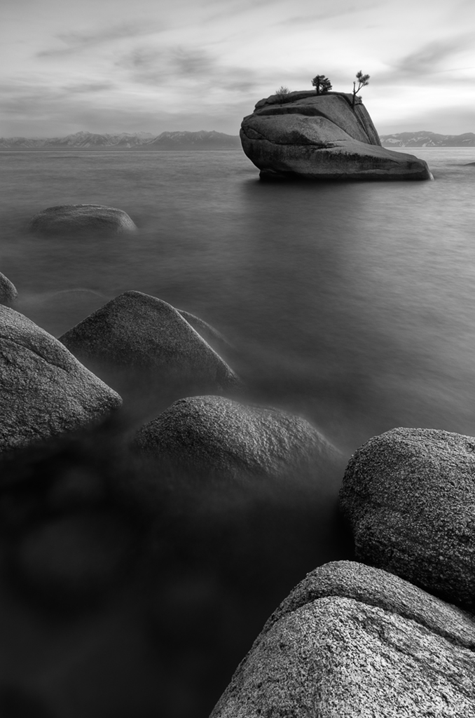
...you go with black and white.
ISO 100, F11, 30 sec.
Comments and critiques welcome!
Comments
14 comments
Comment posted by Todd Liotine on June 13, 2012 at 12:18 AM
Works great in b&w! Being really picky, the rock in the LR being the brightest distracts my eye away from the subject which I assume is banzai rock.
Registered on July 1, 2008, 131 Posts, 671 Comments
Comment posted by Jean Day on June 13, 2012 at 12:23 AM
@Todd...thanks for the critique...I wondered if I shouldn't tone that down a bit. :)
Registered on April 10, 2011, 36 Posts, 306 Comments
Comment posted by John Mumaw on June 13, 2012 at 7:26 AM
Excellent composition, and it works quite well in b&w. The long exposure added much interest, too. I like it!
I also think that a very slight burning down of the right side of that rock to more closely match the left side (or the other side of the 'split') would be an asset.
Registered on September 9, 2005, 62 Posts, 2289 Comments
Comment posted by Morris McClung on June 13, 2012 at 9:46 AM
Very nice. Yes, a little burning on that foreground rock and you're done.
Registered on May 7, 2007, 670 Posts, 19650 Comments
Comment posted by Mark Seaver on June 13, 2012 at 10:25 AM
Works well in b&w. I like how the foreground rocks set the stage for the big rock in the distance.
Registered on January 23, 2011, 1103 Posts, 17270 Comments
Comment posted by Michael J Greene, on June 13, 2012 at 2:17 PM
I really like the comp and the depth of field is outstanding. Overall, the tones feel a little flat to me. I could see employing some additional selective contrast adjustments.
Registered on June 18, 2009, 86 Posts, 2317 Comments
Comment posted by R.Bill Moser on June 13, 2012 at 3:38 PM
Great composition and the black & white conversion works well. I also like the long exposure effect. I would burn a little the rock in the foreground.
Registered on January 29, 2010, 285 Posts, 4281 Comments
Comment posted by Lon Overacker on June 13, 2012 at 4:29 PM
Jean,
Wonderful take away from this popular Tahoe locale. Excellent near/far and engaging composition. I too like the effect with the water.
Although clearly a personal choice, I might opt for some more contrast throughout - but mostly the sky and bg mountains. Just enough contrast to give more clarity, if that makes sense.
Lon
Registered on November 24, 2006, 521 Posts, 19147 Comments
Comment posted by Jean Day on June 13, 2012 at 8:28 PM
Thanks so much to you all for the great feedback. Here's the redo burning in the foreground rock and adding just a bit more contrast. Thanks again!
Registered on April 10, 2011, 36 Posts, 306 Comments
Comment posted by Tony Kuyper on June 13, 2012 at 9:03 PM
Regardless of the light/color, this comp is what makes this for me. You really nailed it, Jean!
I think I prefer the original.
Or maybe not.
Yup, original.
Registered on November 1, 2003, 364 Posts, 22328 Comments
Comment posted by Jean Day on June 14, 2012 at 2:10 AM
@Tony...ha! Well you're a big help!!! Thanks so much for taking the time to comment.
Registered on April 10, 2011, 36 Posts, 306 Comments
Comment posted by David Edwards on June 14, 2012 at 3:08 AM
A beautiful b&w Jean. I like the tonal differences of the original fg rocks, but the added contrast of the repost in the top half is nice. Lovely comp.
Registered on December 6, 2008, 142 Posts, 2623 Comments
Comment posted by Shantikara Valuska on June 15, 2012 at 4:07 PM
Very nice composition! Yep works very well in BW.
Registered on July 25, 2011, 38 Posts, 451 Comments
Comment posted by Nick Bristol on June 16, 2012 at 6:48 PM
A wonderful b/w image, Jean. I think this works really well!
Nick Bristol
Lone Rock, WI
Registered on February 1, 2004, 752 Posts, 14140 Comments

Comments
14 commentsI also think that a very slight burning down of the right side of that rock to more closely match the left side (or the other side of the 'split') would be an asset.
Wonderful take away from this popular Tahoe locale. Excellent near/far and engaging composition. I too like the effect with the water.
Although clearly a personal choice, I might opt for some more contrast throughout - but mostly the sky and bg mountains. Just enough contrast to give more clarity, if that makes sense.
Lon
I think I prefer the original.
Or maybe not.
Yup, original.
Nick Bristol
Lone Rock, WI