Nature Photographers Network
This is the preserved archive of the original Nature Photographers Network. The community continues at naturephotographers.network.
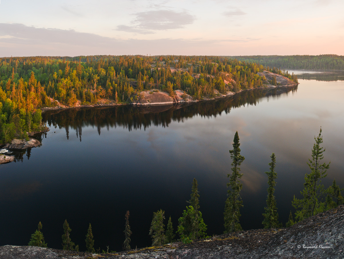
Nopiming Morning
‹ PreviousLandscape GalleryNext ›

Nopiming Morning

by Raymond Klassen

Gallery: LandscapePosted June 12, 201286 views5 comments
This is a 4 vertical shot stitch that was double processed for dynamic range. I'd love to hear your thoughts/suggestions in regards to the processing. Is the sky still too faded? Thanks for any ideas. I'd love to print this big, since it is a large file.

Please view LARGER version for detail.

Thanks for any advice you might have.

Raymond

Comments

5 comments
Comment posted by Mark Seaver on June 13, 2012 at 11:07 AM
What a lovely peaceful scene, I can hear the loons calling. I like the isolated trees in the foreground and the fact that they don't overlap the far shore. The light on the far shore is also very nice.. Yes, I'd like to see some more color in the sky. I'd also be inclined to reduce the contrast across the lake (some burning on the right and dodging on the left).
Registered on January 23, 2011, 1103 Posts, 17270 Comments
Comment posted by Lon Overacker on June 13, 2012 at 4:02 PM
Raymond,

Ya know, I think the sky is quite fitting for the scene and conditions. Sure, I guess you could try and make it pop a little more,maybe some reduced brightness, tad more contrast and/or saturation, but really it's pretty fitting with the scene. Indeed a grand view.

the only small nit I have would be the dark top of the tallest tree. I'm supposing from the use of a grad? Not sure how easy it would be to fix, but something you might consider.

Might make for a nice pano too without the rock and trees at the bottom, but would require some creating cloning to get rid of the tops of the trees. But I do like this as presented. I think for print this would just need some added contrast up top, just a little.

Lon

Registered on November 24, 2006, 521 Posts, 19147 Comments
Comment posted by Raymond Klassen on June 13, 2012 at 6:06 PM
Thank you both for the suggestions. Lon, that tree top is dark even on the original file, and I did not use a grad filter.
Registered on November 30, 2008, 114 Posts, 790 Comments
Comment posted by Tony Kuyper on June 13, 2012 at 9:12 PM
Sky is maybe a bit faded, but it provides nice contrast to the land . . . and it looks totally real. I really like the quality of light in this.
Registered on November 1, 2003, 364 Posts, 22328 Comments
Comment posted by Mark Pelton on June 14, 2012 at 8:01 PM
Raymond, I like this as is, and personally I wouldn't worry to much about the sky. We look at skys like this all the time. My preference would have been to add slightly more foreground and slightly less sky in the composition.
Registered on November 25, 2003, 380 Posts, 4647 Comments