Nature Photographers Network
This is the preserved archive of the original Nature Photographers Network. The community continues at naturephotographers.network.
Dogwood Dreamin'
‹ PreviousLandscape GalleryNext ›

Dogwood Dreamin'

by Lon Overacker

Gallery: LandscapePosted June 6, 2012688 views37 comments
Can't believe it's been over 3 months since my last image post. Just now I'm finally processing some new images - although these were captured a month ago now, spring in Yosemite with Chris, Harley, Kyle and Preston. I hope to contribute more in the coming weeks with some images from our trip.

Despite it's popularity, and possibly the most photographed valley in the world, Yosemite continues to provide diverse and endless opportunities for imagery. Sure, this is nothing original, but finding combinations of light, color, and even background make the challenge fun and rewarding. At least I think so.

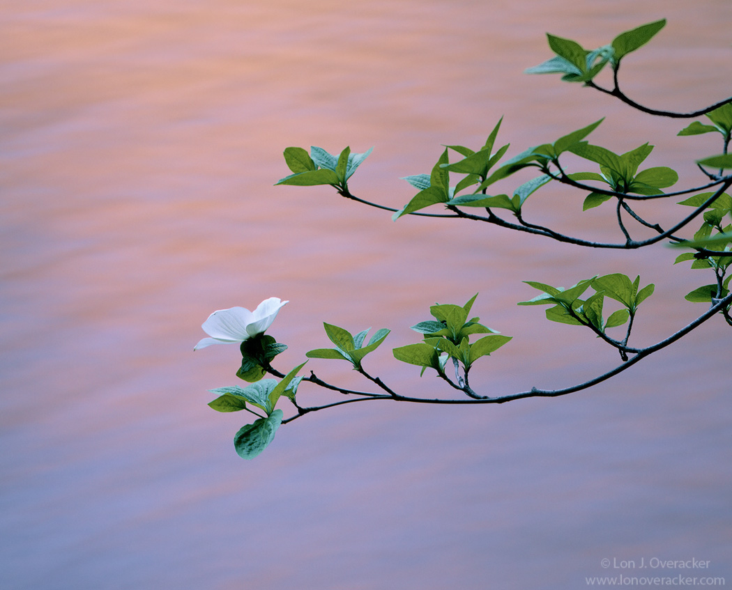
Here's your classic Pacific dogwood set against the flow of the Merced River late in the afternoon as the light reflects off the granite walls of the valley. This is a considerable crop from the original as I just don't have the reach with setup.

We were real fortunate too that for the time I was photographing, it was dead calm. This first one is a 12 second exposure and I'm going to post a second image - that one at 6 seconds.

Would love to get your comments and feedback. And which image do you prefer?

4x5, 300mm, Velvia 50, f/32 @12s and 6s respectively.

thanks!

Lon

Comments

37 comments
Comment posted by Lon Overacker on June 6, 2012 at 8:22 PM
Second version. Do you have a preference?
Registered on November 24, 2006, 521 Posts, 19147 Comments
Comment posted by Navin Sarma on June 6, 2012 at 8:44 PM
Hi Lon, definitely prefer the first. The cooler tones lend more to the simplicity and softness of the subject and light. Nice work.
Registered on July 17, 2011, 233 Posts, 1373 Comments
Comment posted by Yiming Hu on June 6, 2012 at 8:52 PM
Lon, I prefer the colors of the first version, which I found very pleasing.
Registered on April 28, 2011, 38 Posts, 733 Comments
Comment posted by Youssef Ismail on June 6, 2012 at 9:13 PM
I was wondering where the spring photos from your trip were? Can't wait for more.

Now about these, clearly the first. I like the more gradual change in color. Fortunate to have a dead stillness.
Registered on November 1, 2003, 474 Posts, 5555 Comments
Comment posted by Tom Hilton on June 6, 2012 at 9:27 PM
Great shot:
No 1
Registered on September 19, 2011, 68 Posts, 668 Comments
Comment posted by Robert Dayton on June 6, 2012 at 10:14 PM
Lovely, Lon. I keep looking in the spring for an image like this in the Park but have
yet to come up with one. Liking both images, I don't have a preference. I have a
slight preference, however, for the BG colors and tones in the first post. I slightly
leand toward the green tone in the leaves in the second image over that in the first
post.
Registered on November 11, 2008, 281 Posts, 3958 Comments
Comment posted by Jean Day on June 6, 2012 at 10:45 PM
Definitely the first for color and the longer exposure, making the image so dreamy and the branch stands out even more. Lovely. :toast:
Registered on April 10, 2011, 36 Posts, 306 Comments
Comment posted by Leo Collazo on June 6, 2012 at 10:54 PM
Hey Lon,

I like the way the Dogwood looks in the first image, because the entire section of the plant in the image is in focus and sharp, but I like the background of the second image because its a bit more dynamic and interesting to me because of the more pronounced pastel orange horizontal stripe.

If I had to choose one or the other, the second one would be the one because of that background. Other than that I think they are both great minimal images with beautiful color.
Registered on August 4, 2011, 19 Posts, 69 Comments
Comment posted by Doug Roane on June 6, 2012 at 11:24 PM
wonderful images, Lon. The background colors and texture against the sharpness of the plant make this stand out for me. I prefer the appearance of the dogwood and the WB in #1, but like the added texture and separation of colors in the BG in #2.
Registered on December 12, 2008, 213 Posts, 2226 Comments
Comment posted by Barry Ashenhurst on June 7, 2012 at 2:45 AM
Twelve seconds at f32? Good onya Lon!
This is a lovely, classic large format composition, andal though there's a little movement in the upper leaves I don't believe it spoils the shot. Sweet. :smile:
Registered on August 4, 2009, 253 Posts, 455 Comments
Comment posted by Andreas Resch on June 7, 2012 at 3:41 AM
A brunch in front of moving water - that has become quite a signature shot for you, Lon. I love it. The crispness of the branch separates so well from the soft water. On top the reflections are gorgeous. You must have been very lucky with the wind.
Registered on November 14, 2007, 322 Posts, 6101 Comments
Comment posted by Danny Laureys on June 7, 2012 at 3:49 AM
I like the green and flower against the colors in the water, comp is excellent, do like the first version. :toast: :toast:
Registered on January 5, 2008, 590 Posts, 1261 Comments
Comment posted by Nancy Lea Sandy on June 7, 2012 at 9:31 AM
Both are beautiful, Lon, but the first has more emotional pull due to it's gentleness. The colors are lovely
Registered on January 24, 2011, 576 Posts, 6942 Comments
Comment posted by Paul Marcellini on June 7, 2012 at 9:40 AM
I definitely prefer the color tones of the first as well as the softer transition of the color. :toast:
Registered on November 27, 2007, 250 Posts, 2468 Comments
Comment posted by Jeremy Calow on June 7, 2012 at 10:03 AM
I like the first Lon, pinks and cool blues work better IMO with the dogwood. Simple and calm scene, captured perfectly!
Registered on November 8, 2007, 39 Posts, 363 Comments
Comment posted by Adam Gibbs on June 7, 2012 at 12:38 PM
Simple and effective Lon. No real preference for me, both excellent images.
Registered on November 1, 2003, 168 Posts, 870 Comments
Comment posted by Stan Rose on June 7, 2012 at 2:02 PM
close call. I like the colors in #1 better, but #2 seems a tad brighter/better lit, which i prefer. Both are real nice.
Registered on September 15, 2005, 836 Posts, 17099 Comments
Comment posted by Marc Adamus on June 7, 2012 at 2:14 PM
Hey, these are classics for a darn good reason and the light in this rendition really sings! Amazing that you do these with the LF gear and so few shots, yet do them so well. There's a lot to be said for getting to know a subject in great detail.
Registered on September 17, 2005, 780 Posts, 8091 Comments
Comment posted by Nathan Apodaca on June 7, 2012 at 2:53 PM
Nice image, Lon! Glad to see more of your images from that beautiful area. OK, it's hard to pick between the two, but I guess I'm leaning toward the 1st, because of the colors... Really, it's a difficult choice... I like how you isolated the subject and placed it perfect in the frame for a good comp. Also, I can't believe it held still for a whopping 12 seconds!
Registered on November 16, 2011, 67 Posts, 1127 Comments
Comment posted by Kent Mearig on June 7, 2012 at 3:08 PM
I definitely prefer the first version because of its smoother gradient of colors in the background.
Registered on September 4, 2006, 237 Posts, 4748 Comments
Comment posted by R.Bill Moser on June 7, 2012 at 3:32 PM
I'd prefer the first one :toast:
Registered on January 29, 2010, 285 Posts, 4281 Comments
Comment posted by Chris Chamberlain on June 7, 2012 at 4:08 PM
Another shot that desrves the word elegant to describe it. This turned out really nice. I think the softer light and color of the first is my choice. I guess i'm gonna have to get a 70-200 before i can get a good comp with this subject.

Chris
Registered on March 13, 2007, 500 Posts, 8365 Comments
Comment posted by Patricia Brundage on June 7, 2012 at 4:20 PM
The first showcases the dogwood and the second puts more emphasis on the water feature. Both excellent images but because of your title I am assuming the dogwood should take center stage and therefore #1 wins.
Registered on March 23, 2006, 1111 Posts, 6531 Comments
Comment posted by Mark Seaver on June 7, 2012 at 4:45 PM
The moving water with its pastel reflections is the perfect complement to the gentle sweep of the dogwood branches and flower. I much prefer the overall gentleness of the original.
Registered on January 23, 2011, 1103 Posts, 17270 Comments
Comment posted by Kah Kit Yoong on June 7, 2012 at 7:38 PM
Love the subtle colour gradations in the background canvas to the delightful main subject. I prefer the first version but hard to say why, only that immediately it looks better.
Registered on September 27, 2006, 636 Posts, 10682 Comments
Comment posted by Nick Bristol on June 7, 2012 at 9:35 PM
There is a soff and elegant look here which feels wonderful. I'm sure this would make a beautiful print! I like the first version the best. The color just seems to work better with the feel and mood for me. Very, very nice, Lon!

Nick Bristol
Lone Rock, WI
Registered on February 1, 2004, 752 Posts, 14140 Comments
Comment posted by Michael J Greene, on June 8, 2012 at 2:34 AM
Hi Lon,

Good to see you posting. The light is really pretty and the reflected colors are wonderful. The color balance is exceptional too as is the placement of the flower within the frame. Overall, I like the colors better in the first shot.

Michael
Registered on June 18, 2009, 86 Posts, 2317 Comments
Comment posted by Anil Rao on June 8, 2012 at 3:21 AM
What a gentle and peaceful scene. I love the way the natural beauty of the location is coming through here.

Although both are lovely, I prefer the 1st one.
Registered on November 15, 2003, 234 Posts, 4923 Comments
Comment posted by Eva McDermott on June 8, 2012 at 5:57 AM
Beautiful images Lon. As several have already pointed out, the 1st has a smoother color gradient and is also my preference.
Registered on January 4, 2009, 1015 Posts, 13229 Comments
Comment posted by Nicolaus Wegner on June 8, 2012 at 3:38 PM
Has Lon written all over it. Can't offer up any critiques, beautiful work!
Registered on February 21, 2010, 133 Posts, 1509 Comments
Comment posted by Mark Pelton on June 8, 2012 at 6:19 PM
Very nice, Lon. I prefer the 2nd, as it seems to provide slightly more contrast to the dogwood branch. Amazing that you it was still enough to get such a long exposure.
Registered on November 25, 2003, 380 Posts, 4647 Comments
Comment posted by David Edwards on June 8, 2012 at 10:42 PM
Lovely shot Lon. I like the first version with the warmer purples as opposed to the bluer second version. They seem to sit nicer with the green leaves. There's a nice zen to this one, very calm and relaxing.
Registered on December 6, 2008, 142 Posts, 2623 Comments
Comment posted by Tony Kuyper on June 9, 2012 at 11:42 AM
Classic image but very well done. I like the color and detail in the first one best. The second one feels a bit bottom heavy with blue. I like how the simplicity here and the well managed light quickly engage the viewer. While this isn't a necessity for a photograph, when these things things come together there's an almost instant connection that feels good.
Registered on November 1, 2003, 364 Posts, 22328 Comments
Comment posted by Richard Olsen on June 9, 2012 at 3:13 PM
Simple and beautiful. Great find and excellent capture! :toast:
Registered on October 19, 2006, 306 Posts, 1571 Comments
Comment posted by Dean Sauskojus on June 10, 2012 at 2:10 PM
I think the first is better because of the gradient of color from the bottom to the top, whereas the second has the streak through the middle which distracts from your main focus of the Dogwood. The colors seem a bit more pleasing too. I'm getting kind of picky but the branch in the URC is also in better focus in the first. Beautiful job Lon! Love your work.
Registered on September 29, 2009, 137 Posts, 2659 Comments
Comment posted by Philip Schwarz on June 11, 2012 at 8:14 AM
Beautiful shot. Great comp and the background colors really make the photo.
Registered on November 29, 2006, 236 Posts, 1210 Comments
Comment posted by Zack Clothier on June 13, 2012 at 3:09 AM
I knew from the thumbnail this had to be yours, Lon. Beautiful, intimate shot. I do find the out of focus leaves on the far right to be mildy distracting, perhaps you could crop them out. :toast:
Registered on January 28, 2010, 343 Posts, 2257 Comments