Nature Photographers Network
This is the preserved archive of the original Nature Photographers Network. The community continues at naturephotographers.network.
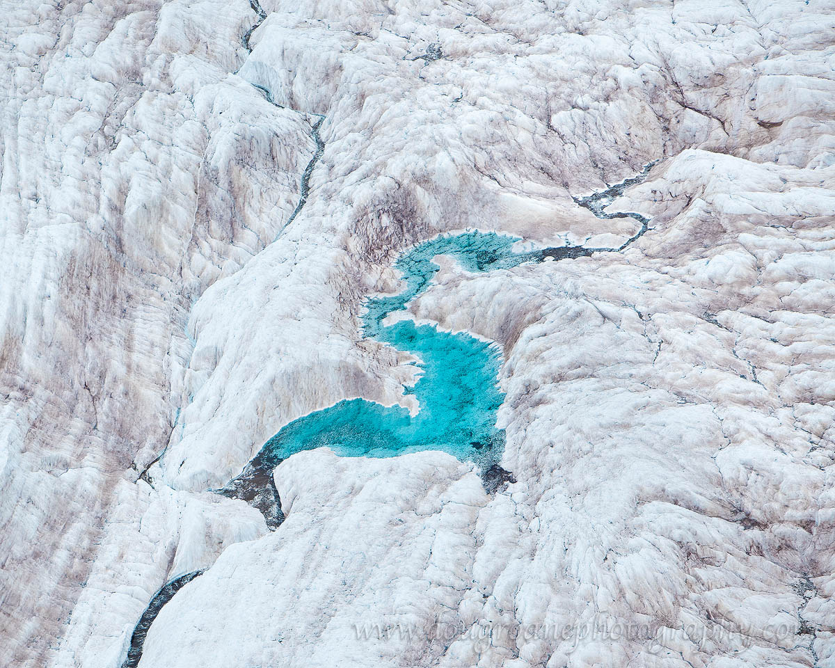
Glacial "S"tream
‹ PreviousLandscape GalleryNext ›

Glacial "S"tream

by Doug Roane

Gallery: LandscapePosted June 5, 2012496 views18 comments
Hi folks. I haven't been around here in awhile and it looks like I've missed alot! This image is an aerial photo taken last Fall over Wrangell-St. Elias Nat'l Park, Alaska. One of the problems with photographing directly over a glacier is, obviously, it's hard to get a sense of scale. Lacking that, I'm curious to hear what you all think. I've included a B/W version also, because I like how the textures are emphasized.

Canon 5D2. 70-200/2.8 IS @ 170 mm. ISO 400. f/3.5. 1/3000s. Processing was fairly basic for this image (mostly done in ACR)

Comments

18 comments
Comment posted by Doug Roane on June 5, 2012 at 11:34 PM
Registered on December 12, 2008, 213 Posts, 2226 Comments
Comment posted by Lon Overacker on June 6, 2012 at 1:54 PM
Doug,

This is wonderful! The lack of scale is noteable as you mention, but not detrimental. I think the lack of scale adds interest and a sense of wonder. Love the color version. B&W is graphic, but that turquoise really shines in the color version. Excellent, love this.

Lon
Registered on November 24, 2006, 521 Posts, 19147 Comments
Comment posted by Phil Pogledich on June 6, 2012 at 3:00 PM
I'm totally with Lon on the color version...love it. B&W actually doesn't do much for me. Very cool shot.
Registered on August 24, 2009, 123 Posts, 3099 Comments
Comment posted by R.Bill Moser on June 6, 2012 at 3:29 PM
The color version is awesome :toast:
Registered on January 29, 2010, 285 Posts, 4281 Comments
Comment posted by Dean Sauskojus on June 6, 2012 at 4:51 PM
The shape reminds me of a Chinese Dragon. Real unique aerial photo and the color and texture is outstanding.
Registered on September 29, 2009, 137 Posts, 2659 Comments
Comment posted by Navin Sarma on June 6, 2012 at 5:57 PM
I actually love the lack of sense of scale. It's very intriguing and mind bending. I think your center comp works pretty well given the shape spans nearly corner to corner.
Registered on July 17, 2011, 233 Posts, 1373 Comments
Comment posted by Nancy Lea Sandy on June 6, 2012 at 8:12 PM
the texture pops a lot more in the b&w version but the pastel ice and turquoise stream really bring this to life. Beautiful work.
Registered on January 24, 2011, 576 Posts, 6942 Comments
Comment posted by Mark Seaver on June 6, 2012 at 10:37 PM
Love the turquoise dragon! It's a neat view and the lack of scale helps make it abstract.
Registered on January 23, 2011, 1103 Posts, 17270 Comments
Comment posted by Paul Marcellini on June 7, 2012 at 9:51 AM
Yup, I like it. Both versions actually. Would love to do some aerials sometime. That water color is awesome.
Registered on November 27, 2007, 250 Posts, 2468 Comments
Comment posted by Abdullaziz Bin Ali on June 7, 2012 at 10:09 AM
I love the colored version more
seems really huge
Registered on May 31, 2009, 112 Posts, 1590 Comments
Comment posted by Adam Gibbs on June 7, 2012 at 12:47 PM
Regardless of scale this is really fascinating Doug. What a great contrast between the blue and white.
Registered on November 1, 2003, 168 Posts, 870 Comments
Comment posted by Kent Mearig on June 7, 2012 at 3:00 PM
I prefer the color version, but I could see putting a little more work into the highlight hues and details in that version. It's a great photo!

...what lacking sense of scale? It's a glacier... :wink:
Registered on September 4, 2006, 237 Posts, 4748 Comments
Comment posted by Nathan Apodaca on June 7, 2012 at 4:39 PM
'WOW'! <---This is definitely a 'wow' image.

Looks great to me, as far as processing goes. I'd love to see this printed large!
Registered on November 16, 2011, 67 Posts, 1127 Comments
Comment posted by Grant Collier on June 8, 2012 at 2:14 PM
Definitely like the color version the best. The cool blues really make this shot. I might have liked a slightly less centered composition but overall a great shot!
Registered on July 29, 2005, 73 Posts, 430 Comments
Comment posted by Wick Smith on June 8, 2012 at 4:07 PM
Great scene & it is tough to get size perspective. The blue is incredible. I'd stick with the color version as that makes the photo.
Registered on June 12, 2009, 91 Posts, 379 Comments
Comment posted by Tony Kuyper on June 9, 2012 at 11:17 AM
I prefer the abstract quality of this to any sense of scale. Just don't need scale when it looks this good. Don't really care much for the B&W.
Registered on November 1, 2003, 364 Posts, 22328 Comments
Comment posted by David Edwards on June 10, 2012 at 1:50 AM
Color version is fantastic Doug! I like that I can't guess the exact scale of the scene... it makes it intriguing and keeps me exploring around the image, especially the large version. The color really makes this one awesome.
Registered on December 6, 2008, 142 Posts, 2623 Comments
Comment posted by Zack Clothier on June 13, 2012 at 3:03 AM
Put me down for the color version as well..the turquoise water really makes this image shine. No need for scale here, wonderful shot, Doug!
Registered on January 28, 2010, 343 Posts, 2257 Comments