Nature Photographers Network
This is the preserved archive of the original Nature Photographers Network. The community continues at naturephotographers.network.
Fade to Blue
‹ PreviousLandscape GalleryNext ›

Fade to Blue

by Jorne de Bruin

Gallery: LandscapePosted June 2, 2012150 views10 comments
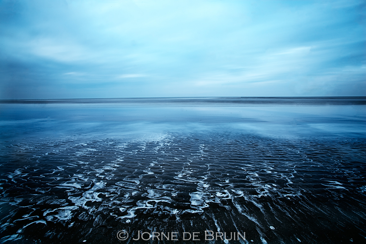
This was just after sunset under an overcast sky. This gave me the chance to mess about with some longer shutterspeeds. While lots of people stay in with this sort of weather, I always find it nice to experiment a little and see what you can get out of a scene. Tried a lot of compositions, and the funny thing is, when I saw this image in the viewfinder I initially dismissed it as a failure (due to the foam in the fg not working for me). Luckily I kept the image for a second glance on my computer screen! The lesson? Never judge an image on your camera alone ;-)

C&C welcome, pls view large.

Tech 1dsII, 17mm, 90 second exposure

Comments

10 comments
Comment posted by Richard Teller on June 2, 2012 at 11:42 PM
To appreciate this image you must look at the larger photo. Great feeling of depth. An interesting and artistic image.
Registered on August 23, 2010, 1162 Posts, 6692 Comments
Comment posted by Karsten Wrobel on June 3, 2012 at 5:53 AM
Jorne, I like the blue mood and the vast emptiness here...
Registered on November 1, 2008, 117 Posts, 851 Comments
Comment posted by Peter Richter on June 3, 2012 at 6:37 AM
Jorne, your image is an impressive visualizazion of "blue" to me. The repetitive pattern leading into the depth works very well for me and keeps my attention. The clear cut horizon makes for another interesting element to my eye.

Peter
Registered on November 10, 2010, 218 Posts, 2723 Comments
Comment posted by Scott Smorra on June 3, 2012 at 9:06 AM
Very nice color palette Jorne. The blues look great. I also really like the patterns in the foreground.
Registered on November 2, 2009, 161 Posts, 2143 Comments
Comment posted by Jeremy Cram on June 3, 2012 at 10:02 AM
I like the starness here. The squigly lines are a great foreground. Thie would make great large print imo.
Registered on June 4, 2006, 204 Posts, 818 Comments
Comment posted by Stan Rose on June 3, 2012 at 3:59 PM
It's very blue...and im feeling a bit blue right now (even wearing a 'King of The Blues' tee-shirt...) so it works perfectly for me... :frown: :wink:
Registered on September 15, 2005, 836 Posts, 17099 Comments
Comment posted by Tony Kuyper on June 3, 2012 at 6:39 PM
Cool foreground. Could see cropping some of the sky to emphasize it a bit more.
Registered on November 1, 2003, 364 Posts, 22328 Comments
Comment posted by Mark Seaver on June 4, 2012 at 9:00 AM
Very interesting image, especially the squiggly lines in the foreground. I agree with TK's crop suggestion.
Registered on January 23, 2011, 1103 Posts, 17270 Comments
Comment posted by Morris McClung on June 4, 2012 at 11:05 PM
Nice texture and mood. The cool blue palette is very pretty.
Registered on May 7, 2007, 670 Posts, 19650 Comments
Comment posted by Shantikara Valuska on June 12, 2012 at 5:02 PM
I love this one also. Especially the pattern with the foam in the FG (which you did not like :wink: )
:toast:
Registered on July 25, 2011, 38 Posts, 451 Comments