Nature Photographers Network
This is the preserved archive of the original Nature Photographers Network. The community continues at naturephotographers.network.
Untitled
‹ PreviousLandscape GalleryNext ›

Untitled

by Peter Coskun

Gallery: LandscapePosted May 31, 2012305 views14 comments
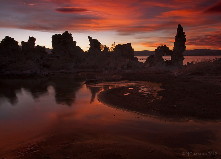
I Can't think of a good title for this image, so any suggestions will be helpful. This is another shot from mono lake. The last image from this sunset that I really liked (Still have tons more from that evening, but I'll spare you looking at dozens of images from the same place). What really pulled me to this scene was the curve in the water. The colors here are natural, no saturation was added just a few slight curves adjustments and sharpening. I wanted to have the tufa's silhouetted against the colorful sky, and even if I were to brighten them up they wouldn't look so good. Cropped a bit from each side as well. Comments and critiques appreciated.

Canon 7d
Canon 17-40mm @17mm
ISO 100
f22
2.5 sec
3 stop/2 stop grad ND filters (3 stop for sky, 2 stop for foreground)
Tripod

Comments

14 comments
Comment posted by John Fan on June 1, 2012 at 11:16 AM
Beautiful color and reflection. The image overall seems dark, at least on my monitor.
Registered on August 24, 2010, 135 Posts, 489 Comments
Comment posted by Ken Smith on June 1, 2012 at 11:40 AM
Enchanting forms and fire-lit sky .... nicely captured. The right side contains more action whilst the left seems to drift. I might crop left for a square frame. Well done!
Registered on September 5, 2008, 449 Posts, 2444 Comments
Comment posted by Wayne Rhodus on June 1, 2012 at 3:01 PM
The dark features and rich, saturated sunset colors combine to create a foreboding yet strangely inviting mood. I like it Peter.
Registered on November 16, 2003, 157 Posts, 3326 Comments
Comment posted by Peter Coskun on June 1, 2012 at 3:38 PM
Thanks everyone. It looks pretty vibrant on my calibrated mac, but a bit dull on a normal desktop that is calibrated.
Registered on October 31, 2011, 170 Posts, 1240 Comments
Comment posted by Karsten Wrobel on June 1, 2012 at 4:10 PM
Peter, I like the vibrant colours and the overall darker nature of the image... a bit undecided about the comp - appealing due to the curves in the fg and water reflection but not easy on the eye... the rocks on the lhs look a tad sharp on my screen
Registered on November 1, 2008, 117 Posts, 851 Comments
Comment posted by Kathy Barnhart on June 1, 2012 at 6:05 PM
I love the rich, dark colors but at the same time I want to see more. I thought at first glance it was an ocean photo, so it's refreshing to see a Mono Lake image that is different.
Registered on November 11, 2011, 404 Posts, 1639 Comments
Comment posted by Peter Coskun on June 1, 2012 at 6:10 PM
Karsten I see what you mean on the left and I agree, The curve is what drove me to the scene, but I am not one to do square crops. I wish I would have taken a few steps to the left and turned the camera towards the right.

Kathy, I can see about maybe brightening the scene up a bit and allow the colors to pop. When I first looked at my LCD screen it reminded me of images from Bandon beach in Oregon. It looks like I somewhat achieved what I was going for, taking more unique images from an often photographed location. I could be returning to the area again over the summer and really try something different.
Registered on October 31, 2011, 170 Posts, 1240 Comments
Comment posted by Yiming Hu on June 1, 2012 at 7:26 PM
Peter, the colors in the sky are vibrant. I do think however that overall the picture is a little bit dark.
Registered on April 28, 2011, 38 Posts, 733 Comments
Comment posted by Peter Coskun on June 1, 2012 at 8:38 PM
Here is a brighter version for comparison
Registered on October 31, 2011, 170 Posts, 1240 Comments
Comment posted by Scott Smorra on June 2, 2012 at 12:33 AM
Very nice sunset light Peter. I like the brighter version better, but it looks like the red channel is blown in the sky. I might try blending the sky from the first image with the land in the second.
Registered on November 2, 2009, 161 Posts, 2143 Comments
Comment posted by Peter Coskun on June 2, 2012 at 12:51 AM
Thanks Scott, the red's should be pretty much at their limits and don't appear to be blown on my monitor, but I could probably just blend the two images together and mask the sky over it from the first.
Registered on October 31, 2011, 170 Posts, 1240 Comments
Comment posted by Stan Rose on June 2, 2012 at 12:30 PM
Real pretty comp, love the reflection! I agree with the other comments. It definitely looks better brighter, but by brightening it you've lost contrast where you need it. Hard to suggest w/o actually trying it, but i think a careful S-curve will enhance things.
Registered on September 15, 2005, 836 Posts, 17099 Comments
Comment posted by Paul Duval on June 2, 2012 at 1:31 PM
Purgatory Dreaming.

Peter,

This has an eerie underwordly feel to it especially if you only look at the bottom half of the image with the reflected skyfire and the spirit shape just off center right with the glowing eyes. So the title at top occurred to me. Take it for what you will, and it looks like you got more than one keeper on your first evening.

Paul
Registered on June 30, 2009, 508 Posts, 1907 Comments
Comment posted by Peter Coskun on June 2, 2012 at 8:41 PM
Thanks Stan, I've been playing around with a few different variations with curves, brightness and contrast. Still don't think I got it down yet, but hopefully will find the perfect fit.

Paul thanks for giving this a title. Your description is pretty close to what I was thinking while viewing this.
Registered on October 31, 2011, 170 Posts, 1240 Comments