Nature Photographers Network
This is the preserved archive of the original Nature Photographers Network. The community continues at naturephotographers.network.
Headwaters--Gold Dust + repost
‹ PreviousLandscape GalleryNext ›

Headwaters--Gold Dust + repost

by Nancy Lea Sandy

Gallery: LandscapePosted May 26, 2012107 views12 comments
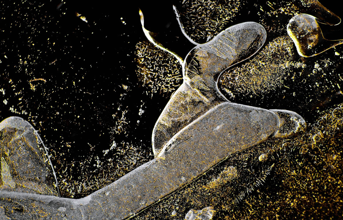
From early spring when the ice was still on the creeks in the morning. The highlights were golden while all the other colors were drab and uninviting. I de-saturated most the color and deepened the shadows in LR. I'd love some feedback on this treatment. Let me know if the image is still too drear. Thanks for looking


Canon T1i
1/4000 sec f/5.6 190mm

Comments

12 comments
Comment posted by Dan Baumbach on May 26, 2012 at 12:24 PM
I don't think this is dreary at all. I really like it. I like the gold and the shapes of the ice.

- Dan
Registered on November 1, 2003, 473 Posts, 7980 Comments
Comment posted by Philip Hodgkins on May 26, 2012 at 5:30 PM
Ditto what Dan says.
Registered on July 24, 2006, 2741 Posts, 12349 Comments
Comment posted by Ian Cameron on May 26, 2012 at 9:04 PM
Hi Nancy I think those colours you have displayed here are great but I also think the right side of the image is much stronger than the left. I think I would be very tempted to create a square format image from the right side of the image.
Registered on August 6, 2004, 1125 Posts, 3318 Comments
Comment posted by Stan Rose on May 26, 2012 at 10:14 PM
my philosophy with these kind of abstracts is that you should go as tight as possible--keep zooming in until you are on the verge of losing an important part of the comp. I think the right half of this comp is where all the interest is. Cut it in half, and look at the lhs--not very exciting, right? Since it doesnt strongly support the rhs--get rid of it. :wink:
Registered on September 15, 2005, 836 Posts, 17099 Comments
Comment posted by Nick Bristol on May 26, 2012 at 10:30 PM
I agree the right side of this looks fantastic. I go along with Ian's and Stan's crop suggestion. I really like what you did here, Nancy! Really cool looking. :toast:

Nick Bristol
Lone Rock, WI
Registered on February 1, 2004, 752 Posts, 14140 Comments
Comment posted by Nancy Lea Sandy on May 27, 2012 at 12:34 AM
Now why didn't I see that? that is exactly what I was looking for with this. Thank you very much, guys. Your advice is always appreciated.
Registered on January 24, 2011, 576 Posts, 6942 Comments
Comment posted by Paul Duval on May 27, 2012 at 1:39 AM
Nancy,

The crop elimantes the negative space, way more effective.

Paul
Registered on June 30, 2009, 508 Posts, 1907 Comments
Comment posted by Eva McDermott on May 27, 2012 at 5:05 PM
The repost is definitely a winner Nancy! It does indeed look like gold dust.
Registered on January 4, 2009, 1015 Posts, 13229 Comments
Comment posted by Tony Kuyper on May 27, 2012 at 7:57 PM
Very nice. Interesting how this place is always tuned in to you and you to it. I guess I prefer the crop, but original is quite good too.
Registered on November 1, 2003, 364 Posts, 22328 Comments
Comment posted by Nicolaus Wegner on May 27, 2012 at 9:31 PM
This is a hard one for me to find focus on Nancy. I like some of your previous abstracts better.
Registered on February 21, 2010, 133 Posts, 1509 Comments
Comment posted by Margaret Summers on May 27, 2012 at 11:10 PM
I like the original, but the repost is AMAZING! What a difference a crop makes!
Registered on May 24, 2011, 54 Posts, 99 Comments
Comment posted by Robert Dayton on May 28, 2012 at 7:31 PM
Of your water abstracts, this is one of my favorites. I like the textures, shapes, and lines.
Although I like both, I have a slight preference for the 2nd one.
Registered on November 11, 2008, 281 Posts, 3958 Comments