Nature Photographers Network
This is the preserved archive of the original Nature Photographers Network. The community continues at naturephotographers.network.
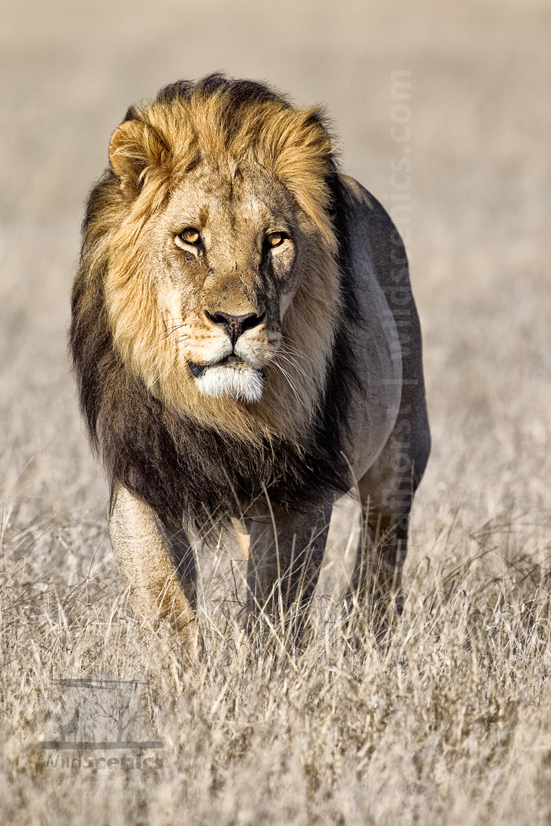
Kalahari King (+alt. versions)
‹ PreviousWildlife GalleryNext ›

Kalahari King (+alt. versions)

by Vincent Grafhorst

Gallery: WildlifePosted March 27, 2012355 views20 comments
I once read a statement saying that 90% of the US tourists (apparently the study was conducted in the US) visiting Africa, come specifically to see a Male Lion. I am not sure how true that really is, but it did not surprise me. Seeing a Tautona (big male lion in Setswana) up close in the wild is a magnificent sight and even after many sightings remains impressive.


Central Kalahari GR, Botswana.
Camera Model Canon EOS 1D Mark IV
Shutter Speed 1/800 Sec.
Aperture Value f/7.1
ISO Speed 200
Lens EF500mm f/4L IS USM

Comments

20 comments
Comment posted by Stuart Williams on March 27, 2012 at 10:04 AM
some of my fondest memories: in the bright moonlight watching a pride of lions coming down to water and having the still air crackling with the depth and timbre of the roaring. the huge head and mane thrown back, snout forward and from the very depths of the male comes the sound, growing to a earth-shaking crescendo! Yes!
Registered on December 7, 2007, 247 Posts, 4792 Comments
Comment posted by Stephen Kaluski on March 27, 2012 at 10:13 AM
Nice portrait Vincent, like the stance and subtle BKG, works well against this awesome character. Just wonder about easing off a fraction on the Contrast?

US tourists (apparently the study was conducted in the US) visiting Africa, come specifically to see a Male Lion.

FWIW Vincent, having just past a big male Leopard and two honey badgers in daylight, the group we stopped to tell were only interested in male lions, what a feast they missed. :smile: Guess we all have our own agenda's.

TFS
Steve
Registered on March 25, 2007, 189 Posts, 1064 Comments
Comment posted by Jagdeep Rajput on March 27, 2012 at 11:29 AM
No wonder, an impressive specimen. The lighting appears to be bit harsh, but handled well. I feel, Steve's suggestion about easing off contrast holds merit.
Jagdeep Rajput
:wavey:
Registered on April 29, 2008, 686 Posts, 2857 Comments
Comment posted by Vincent Grafhorst on March 27, 2012 at 11:30 AM
Hi Steve, the original is a lot less contrasty indeed as you can see. It was only after I made a B&W conversion that I experimented with this more contrasty look, which I actually like a bit better than the original. What I did I stacked the color and B&W on top of each other and used the luminosity blending mode to get to this result.
Registered on February 24, 2006, 504 Posts, 7203 Comments
Comment posted by Vincent Grafhorst on March 27, 2012 at 11:31 AM
And the B&W version for comparison.
Registered on February 24, 2006, 504 Posts, 7203 Comments
Comment posted by Max Waugh on March 27, 2012 at 11:40 AM
Hmm... tough call for me. I see the appeal of the high contrast version in color, though I think I prefer it in B/W. I do like the "non-contrasty" color version as well.

Max
Registered on September 26, 2008, 428 Posts, 2329 Comments
Comment posted by Jerry Austin on March 27, 2012 at 12:11 PM
Is it just me or does the image look a bit compressed in the horizontal direction?
Registered on January 6, 2012, 651 Posts, 3448 Comments
Comment posted by Stephen Kaluski on March 27, 2012 at 12:15 PM
Hi Vincent, I think the RP has lost a bit of character as you say. I am not a great fan of Luminosity mask as I have found detail looks lost and or, reduced. Try a Linear Curves adjustment, that might just bring back that contrast it needs, but not as severe, WDYT? Brad will chuckle, but on the RP I think you could add a hint more select USM. . :wavey:

I know young Morkel will have a thought about the B/W :wink:

I do like that slight windswept mane under the chin.

Steve
Registered on March 25, 2007, 189 Posts, 1064 Comments
Comment posted by Morkel Erasmus on March 27, 2012 at 2:04 PM
Magnificent specimen as only the Kalahari can deliver, Vincent! :eek:
I like the head-on approach and the flowing black mane. In his prime, I would say... :smile:

Steve was right - I love the B&W! Nice rich tones, good detail...really makes the facial/mane detail shine.
I too like playing around with luminescent B&W layers on top of the colour layers so I quite like the OP, but think the ideal colour version would be somewhere between your OP and colour RP...? :wink:
Registered on March 22, 2011, 385 Posts, 2068 Comments
Comment posted by Dan Roberts on March 27, 2012 at 2:15 PM
Nice shot of a beautiful animal. IMHO the second color version isolates the subject a bit more (which suites my taste).

Regarding the statistic, I suppose Disney brainwashed us all with the Lion King.
Registered on March 9, 2011, 69 Posts, 501 Comments
Comment posted by Ajit Huilgol on March 27, 2012 at 9:56 PM
Love the windswept mane, the direct approach and the bg. I, too, though, prefer something in between the original and the repost. Regarding Americans' preference for male lions, you can't blame them can you, if something like this specimen walks past!
Registered on December 19, 2008, 302 Posts, 2055 Comments
Comment posted by Richard Teller on March 27, 2012 at 11:43 PM
Great pose and light. The look on the face of the lion and the wind blowing his mane really makes the image.
Registered on August 23, 2010, 1162 Posts, 6692 Comments
Comment posted by Stuart Williams on March 28, 2012 at 1:43 AM
oh, and i prefer the less contrasty image- certainly in the grass.
Registered on December 7, 2007, 247 Posts, 4792 Comments
Comment posted by Jorne de Bruin on March 28, 2012 at 5:00 AM
Superb image Vincent, the contrasty colour version has my preference by far, especially the grass looks better in that one! :toast: :wavey:
Registered on June 26, 2008, 178 Posts, 2136 Comments
Comment posted by James Campbell on March 28, 2012 at 5:41 AM
Hey Vincent, I really like these all.. Not just because I'm easy to please but because variations and adjustments on a strong starting point more often than not look great! At some point it really becomes a matter of taste - and on that we will seldom get consensus.. Your image however is great - awesome light and a very neatly combed mane :wavey:
Registered on January 12, 2009, 48 Posts, 377 Comments
Comment posted by Vincent Grafhorst on March 28, 2012 at 11:36 AM
Jerry, you said:
Is it just me or does the image look a bit compressed in the horizontal direction?

I cannot explain what you see other than that it is perspective distortion caused by the narrow field of view of a long focal length lens.
Registered on February 24, 2006, 504 Posts, 7203 Comments
Comment posted by Anand Narayanan on March 28, 2012 at 12:31 PM
That is one handsome lion and a handsome shot. I like the original non contrasty version best.
Registered on October 25, 2009, 110 Posts, 835 Comments
Comment posted by Ken Archer on March 29, 2012 at 7:08 PM
Awesome portrait Vincent! I like the original too. :cool:

Ken Archer
Registered on October 28, 2004, 222 Posts, 6683 Comments
Comment posted by Joe James on March 29, 2012 at 9:45 PM
I like all three as this is one magnificent Kalahari lion with that black mane. If I had to choose I'd pick the second shot simply because it's the one with the least amount of processing but all three versions are great. Thanks for sharing and for the explanation.

PS - Call me strange but I qualify as one of those tourists but to me the draw isn't a single species but the total package of variety and sheer numbers. I think there are more large mammals in just Kruger than all of the Northern Rocky Mountains parks (Yellowstone, Teton, Glacier, Waterton, Banff, Kootenay, Yoho and Jasper) combined. Of course, the winters are a bit harsher in the Rockies than anywhere in Africa. :wink:
Registered on November 20, 2009, 89 Posts, 808 Comments
Comment posted by Neal Cooper on April 3, 2012 at 12:30 PM
A really powerful image Vincent. I love both your reposts. I have just returned from Kgalagadi myself and had the privilege to be 2 meters away from a male and female. Awesome feeling and firmly puts perspective of where we would fit in on the food chain.
Registered on June 3, 2009, 144 Posts, 306 Comments