Nature Photographers Network
This is the preserved archive of the original Nature Photographers Network. The community continues at naturephotographers.network.
Bodie Ghost Town, CA
‹ PreviousPOP Photos GalleryNext ›

Bodie Ghost Town, CA

by Robert Dayton

Gallery: POP PhotosPosted March 26, 2012107 views6 comments
In 2007 the Merced Camera Club signed up for a special
tour that permitted us to enter the interior of the Bodie
Ghost Town buildings. I had the privilege of being a member
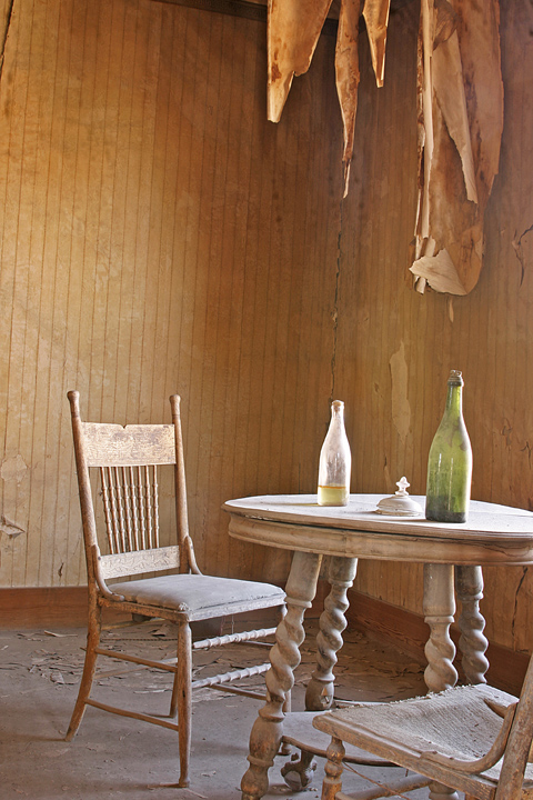
of the group. I've posted here a horizontal and a vertical
of a table setting. As I mentioned in a previous Bodie
posting that if the posted image does not appear to be level
that's because in many of these buildings the walls, floors,
and ceilings literally were tilted. Instead of leveling the
image in post-production, I opted to show it as it really was.
Thank you for taking the time to view my work, and as always, I
welcome your C&C.

Canon 10D
Canon 24mm lens
Bogen Tripod
Cable Release

Comments

6 comments
Comment posted by Robert Dayton on March 26, 2012 at 2:19 PM
The horizontal version
Registered on November 11, 2008, 281 Posts, 3958 Comments
Comment posted by Harley Goldman on March 26, 2012 at 6:18 PM
I prefer the second. I find it more simple and down to the essentially story-telling elements.

Both seem to need a CCW rotation, especially the first one.
Registered on November 19, 2003, 586 Posts, 11271 Comments
Comment posted by Jeffrey Sipress on March 27, 2012 at 12:01 PM
Good to hear you got inside. I have, too.

The processing has an HDR look to it. A little bright overall.
Registered on February 17, 2004, 236 Posts, 1197 Comments
Comment posted by Peter Cross on March 27, 2012 at 7:49 PM
I, too, prefer image #2. Just seems to be stronger. Nice comp. The tilt doesn't bother me for the reason you noted. Not sure how public, per se, would react not knowing about the out of level floors, etc. Interesting image.
Registered on April 3, 2010, 271 Posts, 1342 Comments
Comment posted by Kent Staubus on March 27, 2012 at 8:37 PM
Very nice use of light, and control of exposure. The tilt adds a little from my POV, but if not explained it would bother me.


Kent in SD
Registered on November 11, 2003, 121 Posts, 2098 Comments
Comment posted by Catherine Reilly on April 17, 2012 at 5:11 PM
I think the vertical tells a more complete story. Glad you explained the tilt; it's a little unnerving. The light reveals the century's accumulation of dust very well! Cracks in the wall, debris on the floor, whatever it is hanging from the ceiling and the table/chairs-- it's got it all. Love it.
Registered on August 16, 2006, 603 Posts, 9192 Comments