Nature Photographers Network
This is the preserved archive of the original Nature Photographers Network. The community continues at naturephotographers.network.
White Out & Re-Post
‹ PreviousLandscape GalleryNext ›

White Out & Re-Post

by Harry Lichtman

Gallery: LandscapePosted February 26, 2012341 views29 comments
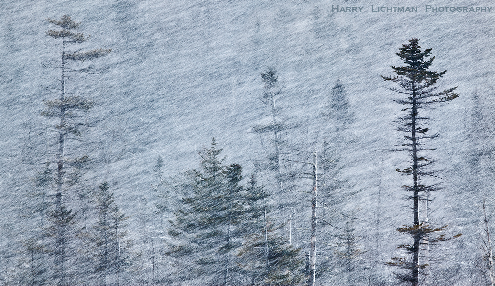
Winter returned with a furry this past weekend in NH's White Mountains as well as many other parts of New England. I was glad to be able to experience some this as the winter has been largely a disappointment as far as large winter storms go. In addition to some isolated heavy snows, winds blew through valley areas at near hurricane force. I was after the graphic nature and abstract quality of the blowing snow. Small breaks in the clouds allowed some back lighting. Processing was largely a creative endeavour, and I'm not sure if I got it right. The file created a very narrow histogram, so I tried to reconstruct colors and bring the brightness of the blowing snow to the final image. I have a B&W version, but thought the small touches of color brought a little reality to the abstract nature of this one.

Your comments and suggestions appreciated.

Larger Image Provided

5DII, Canon 100-400, ISO 100, 1/20 second

Comments

29 comments
Comment posted by Peter Cross on February 26, 2012 at 10:55 PM
I like this Harry. Certainly depicts white out conditions in the mtns. Looks like sitting besides a fireplace with something warm is the thing to do. I get a good sense of motion from the blowing snow. My only quesion is why the white pine on the right appears to be out of the snow. I know its closer and thus there is fewer snow flakes between you and it, but it still seems a little odd to me.
Registered on April 3, 2010, 271 Posts, 1342 Comments
Comment posted by Joseph Rossbach on February 27, 2012 at 12:11 AM
This is an incredible image Harry! :toast: :toast:
Registered on November 25, 2005, 484 Posts, 1377 Comments
Comment posted by David Chauvin on February 27, 2012 at 7:00 AM
Sweet! Beautifully composed and the processing looks great. :cool: :cool:
Registered on August 5, 2004, 1007 Posts, 5595 Comments
Comment posted by Hamed Musharbak on February 27, 2012 at 7:59 AM
this is wonderful Harry, i like it a lot

Hamed
Registered on June 1, 2009, 372 Posts, 2282 Comments
Comment posted by Harry Lichtman on February 27, 2012 at 8:52 AM
Peter- That tree was closer than the others, so there was not as much snow blowing between it and me. Also, depending on the gusts, there was more or less visibiity in the trees behind. I tried timing shots to allow some trees to be visible and depth to the shot. Most of the time, is was just blowing snow.
Registered on September 17, 2010, 304 Posts, 3507 Comments
Comment posted by Dan Baumbach on February 27, 2012 at 9:13 AM
I like this in color. My only nit is how much the tree on the right stands out. I understand that it does because it was closer than the others, but if you could lighten it a bit, I think it would make the image better. Whatever, it's very nice as it is.

- Dan
Registered on November 1, 2003, 473 Posts, 7980 Comments
Comment posted by Eva McDermott on February 27, 2012 at 9:48 AM
I like the subtle touch of color and the depth the tree in the right foreground give the overall scene. With the driving snow it must have been difficult keeping the lens clear. The driving snow gives this a very painterly look.
Registered on January 4, 2009, 1015 Posts, 13229 Comments
Comment posted by Andreas Resch on February 27, 2012 at 11:43 AM
Very nice and artistic, Harry. I like how the snow creates depth by blending the distant trees with the background.

BTW ... I haven't forgotten about your cabin hikes here in Austria. Just gimme some time to figure out some good ones.
Registered on November 14, 2007, 322 Posts, 6101 Comments
Comment posted by Peter Richter on February 27, 2012 at 12:17 PM
Harry, I really appreciate the graphic quality of your image. The subtle colors work perfectly for me and the tree at the right anchores the composition well to my eye.

Peter
Registered on November 10, 2010, 218 Posts, 2723 Comments
Comment posted by Daniel Rappaport on February 27, 2012 at 12:36 PM
Beautiful graphic image. I visually assume, as you note that the right tree is just closer or snuck in between gusts of snow. Anyway I think that the incongruity adds a bit to the tension of the image as a whole.
Registered on September 9, 2009, 294 Posts, 2006 Comments
Comment posted by Gary Reed on February 27, 2012 at 12:41 PM
The left side with the hint of colour is more interesting to me. The hard contrast of the pine on the right takes away from the soft fury of snow with muted colour on the left. :toast:
Registered on September 19, 2009, 198 Posts, 1074 Comments
Comment posted by Morris McClung on February 27, 2012 at 1:09 PM
The backlighting and your processing makes this appear like an etching. An interesting and beautiful effect. Very nicely done.
Registered on May 7, 2007, 670 Posts, 19650 Comments
Comment posted by Kah Kit Yoong on February 27, 2012 at 1:26 PM
Wow this is great. Looks like some sort of fine art treatment with some texturing but it's just nature's canvas.
Registered on September 27, 2006, 636 Posts, 10682 Comments
Comment posted by Navin Sarma on February 27, 2012 at 1:35 PM
furious, violent. i love how dynamic this image is. i like the tree on the right, and wonder if you could bring even more interest to the background by deepening some of the shadows of the bokehed/whited-out trees
Registered on July 17, 2011, 233 Posts, 1373 Comments
Comment posted by Nick Bristol on February 27, 2012 at 1:37 PM
This is really nice, Harry. I love how you captured the conditions here. Glad you got the chance to get out during a storm. :toast:

Nick Bristol
Lone Rock, WI
Registered on February 1, 2004, 752 Posts, 14140 Comments
Comment posted by Ben Horne on February 27, 2012 at 2:30 PM
The texture and layered sense of depth here is fantastic. No nits from me. Excellent work Harry!
Registered on August 27, 2009, 51 Posts, 959 Comments
Comment posted by Zack Clothier on February 27, 2012 at 3:22 PM
Very artsy looking image Harry, I really enjoy this. To my eye there appears to be some haloeing around the closest tree, could be my eyes playing tricks on me due to the contrast there, not sure. Anyway, nice image! :toast:
Registered on January 28, 2010, 343 Posts, 2257 Comments
Comment posted by Mark Seaver on February 27, 2012 at 6:09 PM
Wow, that's a storm! I really like how well this conveys the power of the storm.
Registered on January 23, 2011, 1103 Posts, 17270 Comments
Comment posted by Harry Lichtman on February 27, 2012 at 6:40 PM
Thanks All - I tried addressing some of the suggestions and processed a slightly different comp of the same scene. I found an image which didn't have the bottoms of the trees cut off so abruptly at the bottom - something that bothered me about the original post.

Dan & Gary - When I added contrast to the entire image in PS, I limited it on that right tree so it appears slightly less dark, though still more prominent to add depth. Hopefully it is not such a harsh contrast of the left of the scene.

Eva - No problems keeping the lens clear - The 100-400 comes with a monster lens shade and I was shooting perpendicular to the wind. I was in the woods shooting out into this scene, but stability was a problem. While on a tripod with IS on, found the images amazingly sharp where it needed to be (tree branches), though it may be difficult to tell at this size.

Navin & Zack - I increased the contrast in areas of the background to help bring out water ever might be hidden back there. I selectively darkened those bright areas that especially appear around the right tree and a bit in the center of the image. Not sure why, but all of the original RAWs show this brighter area, which of course is accentuated when any contrast is applied. It does seem odd to be naturally occurring but may have to do with what was behind the tree in that part of the image. I'll have to check it out on a calmer day. :biggrin:
Registered on September 17, 2010, 304 Posts, 3507 Comments
Comment posted by Stan Rose on February 27, 2012 at 9:40 PM
Interesting. I like it, but fwiw it doesn't really convey the sense of a blizzard/snow to me--i guess since there are no flakes identifiable, it seems more like just a textured overlay. But an interesting one... :biggrin: Oh--i just saw the repost--well i think it conveys the mood a bit better...
Registered on September 15, 2005, 836 Posts, 17099 Comments
Comment posted by Jon Daining on February 27, 2012 at 11:17 PM
Harry, this is a very strong, dynamic composition. The color works well for me. While I can see this making a fine B&W as well,
the simplicity of the scene and tones makes the small bit of color a nice enhancement rather than a distraction. Can't really think of anything I would want to change here.
Registered on February 25, 2012, 25 Posts, 191 Comments
Comment posted by Floris van Breugel on February 28, 2012 at 1:55 AM
Wonderful textures and mood, Harry. The color often adds a lot in scenes like this, so I think you made the right choice. I think the one crisp tree throws things off a bit, so I would prefer a composition that eliminates it.
Registered on December 19, 2008, 306 Posts, 4840 Comments
Comment posted by Tony Kuyper on February 28, 2012 at 9:37 AM
This looks like an image that been printed on a highly textured paper. I really like the effect, and this image is perfect for this.
Registered on November 1, 2003, 364 Posts, 22328 Comments
Comment posted by Lon Overacker on February 29, 2012 at 1:24 AM
Harry,

Love this. Haven't read any comments yet, but my first impression: Charcoal Filter... :wink: But I think it works better when it's natural. Had to do a second take when I read that "processing was largely a creative endeavor...." but I think you just mean with colors, luminosity, etc. and that you didn't really use the Charcoal filter. This is a great image.

Lon
Registered on November 24, 2006, 521 Posts, 19147 Comments
Comment posted by Harry Lichtman on February 29, 2012 at 6:36 AM
Lon - Yes, what I meant was that there was a very narrow band of information in the RAW capture, sandwiched into about 1/4 of the right end of the histogram. So, when I processed the RAW, I had many options open as far as the black, brightness, exposure, contrast sliders. I decided to create a more contrasty image in order to bring out the blowing snow detail and the background trees. The more I dragged each end of the histogram to the left and right, the more the image appeared to be "etched". This was a moderate amount of stretching the histogram. Where/what is the charcoal filter? :confused:
Registered on September 17, 2010, 304 Posts, 3507 Comments
Comment posted by Margaret Summers on February 29, 2012 at 2:09 PM
This is a great graphic photo. I love the vertical/horizontal (almost) juxtaposition. I think I would also like it in B&W, but this is so close that I don't know how much it would change. You must've been darn cold!
Registered on May 24, 2011, 54 Posts, 99 Comments
Comment posted by Anil Rao on March 2, 2012 at 12:01 PM
Love it. Very creative!
Registered on November 15, 2003, 234 Posts, 4923 Comments
Comment posted by Tom Haxby on March 2, 2012 at 12:41 PM
Wonderful. I have had a similar image in mind for a couple of months now,but it never seems to snow during the daylight hours on the weekend :confused: Surprised that 1/20 of a second gave the motion, but perhaps there was some wind moving the snow along. Thanks for sharing.
Registered on July 6, 2006, 126 Posts, 647 Comments
Comment posted by Brian Donovan on January 10, 2014 at 5:44 PM
Agree with right tree as been said. Repost looks great! I think you found a good balance between an abstract and landscape here.
Registered on August 29, 2013, 11 Posts, 40 Comments