Nature Photographers Network
This is the preserved archive of the original Nature Photographers Network. The community continues at naturephotographers.network.
Blizzard Veil w/2 Repost
‹ PreviousLandscape GalleryNext ›

Blizzard Veil w/2 Repost

by Scott Fricke

Gallery: LandscapePosted February 24, 2012179 views15 comments
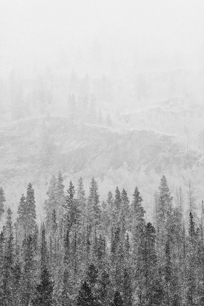
A late autumn blizzard drops a veil over this mountainside near Silver Plume, Colorado. I was drawn to the layering created by the trees and the rocks anyhow everything faded to white into the distance.

One question I'd like to pose, are the darkest trees in the foreground too dark? I've gone back and forth on it and would like to hear some other opinions. Any critiques or comments would be greatly appreciated.


Canon 5DII, 70-200 f2.8L IS @ 1600mm

f5.6, 1/500sec, ISO 400

Converted to B&W in Silver Efex Pro2

Comments

15 comments
Comment posted by Joseph Campisi on February 24, 2012 at 11:37 PM
Love the high key treatment here Scott. I think the lightest trees are too light actually. I'd try to bring them out a little more, and crop a bit off of the top.
Registered on November 24, 2008, 304 Posts, 3211 Comments
Comment posted by Anne K. Rusk on February 25, 2012 at 12:19 AM
I think the bottom trees are perfect, but I would burn down a few of the other trees to bring the bg back. The drop off of the layers happens too quickly for me. A great scene to work with indeed!
Registered on October 10, 2010, 65 Posts, 904 Comments
Comment posted by Tony Kuyper on February 25, 2012 at 12:21 AM
Wonderful atmosphere created by the weather. The soft detail is very attractive in this context.
Registered on November 1, 2003, 364 Posts, 22328 Comments
Comment posted by Nick Bristol on February 25, 2012 at 9:13 AM
Scott, I like what you captured here with these conditions. The foreground trees look good as you have them to me. I wouldn't mind seeing the background trees show up just a little more, but then again in these conditions this is probably just what it looked like. A little off the top would work for me. I like your b/w conversion alot as well. Nice work!

Nick Bristol
Lone Rock, WI
Registered on February 1, 2004, 752 Posts, 14140 Comments
Comment posted by Gary McGhee on February 25, 2012 at 9:43 AM
I don't think the near trees are to dark Scott. The weather conditions come through nicely in this.

Gary.
Registered on April 15, 2010, 142 Posts, 2416 Comments
Comment posted by Dietrich Gloger on February 25, 2012 at 9:52 AM
This is a very interesting and well made photograph. I like the composition/balance. The conditions (snow?) work well to create this nice effect. The dark/bright transition from near to far works well, but you could maybe lighten the nearest trees a bit.
Registered on January 26, 2007, 360 Posts, 9876 Comments
Comment posted by Morris McClung on February 25, 2012 at 10:53 AM
Scott, I love the etching quality of this! I think a black background would bring out the detail that is probably there already. And, I could see a small crop off of the top, but this is excellent! :toast:
Registered on May 7, 2007, 670 Posts, 19650 Comments
Comment posted by Dan Baumbach on February 25, 2012 at 12:39 PM
I don't think the foreground trees are too dark. I like the image as presented. I like the fade out in the background.

- Dan
Registered on November 1, 2003, 473 Posts, 7980 Comments
Comment posted by Lon Overacker on February 25, 2012 at 3:13 PM
Scott,

This is fabulous! To answer your question first off, NO, the darker trees at the bottom are perfect, IMHO. They start what is this wonderful gradient or fading from bottom to top. I mean this goes from clear with detail, to obscure nothing. This is great.

The only suggestion I have would be a small crop off the top. There is space up top with nothing but the gray. I would cut that space in half, still leaving enough of "nothing" to complete the transition top to bottom. Hope that makes sense.

Contrast looks great all the way through. Might be over sharpened? Hard to tell at this size and a larger version I'm sure would be a real treat.

Lon
Registered on November 24, 2006, 521 Posts, 19147 Comments
Comment posted by Scott Fricke on February 25, 2012 at 3:34 PM
Thank you everybody for your comments so far. The consensus seems to be a crop at the top, which I think is a good call.

Lon, in regard to the possible over sharpening, I think some of what you see is the falling snow (a lot of really big flakes) creating a bit of the 'noise' look. I actually backed off the sharpening quite a bit because of this.

Here is the cropped version with a little less sharpening, does this look better?
Registered on January 19, 2007, 133 Posts, 1448 Comments
Comment posted by Lon Overacker on February 25, 2012 at 4:40 PM
Scott,

Thanks for taking the time to crop and repost. Personally, the crop works great and accomplishes what I thought it would. Looks great. I hadn't considered the falling snow and blizzard re: sharpening. that makes sense to me and really, most times it's tough to sharpen and judge for these small web versions. But the repost looks great on all accounts.

Lon
Registered on November 24, 2006, 521 Posts, 19147 Comments
Comment posted by Stan Rose on February 26, 2012 at 12:29 AM
Cool, Scott! My 2pennies: id crop the two dark trees on bottom--i can take or leave the top, but i think this works best w/ low contrast. :smile:
Registered on September 15, 2005, 836 Posts, 17099 Comments
Comment posted by Peter Richter on February 26, 2012 at 10:59 AM
Scott, the larger negative space at the top in your first version really works for me, it is even story telling in my opinion and lets me experience the lonesomeness one must feel standing in the middle of this inhospitable scene. Your composition based on the delicate layers is well balanced and consistent to my eye.

Maybe reducing the contrast in the foreground a bit might enhance the shadowy character. Anyway, thanks for sharing this impressive image.

Peter
Registered on November 10, 2010, 218 Posts, 2723 Comments
Comment posted by Scott Fricke on February 26, 2012 at 12:27 PM
Lon, thanks for the follow-up, I appreciate the thoughts.

Stan and Peter, I been torn about the contrast issue at the bottom as well so following your responses I did a little dodging at the bottom to lighten up that area, especially those darkest trees. Is this better or worse?
Registered on January 19, 2007, 133 Posts, 1448 Comments
Comment posted by dean hebert on February 26, 2012 at 8:49 PM
I like what you're going for here, I think the 2nd repost is the better one. I might try and make the transition from fg to bg a bit less abrupt. :toast:
Registered on August 4, 2010, 70 Posts, 1132 Comments