Nature Photographers Network
This is the preserved archive of the original Nature Photographers Network. The community continues at naturephotographers.network.
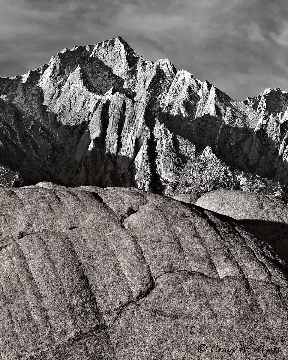
Rock Concert
‹ PreviousPhoto Art GalleryNext ›

Rock Concert

by Craig Myers

Gallery: Photo ArtPosted February 9, 2012238 views7 comments
I like engraved book plates, so I tried to replicate the look of one by converting this photo taken in the Alabama Hills of a section of the Sierra crest to B-W and oversharpening it a bit in the rocky sections. I also toned the foreground differently to keep the original contrast between the warm lower rocks and cooler peak beyond. Appreciate any feedback.

Canon 5D MK2; 1/160 @ f/16; 100mm; ISO 200; 100-400 f/4.5-5.6L; tripod.

Comments

7 comments
Comment posted by Philip Hodgkins on February 9, 2012 at 10:10 AM
This seems to me to be on the boundary between photo art and landscape. Wherever it falls, well done! :toast:
Registered on July 24, 2006, 2741 Posts, 12349 Comments
Comment posted by Bill Caldwell on February 10, 2012 at 4:15 PM
Beautiful B&W--I love all the craggy texture (nice lighting) and I like the toning on the FG (I've never seen partial toning before), very cool!
Registered on October 10, 2011, 62 Posts, 508 Comments
Comment posted by David W. Kelly on February 12, 2012 at 8:51 AM
Well done. Is this a composite?
Registered on October 7, 2005, 883 Posts, 6590 Comments
Comment posted by Brigitte Lorenz on February 12, 2012 at 2:50 PM
well done, looks great!

Brigitte
Registered on January 10, 2009, 187 Posts, 1507 Comments
Comment posted by Craig Myers on February 12, 2012 at 4:30 PM
Thanks to all for the feedback.

David, this isn't composited. I used masks to keep noise out of the sky and to warm tone the foreground.
Registered on September 1, 2008, 85 Posts, 757 Comments
Comment posted by Marc Ward on February 13, 2012 at 10:10 PM
Craig,

Love the different tones and textures. Even though it's over-sharpened, you've mitigated that by masking the sky and giving the foreground a graphic feel. Very interesting image.
Registered on February 26, 2009, 304 Posts, 1365 Comments
Comment posted by Mark Seaver on February 19, 2012 at 12:17 PM
It's been a long time since I thought about engraved book plates.... I like the tonal variation in the foreground. For me, it adds considerable interest. Maybe because it's b&w, it doesn't seem oversharpened, just high contrast. This is very nice.
Registered on January 23, 2011, 1103 Posts, 17270 Comments