Nature Photographers Network
This is the preserved archive of the original Nature Photographers Network. The community continues at naturephotographers.network.
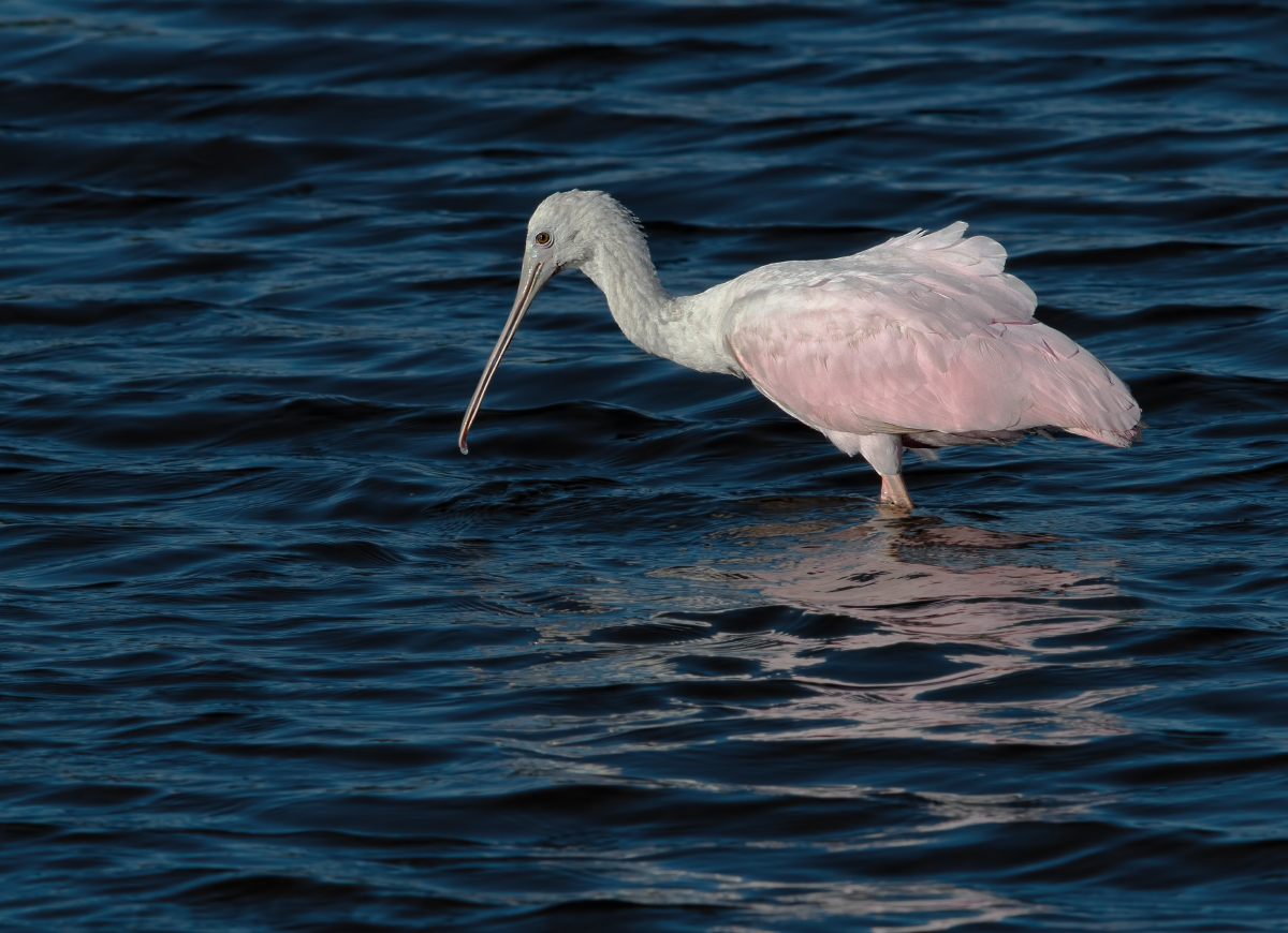
Jv. Roseate Spoonbill + RP
‹ PreviousAvian GalleryNext ›

Jv. Roseate Spoonbill + RP

by Barbara Graham

Gallery: AvianPosted February 1, 2012243 views12 comments
Canon EOS 7D
EF400mm f/5.6L USM
1/15/2012 – 4:03:09 PM
1/1600 sec
Manual
f/10
ISO 400
Merritt Island NWR
Raw, LR3, CS5, 70% of FF

I think this is a juvenile, but I'm not sure. I like that you can see the whole bill, though I wish you could see it from the front.

Comments, opinions and suggestions would be greatly appreciated.

Thank you!

Comments

12 comments
Comment posted by Harry Harris on February 1, 2012 at 6:39 PM
Barbara, I love the contrast of the colors of the Spoonbill and the dark blue water. Bird is sharp, and I do not think I could improve on this image. Great job.
Registered on August 2, 2010, 169 Posts, 741 Comments
Comment posted by Jaymes Dempsey on February 1, 2012 at 7:32 PM
Great job on this capture, Barbara. The exposure is perfect, and I love the pink coloring of the reflection in the water. Also, the ruffled feathers on the back are nice, too.
Jaymes
Registered on June 28, 2010, 47 Posts, 590 Comments
Comment posted by Charles Gangas on February 1, 2012 at 8:42 PM
Barbara-lovely detail and a very pleasing composition. I wonder if you used any negative EV as the image appears a tad dark overall. I might be temped to increase the BG light a tad, and maybe some on the bird without blowing the highlights. Then again, it could certainly be my tired eyes. Nice image.
Registered on August 12, 2009, 544 Posts, 2414 Comments
Comment posted by Brian Gatlin on February 1, 2012 at 10:37 PM
Barbara, I like the pose here. For me, I find this to be an interesting angle for spoonbills, because even though you can't see the spoon shape, I think the profile view, showing the shorter lower half of the bill and the curve at the tip of the top half is cool to see. I like the bit of reflection and colors in the water. For me this image looks quite dark, with the whites in particular looking rather gray. I took a look in photoshop and in a levels layer I think you could take the white point in all the way to about 235 (or brighten things in some other manner).
Registered on March 21, 2009, 202 Posts, 4187 Comments
Comment posted by David Bostedo on February 1, 2012 at 10:58 PM
Nice one Barbara! Love the colors here.
Registered on May 5, 2006, 178 Posts, 2224 Comments
Comment posted by Keith Bauer on February 1, 2012 at 11:05 PM
Barbara: Nice sharpness and details in the bird and water. I like the darker tones in the water, but overall the image is pretty dark. Agree with Brian about moving the white point quite a bit. At least to 230 or maybe more to get the whites back.
Registered on November 20, 2003, 458 Posts, 4836 Comments
Comment posted by Barbara Graham on February 1, 2012 at 11:16 PM
Thank you very much for the comments and feedback. This repost has the whites at 232, which seems to be as far as I can go without blowing them out.
Registered on July 27, 2010, 1310 Posts, 5035 Comments
Comment posted by John Tobias on February 2, 2012 at 7:35 AM
Barbara, I do like the repost best. I also like the color you caught on the spoonbill, as well as the water. Thanks for sharing.
Registered on September 12, 2009, 2120 Posts, 6455 Comments
Comment posted by Fabio Giarrizzo on February 2, 2012 at 8:04 AM
Excellent shot- Like very much the bird against the dark color of the water (especially on the repost version)- Great job on exposure and a fine composition choice- Thanks for sharing, Fabio
Registered on December 3, 2010, 90 Posts, 1614 Comments
Comment posted by Jim Hackley on February 3, 2012 at 5:46 PM
Very nice detail in the larger version and I like the repost better, nice job in getting this. Your eye and composition choices have really improved. Way to go.
Registered on September 17, 2009, 302 Posts, 5535 Comments
Comment posted by David Haynes on February 6, 2012 at 1:06 AM
Barbara,
Love the soft pastel colors in a muted sort of way. Very sharp image with very good detail. Don't know if it was possible but getting a lower perspective would probably help this image with a slightly better reflection and blurring out a lot of that water chop. I really like the composition you've given us. Not seeing the front of the bill is not a big deal for me. Nice image Barbara! :wavey:
Registered on February 20, 2010, 110 Posts, 1511 Comments
Comment posted by Albert Darmo on February 6, 2012 at 11:16 AM
Hi Barbara :wavey: The composition is well done!!! The contrasting stunning colors , and sharp detail are very appealing :cool: the repost is even better :smile:
Albert Darmo Canada
Registered on November 25, 2008, 1386 Posts, 11978 Comments