Nature Photographers Network
This is the preserved archive of the original Nature Photographers Network. The community continues at naturephotographers.network.
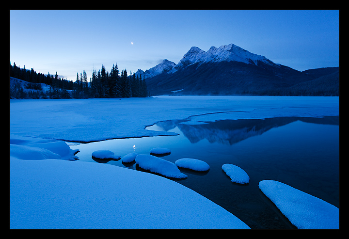
Spray Lake, Kananaskis (please see re-post)
‹ PreviousLandscape GalleryNext ›

Spray Lake, Kananaskis (please see re-post)

by Wayne Simpson

Gallery: LandscapePosted January 19, 2012348 views23 comments
I took this shot this morning about 45 minutes before sunrise. It was about -30 c so I thought I would stick with the daylight balance to keep the cold feel. I would like to know if the blue works for people or if it is too much... I always seem to have trouble with blues in scenes like this! Thanks for your comments!

5d II
17-40
f/14
3.2 sec
iso 320
no filters.

I had the iso bumped up a bit from earlier shots when I was trying to make sure there was no movement in the moon... forgot to bring it back down!

Comments

23 comments
Comment posted by Chris Chamberlain on January 19, 2012 at 8:31 PM
Doesn't look too blue to me. I love it, it looks very clean and crisp, and cold!

Chris
Registered on March 13, 2007, 500 Posts, 8365 Comments
Comment posted by Eva McDermott on January 19, 2012 at 8:40 PM
The blues are wonderful here Wayne. You have captured a very tranquil and beautiful scene in your outrageously beautiful landscape.
Registered on January 4, 2009, 1015 Posts, 13229 Comments
Comment posted by Nathan Apodaca on January 19, 2012 at 8:41 PM
I like this shot a lot. Maybe just a tad too blue, but the scene is incredible, so at first I didn't even notice the strong color. But then again, I wasn't there, so it could have been that way? Anyways, beautiful image, comp, etc., and extraordinary location! TFS...
Registered on November 16, 2011, 67 Posts, 1127 Comments
Comment posted by Kah Kit Yoong on January 19, 2012 at 9:20 PM
Great composition. Not too blue for me. The moon is a small but very effective element here.
Registered on September 27, 2006, 636 Posts, 10682 Comments
Comment posted by Nick Bristol on January 19, 2012 at 9:30 PM
Wonderful! Your comp works great. The cold temps just before sunrise really come across here, meaning the blue looks just right to me. This is very nice Wayne! Like it alot.

Nick Bristol
Lone Rock, WI
Registered on February 1, 2004, 752 Posts, 14140 Comments
Comment posted by Bill Chambers on January 19, 2012 at 11:10 PM
Beautiful. It appears a bit bluish for my tastes, but I love the clarity and crispness. The blue certainly imparts a cold feel and mood.
Registered on April 10, 2005, 753 Posts, 21216 Comments
Comment posted by Vance Gese on January 19, 2012 at 11:15 PM
Love the cold, blue mood and the wonderful, almost abstract foreground. The moon and its reflection really make the image sing. Excellent work.
Registered on November 13, 2008, 298 Posts, 6629 Comments
Comment posted by Tony Kuyper on January 19, 2012 at 11:38 PM
Excellent. The strong blue and shapes make for a very graphic foreground.
Registered on November 1, 2003, 364 Posts, 22328 Comments
Comment posted by Wayne Simpson on January 19, 2012 at 11:49 PM
I had another look and found that the blue just seemed too strong. Please see the revised version.
Registered on December 11, 2006, 303 Posts, 924 Comments
Comment posted by Dan Baumbach on January 20, 2012 at 8:25 AM
I like the original version. It conveys the early morning feel of the place very well.

- Dan
Registered on November 1, 2003, 473 Posts, 7980 Comments
Comment posted by Harry Lichtman on January 20, 2012 at 9:29 AM
I'm a fan of the repost - still looks cold but not as saturated. I think the shot might benefit from a little tighter cropping on each side, as that is where my eye goes naturally.
Registered on September 17, 2010, 304 Posts, 3507 Comments
Comment posted by John Williams on January 20, 2012 at 11:25 AM
The repost is just perfection; both are nice but the repost hits the sweet spot for me. Very appealing photo Wayne. The composition is really strong with the moon as a cherry on top.
Registered on September 6, 2007, 221 Posts, 5985 Comments
Comment posted by Nathan Apodaca on January 20, 2012 at 11:40 AM
I like the repost---It looks very natural. This is a great, clean, interesting image. Everything is well balanced throughout, and the mood is great...
Registered on November 16, 2011, 67 Posts, 1127 Comments
Comment posted by Kyle L. Krause on January 20, 2012 at 4:00 PM
Beautiful Image Wayne, I like the re-post. I have the same problem with blues in winter scenes, they can be a little strong at times. You did a nice job. Maybe one suggestion, I'd clone out the moon in the water,my eyes goes right to the spot. Nice work!
Registered on June 15, 2010, 29 Posts, 605 Comments
Comment posted by Joseph Campisi on January 20, 2012 at 5:02 PM
Love those blues Wayne. The original is good, but I especially like the repost. Love the mood you captured here!
Registered on November 24, 2008, 304 Posts, 3211 Comments
Comment posted by Mark Seaver on January 20, 2012 at 6:09 PM
Terrific shot! The overall blue cast works well at describing cold predawn conditions. I was going to comment about a slight toning down of the blue but then saw the repost, which I think gets it just right.
Registered on January 23, 2011, 1103 Posts, 17270 Comments
Comment posted by James Fougère on January 20, 2012 at 11:14 PM
I also like the repost. Well Done :biggrin:
Registered on October 25, 2010, 41 Posts, 831 Comments
Comment posted by Shantikara Valuska on January 21, 2012 at 1:34 PM
Wonderful image! Very peaceful, great composition. I prefer the original version.
:toast: :toast:
Registered on July 25, 2011, 38 Posts, 451 Comments
Comment posted by Doug Koepsel on January 21, 2012 at 2:05 PM
I like the curves and snow covered rocks in the foreground. Regarding the blue, I prefer your repost as the coldness is still conveyed, but may be inclined to darken the left side sky above trees.
Registered on April 1, 2010, 196 Posts, 1592 Comments
Comment posted by Art Escobado on January 22, 2012 at 10:47 AM
the moon for the dynamic balance win!
Registered on January 7, 2007, 0 Posts, 775 Comments
Comment posted by Mark Metternich on January 22, 2012 at 5:46 PM
Love how clean this image is! :toast:
Registered on June 19, 2009, 276 Posts, 6240 Comments
Comment posted by Harley Goldman on January 22, 2012 at 11:00 PM
Funny, I thought it looked too blue. Then I compared the repost to the original and I prefer the original. Go figure?? Real nice, Wayne! I spent a couple of nights in the Kananaskis area and it is beautiful.
Registered on November 19, 2003, 586 Posts, 11271 Comments
Comment posted by Zack Clothier on January 24, 2012 at 12:17 AM
The repost looks great, Wayne. The composition works well here despite the lack of clouds. :toast:
Registered on January 28, 2010, 343 Posts, 2257 Comments