Nature Photographers Network
This is the preserved archive of the original Nature Photographers Network. The community continues at naturephotographers.network.
Exotica I
‹ PreviousFlora GalleryNext ›

Exotica I

by Jim Sabiston

Gallery: FloraPosted January 17, 2012101 views12 comments
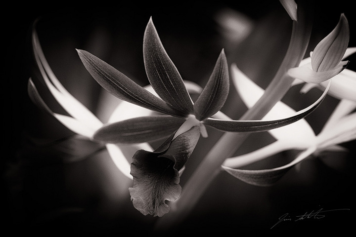
And now for something completely different...

I am working on a series of B&W studies of exotic florals, a rather unusual approach when shooting some of the most uniquely colorful blooms known, but I'm always looking for a different way to approach subjects.

I am very interested in the feedback from the esteemed Flora Gallery contributors. Thanks in advance for any comments.

Comments

12 comments
Comment posted by Bill Fach on January 17, 2012 at 11:03 PM
Jim: Striking shot! I'm pretty challenged when it comes to B&W but to my eye the tonal range here really complements the comp and subject. I like this a lot. >=))>
Registered on November 1, 2003, 1805 Posts, 26981 Comments
Comment posted by Nancy Lea Sandy on January 18, 2012 at 11:26 AM
Interesting take on the subject. The graphic nature of this bloom lends itself well to B&W. I look forward to seeing more
Registered on January 24, 2011, 576 Posts, 6942 Comments
Comment posted by Chris Grabski on January 18, 2012 at 12:28 PM
Beautiful comp in B&W. Fascinating to study. :toast:
Registered on April 29, 2011, 122 Posts, 431 Comments
Comment posted by Daniel Mosquin on January 18, 2012 at 12:45 PM
Intriguing image, and sounds like a fascinating project.
Registered on November 20, 2003, 24 Posts, 122 Comments
Comment posted by Carolyn Derstine on January 18, 2012 at 8:29 PM
This is a beautiful B&W image, Jim. I like how the lighter leaves/petals in the background help to show off the edges of the front flower. I still can't help but wish to see the colors in this though. :smile:
Registered on February 16, 2011, 610 Posts, 3684 Comments
Comment posted by Ramamohan Pai on January 18, 2012 at 11:03 PM
Jim, Tonality is great and so is the overall conversion for my tastes. The criss crossing white petals in the background take my attention away from the main bloom in the front (which has interesting textures and shapes) a little bit but I guess its only me.
Registered on November 1, 2003, 550 Posts, 9037 Comments
Comment posted by Lorna Taylor on January 19, 2012 at 1:05 PM
Beautiful B&W Jim , I agree with Ram about the little bit of distraction of white pedals in the BG but this is only a minor nit ! :wavey:
Registered on November 12, 2010, 254 Posts, 3083 Comments
Comment posted by Jim Sabiston on January 19, 2012 at 1:33 PM
Thanks for the excellent comments. You have all hit pretty accurately on the various points I considered in processing this one. The structure of this particular bloom really lent itself to a stark, graphic approach and I felt that would be the strong suit here. The 'split decision' on the white petals in the background mirrors my own thoughts - the 'rules' say that the white will distract, but as Carolyn observed, it can also serve to further highlight the graphic sweep of the petals in the foreground. I considered 'burning down' the white, but it became too much a of a grey muddle and the graphic nature of the image suffered, so I ended up leaving it 'as is', with only a very subtle toning down of the highlights.

Nancy and Daniel - It is really a very interesting project. I will post more as time allows. Thank you very much for your interest. :smile:
Registered on April 7, 2007, 134 Posts, 443 Comments
Comment posted by Mark Seaver on January 19, 2012 at 3:32 PM
I like how dramatic the b&w treatment creates and the sharp pointed leaves add to that. I find the sharp flower (maybe a bud) segment in the urc distracting.
Registered on January 23, 2011, 1103 Posts, 17270 Comments
Comment posted by Michael Lowe on January 19, 2012 at 9:40 PM
Jim, normally I would agree with the comments about the bg being distracting, but I think it works very well in this instance. It makes a nice contrasting element to the main fg flower. Great job with the b&w conversion. :toast:
Registered on February 11, 2004, 777 Posts, 5252 Comments
Comment posted by Ian Wolfenden on January 20, 2012 at 12:40 PM
It works for me, Jim ! I think there is such an extemsive tonal range here it makes for a good b & w image, if perhaps the dynamic play of the high whites is just a bit distracting. There is also to me the sense of a vignette, which I like.
Registered on May 18, 2007, 1108 Posts, 7647 Comments
Comment posted by Gary Yeoh on January 21, 2012 at 2:15 AM
Jim:
This is beautiful work. I find B&W difficult but having only monochrome to work with in xray, I am beginning to find them very rewarding when all the elements come together. You have good tonal range and nice lines in the image. At first I find the bright bg a little disorientating but after a while I kind of think it works well. I might make the upper most bright blob go away of dimmed. The vignette works well as well. Look forward to seen more of this interesting project.
Registered on September 1, 2009, 588 Posts, 8184 Comments