Nature Photographers Network
This is the preserved archive of the original Nature Photographers Network. The community continues at naturephotographers.network.
Tamar Drama+ repostx2
‹ PreviousLandscape GalleryNext ›

Tamar Drama+ repostx2

by Neale Dyster

Gallery: LandscapePosted January 16, 20121,093 views13 comments
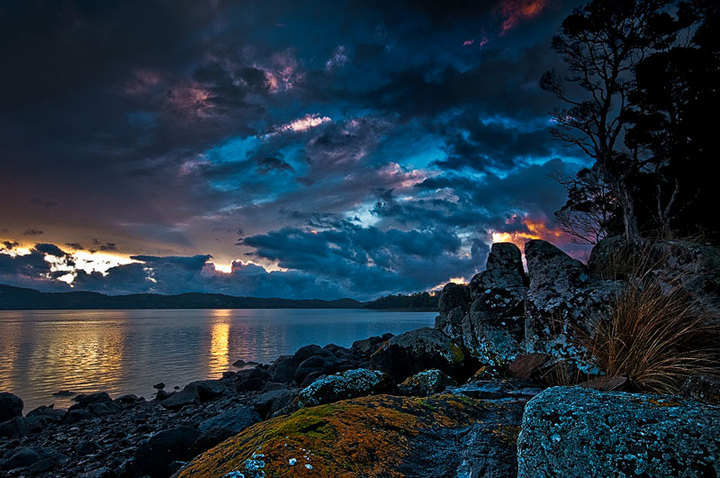
Haven't gotten out with the camera lately so heres one I overlooked from nearly 2 years ago. It's a sunset over the Tamar River in northern Tasmania just around the corner from home. Unsure of the processing look here and also the crop. Previously I cropped about 1/4 off the top but this is the full frame. Any opinions very welcome and a rather late happy new year to all!
D300, Sigma 10-20mm @ 13mm, 1/4 second @ f/16.
Double processed sky/fg

Comments

13 comments
Comment posted by Yiming Hu on January 16, 2012 at 8:02 AM
The sky has lots of drama there. However, I have to be honest that I don't like the HDR-like post processing.
Registered on April 28, 2011, 38 Posts, 733 Comments
Comment posted by Gary Reed on January 16, 2012 at 10:36 AM
There is a lot of competition in this scene. I don't find my eye being drawn into the sunset and that is where all the action is.
Registered on September 19, 2009, 198 Posts, 1074 Comments
Comment posted by Nancy Lea Sandy on January 16, 2012 at 11:32 AM
A beautifully composed scene but the blues are much too strong for my tastes. Nice tension between the drama/energy of the sky and the placid serenity of the water.
Registered on January 24, 2011, 576 Posts, 6942 Comments
Comment posted by Michael J Greene, on January 16, 2012 at 12:04 PM
Neale,

The sky is pretty awesome and you did a great job holding down the reflections on the water. My suggestion is to reduce the cyan levels of your image considerably maybe 25 to 30 points. I hope this helps.

Michael
Registered on June 18, 2009, 86 Posts, 2317 Comments
Comment posted by Joseph Campisi on January 16, 2012 at 1:21 PM
Love the drama of this scene Neale, but those blues look pretty unnatural. Fix that and you'll have a winner.
Registered on November 24, 2008, 304 Posts, 3211 Comments
Comment posted by Lon Overacker on January 16, 2012 at 5:12 PM
Neale,

A little too overprocessed for me, especially the blue/cyan which has already been mentioned. I see some good interest in the rock, grass and tree on the right edge, but it's just too dark - giving favor to the drama in the sky of course. Not sure what you have to work with in the original, but I do think there is great potential here.

Lon
Registered on November 24, 2006, 521 Posts, 19147 Comments
Comment posted by Neale Dyster on January 16, 2012 at 6:52 PM
Thanks for the comments, I know its not quite right but will perservere with it. Is this re-post an improvement or not? (Colour isn't my strong point unfortunately.)
Registered on February 19, 2008, 94 Posts, 738 Comments
Comment posted by Chris Chamberlain on January 16, 2012 at 8:16 PM
It's a nice scene, and awesome sky!! I think the repost is a step in the right direction, but still too much blue/cyan. I think the contrast is kind of heavy too, making the black a bit thick and inky looking in places.

Chris
Registered on March 13, 2007, 500 Posts, 8365 Comments
Comment posted by Tony Kuyper on January 16, 2012 at 11:15 PM
The processing is strong, but it really adds drama to the scene. I like all the color and detail in the dark tones.
Registered on November 1, 2003, 364 Posts, 22328 Comments
Comment posted by David Edwards on January 17, 2012 at 3:45 AM
I like the drama of the sky and your comp, but the processing looks a bit wild. I'm not the greatest with colour either, but I feel this could make a nice b&w conversion given the strong contrast and drama.
Registered on December 6, 2008, 142 Posts, 2623 Comments
Comment posted by Neale Dyster on January 17, 2012 at 7:22 AM
One last try for now, I've tried adjusting the colour balance again and a couple of other small tweaks here and there.
Thanks again for all the comments, they're steering me in a better direction. Looking back at my original post now, I don't know what I was thinking, way over the top !!
(David, I tried a B&W, but didn't really go for it, good suggestion though)
Registered on February 19, 2008, 94 Posts, 738 Comments
Comment posted by Lon Overacker on January 17, 2012 at 5:26 PM
Neale,

The 2nd repost is getting much closer. I think all you need to do really is take that cyan saturation slider and drop it about 30pts. I like the overall lightening; not so much that it ruins the mood and drama, but enough to get a feel for some detail on the rocky shore. Looking better!

Lon
Registered on November 24, 2006, 521 Posts, 19147 Comments
Comment posted by Neale Dyster on January 17, 2012 at 6:11 PM
Thanks Lon, I appreciate your help.
Registered on February 19, 2008, 94 Posts, 738 Comments