Nature Photographers Network
This is the preserved archive of the original Nature Photographers Network. The community continues at naturephotographers.network.
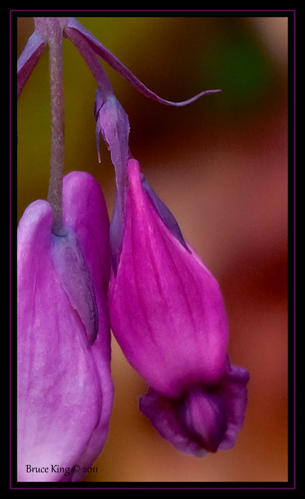
One and a Half Hearts
‹ PreviousFlora GalleryNext ›

One and a Half Hearts

by Bruce King

Gallery: FloraPosted January 2, 2012453 views6 comments
Shot back in May in my sisters backyard. I"m experimenting with simple frames. How does it work? A little unsure of the composition and level of saturation so thought I'd try it out on you fine folks. Are the colors too hot? Thanks for looking.

Comments

6 comments
Comment posted by Bill Fach on January 2, 2012 at 8:16 PM
Bruce: Everything about this works for me. From a compositional standpoint I might have preferred the camera to be rotated a bit more to the left to include more of the left flower and to cut down on the room on the right. I very much like your DOF management and the BG and the frame is a nice complement. 2 thumbs up! >=))>
Registered on November 1, 2003, 1805 Posts, 26981 Comments
Comment posted by Derek Yow on January 3, 2012 at 8:12 AM
A really nice shot and I like your compositional choice. I agree with Bill's thoughts about framing, but this is still presented well. Colors look believable to my eye.
Registered on May 18, 2010, 26 Posts, 655 Comments
Comment posted by Michael Lowe on January 3, 2012 at 11:18 PM
I like it, Bruce. The frame complements the photo nicely. :toast:
Registered on February 11, 2004, 777 Posts, 5252 Comments
Comment posted by Barbara Graham on January 4, 2012 at 12:30 PM
I like the colors, textures and detail. I would probably have liked "two hearts" better, but this is very nicely done.
Registered on July 27, 2010, 1310 Posts, 5035 Comments
Comment posted by Craig Strand on January 5, 2012 at 9:54 AM
Bruce..... I love it "as is," wrap it up! The frame works just fine. Good job!
Registered on March 30, 2008, 416 Posts, 2885 Comments
Comment posted by Ian Wolfenden on January 7, 2012 at 8:08 AM
The frame is simply excellent in my view, Bruce. No, I do not find the colours oversaturated - I think they blend well with the sombre tones of the bg. I also like the way the flowers but up against the frame - a really nice comp. altogether. My only nit ( and it is a small one ) is maybe the brightness bottom L corner - fine for level but perhaps changing the mood slightly.
Registered on May 18, 2007, 1108 Posts, 7647 Comments