Nature Photographers Network
This is the preserved archive of the original Nature Photographers Network. The community continues at naturephotographers.network.
Glowing Mudstone + Repost
‹ PreviousLandscape GalleryNext ›

Glowing Mudstone + Repost

by Youssef Ismail

Gallery: LandscapePosted December 28, 2011267 views11 comments
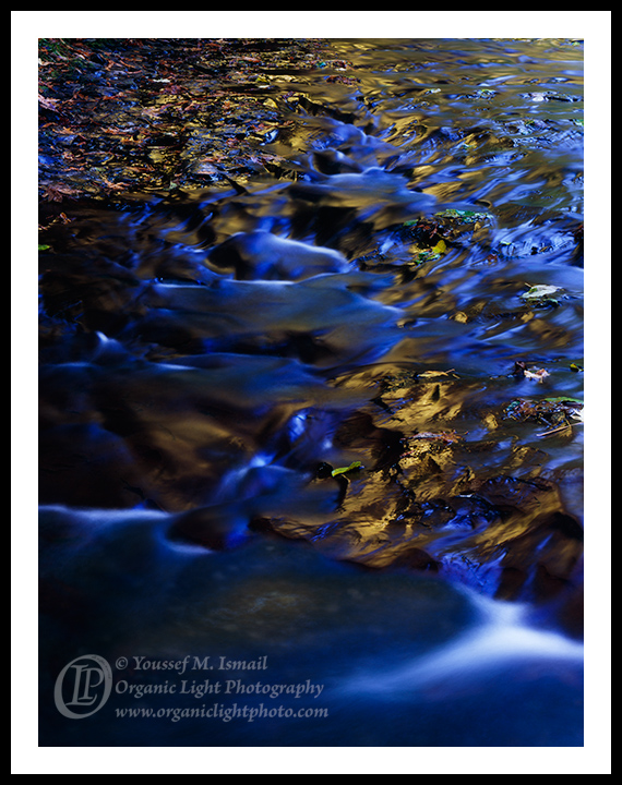
Along one of the creeks in the Santa Cruz Mountains, my home stomping grounds. I was leading a client up one of the canyons and we came upon this portion of the creek where the Big Leaf Maples were starting to turn yellow at the end of October. The trees were giving a nice glow on the wet mudstone and water. I wanted to accentuate the yellow so I used a polarizer to knock out the reflections on the water. What I got in turn was the blue light filtering in from the canopy. The combination of the golds and blues came out great.

4x5, 300mm, f22, 4 sec, Fuji Provia 100F

I would love to hear your honest critiques about this one.

Comments

11 comments
Comment posted by Abdullaziz Bin Ali on December 28, 2011 at 2:42 AM
I totally love the combination here with the strong contrast between blues and yellows
for my taste, I feel you have some extra darks area on the left edge of the artwork :frown:
Registered on May 31, 2009, 112 Posts, 1590 Comments
Comment posted by Mark Seaver on December 28, 2011 at 9:41 AM
I like the combination of blues and golds as well as the shiny softness of the water. The flowing blue water sections at the bottom and along the left side feel a bit dark and heavy to me, but that's an artistic vision thing.
Registered on January 23, 2011, 1103 Posts, 17270 Comments
Comment posted by Bruce King on December 28, 2011 at 11:01 AM
I like this a lot. the contrasting warm and cool tones are striking. The dark areas on the left don't bother me at all, in fact I think they prevent the composition from appearing too static. I might remove the small green leaf along the upper left edge though.
Registered on January 14, 2010, 276 Posts, 2212 Comments
Comment posted by Dan Baumbach on December 28, 2011 at 11:24 AM
Very nice, Youssef.

- Dan
Registered on November 1, 2003, 473 Posts, 7980 Comments
Comment posted by Lon Overacker on December 28, 2011 at 2:38 PM
Youssef,

I love the scene. The color combination of reflected and absorbed light is wonderful. I also am really enjoying the abstract nature of this, especially in the lower 2/3. The UL gets a little lost, but that's minor. I know the Provia is contributing here, but for me the blue is a bit too much. The golds are beautiful, but it's just gone too blue for me in the fringes. I'm sure this looks wonderful on the light table.

Lon
Registered on November 24, 2006, 521 Posts, 19147 Comments
Comment posted by Scott Smorra on December 28, 2011 at 4:16 PM
I like the mix of gold and blue here Youssef, but the blues are a bit strong for my taste. I think I would like it better if the whites of the water had a bit less blue in them.
Registered on November 2, 2009, 161 Posts, 2143 Comments
Comment posted by Nick Bristol on December 28, 2011 at 7:18 PM
A beautiful image! I really like the blue and gold combination, but I do feel that the blue is just a little strong. Still a wonderful image that I very much enjoy!

Nick Bristol
Lone Rock, WI
Registered on February 1, 2004, 752 Posts, 14140 Comments
Comment posted by Vance Gese on December 29, 2011 at 12:53 AM
Love the blue/gold combination, Youssef, especially those deep blues and dark shadows. Also really like the touch of red leaves in the upper left. Wonderful diagonal flow to your composition as well. Outstanding.
Registered on November 13, 2008, 298 Posts, 6629 Comments
Comment posted by Harley Goldman on December 29, 2011 at 10:45 AM
I am thinking along the same lines as Lon. I enjoy the image, but find the blues a little overwhelming.
Registered on November 19, 2003, 586 Posts, 11271 Comments
Comment posted by Youssef Ismail on December 29, 2011 at 4:13 PM
Thanks for the feedback. I too felt the way you all did with this image and was wondering if it was too much. The blues were not accentuated intentionally. I have gone back to the image and using a TK Saturation mask controlled the blues and then opened the darker shadows on the left. How does it look now?
Registered on November 1, 2003, 474 Posts, 5555 Comments
Comment posted by Sandipan Dutta on December 29, 2011 at 11:16 PM
Fine abstract.
Registered on March 9, 2009, 171 Posts, 493 Comments