Nature Photographers Network
This is the preserved archive of the original Nature Photographers Network. The community continues at naturephotographers.network.
Look into my eyes
‹ PreviousWildlife GalleryNext ›

Look into my eyes

by Ingrid Vekemans

Gallery: WildlifePosted December 14, 2011445 views10 comments
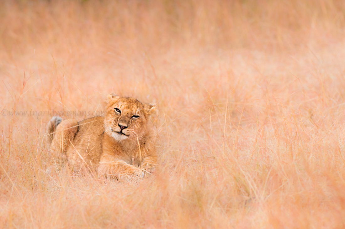
This little cub seemed to be fascinated by me - whatever he did, whichever pose he took, he never took his eyes of me... which was a thrill for me, of course...

f/5.6
1/320
ISO: 400
NIKON D300
Nikkor 300mm f/2,8

!Please do look at the larger version - the colours look totally wrong on the small version, even if both are in sRGB...

Comments

10 comments
Comment posted by Fabio Giarrizzo on December 14, 2011 at 8:36 AM
Great eye contact and awesome warm palette on this one- A pretty image indeed, Fabio
Registered on December 3, 2010, 90 Posts, 1614 Comments
Comment posted by Marsel van Oosten on December 14, 2011 at 3:15 PM
The framing and the habitat are nice, not so crazy about the pose though. The ears pulled flat against the head and the squinted eyes make it look unrelaxed. It's probably playing with that piece of grass which causes this look, but I'd prefer to see more eyes and more ears - especially for the shape of the head. It looks like you did some selective darkening of the foreground and background, and if so, it's a bit too obvious to me. If not, well, then I'm wrong. :wink:
Registered on March 9, 2004, 285 Posts, 2277 Comments
Comment posted by Ingrid Vekemans on December 14, 2011 at 3:26 PM
Thanks Fabio and Marsel for taking the time to comment.
Marsel, the cub was very relaxed, what you see here is him finishing a shake of the head...I think it is indeed the grass that made him almost sneeze and shake his head a bit. Hence also the ears pulled back.
And no, no selective darkening at all in FG/BG...so...hear hear... you're wrong! First time for everything :wink: Obviously a bit sad that you don't like the FG/BG... :frown: Maybe I should selectively lighten it a bit then :smile:
Thanks again!
:wavey:
Registered on August 2, 2010, 138 Posts, 780 Comments
Comment posted by Brad Hill on December 15, 2011 at 9:14 AM
HI Ingrid,

I don't mind the expression at all - while I haven't spent much time in the presence of lions this cub doesn't look stressed or non-relaxed to me - kind of a cute look to me! I like how the cub is pretty much the only thing that's sharp in the frame - no doubt what the subject is and there's certainly a lack of distracting elements! Colour on both versions look identical on my computer - without being there it's quite dicey to comment on how it should look, but to me this looks perhaps too orange and not brown enough? Just a guess...

Cheers...thanks for sharing this...

Brad
Registered on May 29, 2007, 431 Posts, 6061 Comments
Comment posted by Ingrid Vekemans on December 15, 2011 at 2:55 PM
Hmmm...Brad...may I ask what browser you are using? When I look on Safari and Firefox, there is a VERY big difference between the small and the light version. The small version is too red/orange...and the big version is yellow/brown as it should be in reality. Would love to hear more comments from other viewers about how they see both photos?
THANK YOU! :smile:
Registered on August 2, 2010, 138 Posts, 780 Comments
Comment posted by Brad Hill on December 15, 2011 at 3:26 PM
Hi Ingrid,

OK - checked a billion (OK, quite a few) different combinations of browsers and computers. In ALL cases the small and large version looked identical colour-wise:

1. Macintosh: Tried Safari, Firefox, and Google Chrome on both a MacBook Pro and a Mac Pro (so 6 different combinations)

2. PC: Tried Safari, Internet Explorer, and Firefox

All browsers used were current versions.

Cheers...

Brad
Registered on May 29, 2007, 431 Posts, 6061 Comments
Comment posted by Ingrid Vekemans on December 16, 2011 at 8:11 AM
Thanks for the effort, Brad...and I am puzzled... :confused:
Registered on August 2, 2010, 138 Posts, 780 Comments
Comment posted by Margaret Summers on December 19, 2011 at 11:21 AM
Hi, Ingrid. I love this pose and the lion in the grass. I've read the comments and agree that the big and small photos look identical - and too orange for some reason. If that could be toned down a bit, I think this is very successful. One thing I do like is the monochromatic pallette, which emphasizes the lion's camouflage ability.
Registered on May 24, 2011, 54 Posts, 99 Comments
Comment posted by Ingrid Vekemans on February 25, 2013 at 6:32 AM
Just uploading a new version which will hopefully have a better colour - I may have found why I see these colours wrong...

After upload: yes, this is much better - very curious now whether others see the difference now between the first and the last upload??
Registered on August 2, 2010, 138 Posts, 780 Comments
Comment posted by Martin Dunn on February 27, 2013 at 8:43 AM
Lovely Image Ingrid.
I too can't see much difference in colours between the small and large versions.
I do think though that there is perhaps a bit too much grass in the picture. Personally I would have preferred a tighter crop.
Registered on February 20, 2013, 198 Posts, 1011 Comments