Comment posted by Adam Gibbs on December 12, 2011 at 1:06 PM
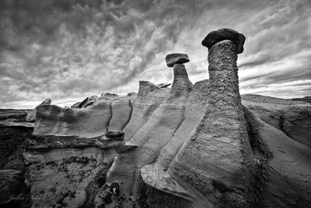
Fascinating hoodoos, John! The B&W approach really bring out the graphic qualities of the scene. Also love the texture of the foreground hoodoo.My only personal suggestion would be to tone down the whites a tad on within the cloud highlights, on the right side
Registered on November 1, 2003, 168 Posts, 870 Comments
Comment posted by Stan Rose on December 12, 2011 at 1:11 PM
yeah, ironically this looks more 'natural' to me as a B&W, the contrasts work better for the scene i think. Id try to get just a bit more detail out of the shadow on top of the tallest hoodoo--otherwise looks good to me!
Registered on September 15, 2005, 836 Posts, 17099 Comments
Comment posted by John Fan on December 12, 2011 at 2:02 PM
Thanks Adam & Stan. I always learn something from you guys.
Registered on August 24, 2010, 135 Posts, 489 Comments
Comment posted by Phil Pogledich on December 12, 2011 at 2:05 PM
I like it more in B&W, and I liked it plenty in color as well. The dramatic sky does feel more natural in B&W. Fascinating shot.
Registered on August 24, 2009, 123 Posts, 3099 Comments
Comment posted by Bill Caldwell on December 12, 2011 at 2:40 PM
Awesome B&W John--fascinating rock formation and great dramatic clouds.
Registered on October 10, 2011, 62 Posts, 508 Comments
Comment posted by Aaron Feinberg on December 12, 2011 at 4:48 PM
Enjoy the diminishing lines here. Nice comp and conversion. Could prob get some more contrasty/dramatic skies if you wanted...personal preference. Solid work
aF
Registered on October 26, 2009, 399 Posts, 2789 Comments
Comment posted by Nathan Apodaca on December 12, 2011 at 10:51 PM
I like this one a bit more. Maybe because in the first one there was hardly any color in the sky, where as in this one, the sky doesn't have to try so hard to look interesting or blend in with the foreground? Anyways, cool shot...
Registered on November 16, 2011, 67 Posts, 1127 Comments
Comment posted by David Edwards on December 13, 2011 at 3:50 AM
The b&w is a winner here imho. The textured sky really adds a lot of contrast and interest to the rock structures.
Registered on December 6, 2008, 142 Posts, 2623 Comments
Comment posted by Dennis Harding on December 13, 2011 at 5:33 PM
I like the B&W best John and I thought your web page and photography is great!
Registered on January 19, 2011, 33 Posts, 408 Comments
Comment posted by John Fan on December 13, 2011 at 6:35 PM
Thanks, Phil, Bill, Aaron, Nathan, David and Dennis.
Registered on August 24, 2010, 135 Posts, 489 Comments
Comment posted by Barry Vangrov on December 14, 2011 at 8:29 PM
I like this much better than the color version. B&W processing looks spot on but if you wanted you could pull even more drama out of the sky with some added contrast. Nice work.
Registered on September 1, 2009, 148 Posts, 749 Comments

Comments
11 commentsaF