Nature Photographers Network
This is the preserved archive of the original Nature Photographers Network. The community continues at naturephotographers.network.
Under the Oak + repost
‹ PreviousLandscape GalleryNext ›

Under the Oak + repost

by Gary McGhee

Gallery: LandscapePosted December 9, 2011930 views22 comments
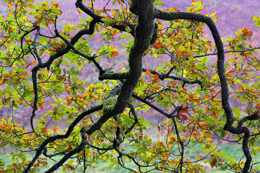
I took this a good few weeks ago at Grasmere up in the Lake District NP whilst there was still some nice autumn colour around.

I like the shot but I would like to hear your thoughts or suggestions for improvements. All feedback is welcome.

Cheers, Gary.

D700, 50-135mm Ais. 1/100 sec, f/5.6, iso 400.

Comments

22 comments
Comment posted by Joseph Campisi on December 9, 2011 at 2:07 PM
Love the comp and color scheme here Gary! The greens, rusty oranges, and lavenders go really well together!
Registered on November 24, 2008, 304 Posts, 3211 Comments
Comment posted by Nick Bristol on December 9, 2011 at 2:41 PM
Very interesting composition (which I really enjoy) and wonderful colors Gary. Nice work!

Nick Bristol
Lone Rock, WI
Registered on February 1, 2004, 752 Posts, 14140 Comments
Comment posted by Jeff Hackett on December 9, 2011 at 2:45 PM
Cool branch pattern and lovely subdued color in the background.
Registered on March 13, 2006, 65 Posts, 1119 Comments
Comment posted by Adam Gibbs on December 9, 2011 at 2:58 PM
The background colour is a great compliment to the Oak branch. The image does seem to be a bit on the red side?
Registered on November 1, 2003, 168 Posts, 870 Comments
Comment posted by Ant on December 9, 2011 at 4:04 PM
Very pleasant image, I like the perspective and the colors...
Registered on April 13, 2009, 27 Posts, 474 Comments
Comment posted by Wayne Willison on December 9, 2011 at 4:39 PM
I like the fresh look brought out by the colors. Good comp as well.
Registered on April 10, 2009, 292 Posts, 3967 Comments
Comment posted by Mark Seaver on December 9, 2011 at 6:34 PM
I think it's terrific. The magenta background really sets off the colors in the foreground leaves and the flow of the branches keeps my eyes moving.
Registered on January 23, 2011, 1103 Posts, 17270 Comments
Comment posted by Phil Pogledich on December 9, 2011 at 7:58 PM
Nicely composed, exposed, processed, etc. I certainly like the DOF as well. Magenta seems a tad strong but I like it for some reason anyway.
Registered on August 24, 2009, 123 Posts, 3099 Comments
Comment posted by Harley Goldman on December 9, 2011 at 8:24 PM
Beautifully composed. Love the strong trunk lines with the foreground and back color. I am finding the magenta a little strong for my tastes. I like the bright background, but find the color a little intense. Overall, really nice image!
Registered on November 19, 2003, 586 Posts, 11271 Comments
Comment posted by Barbara Graham on December 9, 2011 at 8:29 PM
Beautiful image. I love the branches and leaves. I agree about possibly toning down the magenta background a bit. I think it might make the image even more alive.
Registered on July 27, 2010, 1310 Posts, 5035 Comments
Comment posted by Lon Overacker on December 9, 2011 at 9:07 PM
Gary,

Beautiful design, I really like this. Great structure in the branches and the transitioning color of the leaves makes for a wonderful image. Wonderfully seen and crafted.

My only nit/suggestion is agreeing with some others to deal with the magenta color of the bg. If you can do that you'll have an even more wonderful image.

Lon
Registered on November 24, 2006, 521 Posts, 19147 Comments
Comment posted by Tom Haxby on December 9, 2011 at 11:13 PM
This is really spectacular. I agree with the others on the magenta cast, but that is the only thing that I would change. Overall, this has a lot going for it. :toast:
Registered on July 6, 2006, 126 Posts, 647 Comments
Comment posted by Michael J Greene, on December 10, 2011 at 1:00 AM
This is wild Gary like poetry in motion. Outstanding work.

Michael :wavey:
Registered on June 18, 2009, 86 Posts, 2317 Comments
Comment posted by Andreas Resch on December 10, 2011 at 5:03 AM
I love the composition and the crazy colors of the leaves. I'm not a fan of the redish color of the trees in the background which looks too surreal for me.
Registered on November 14, 2007, 322 Posts, 6101 Comments
Comment posted by Bill Chambers on December 10, 2011 at 11:17 AM
A great study of form and color. The BG color really makes this sing. Great eye to see this.
Registered on April 10, 2005, 753 Posts, 21216 Comments
Comment posted by Wayne Simpson on December 10, 2011 at 1:21 PM
Great colour and compositon! Very pretty shot!
Registered on December 11, 2006, 303 Posts, 924 Comments
Comment posted by Eva McDermott on December 10, 2011 at 2:56 PM
Wonderful comp Gary especially the placement of the branches. Beautiful shapes and textures.
Registered on January 4, 2009, 1015 Posts, 13229 Comments
Comment posted by Mark Metternich on December 10, 2011 at 4:16 PM
Excellent graphic look to this. Would sell well.
Registered on June 19, 2009, 276 Posts, 6240 Comments
Comment posted by Guy Manning on December 10, 2011 at 8:21 PM
This is a great example of how the negative space, the nearly black branch design, takes the forefront of an image. Though it is part of the foreground, the chartreuse leaves and complimentary lilac behind them seem to become the ground, while the the branches become the field - the main subject in the frame.This contrast insists that the eye spend more time on the branches. This is a fine image with an oriental feel to the placement and color palette. Well done. :smile:
Registered on October 17, 2011, 13 Posts, 44 Comments
Comment posted by Floris van Breugel on December 10, 2011 at 9:41 PM
The purplish backdrop makes this image! Wow! My only suggestion would be to consider cropping it so the backdrop is consistent. I think you lose a little of the compositional balance of the branch that way, but it's made up for by the simplification of the background, and thus worth it IMO.
Registered on December 19, 2008, 306 Posts, 4840 Comments
Comment posted by Gary McGhee on December 11, 2011 at 8:41 AM
Thanks everyone for all the great feedback.

Sorry for not getting back sooner, when I posted this I then made a few comments and then lost my internet connection.

Mixed reactions regarding the colour of the background, so I've posted a version with the magenta reduced by about 40%.

Thanks again. Gary.

Registered on April 15, 2010, 142 Posts, 2416 Comments
Comment posted by Albert Darmo on December 11, 2011 at 2:43 PM
Hi Gary :wavey: The branches are beautifully structured. The colors are stunning , but the bg color is too saturated, Whops!!!!! the repost is much more natural, great work :smile: :cool:
Albert Darmo
Darmo
Registered on November 25, 2008, 1386 Posts, 11978 Comments