Gallery: LandscapePosted November 23, 201173 views3 comments
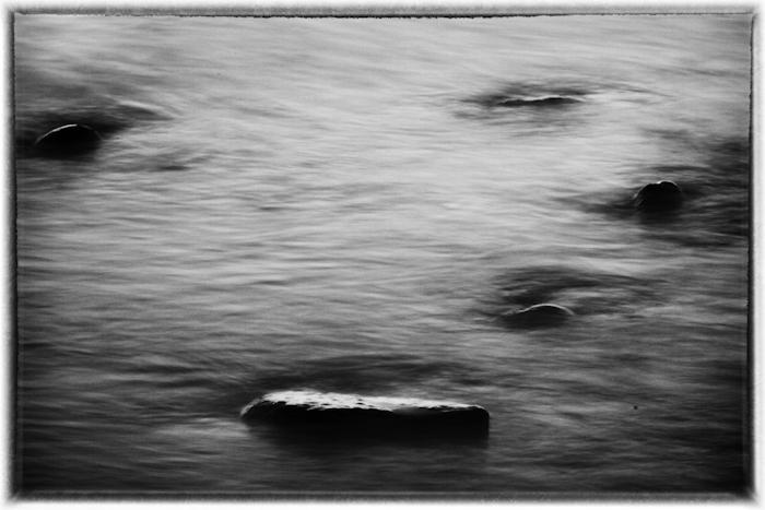
Lake Superior lake shore converted to b/w
f32
2.0sec
Comments
3 comments
Comment posted by Stan Rose on November 25, 2011 at 11:04 AM
I have this bad habit of commenting on photos that have zero comments several rows down the page, sorry but I just get this cheap thrill out of the challenge (I say challenge cause usually the reason for the lack of comments is that people aren't sure how to put their thoughts to words from an image that perplexes them--i have no qualms about sticking my foot in my mouth ) Sooo..here goes:
First the good:
1) I love the mysterious quality, it looks dreamy (slightly nightmarish) and confusing enough to make me think, but still grounded in reality.
2) The balance is good, I like the bottom anchor with strong tonal contrast, and a decent distribution of rocks up top (although more on the lhs might have been stronger)
3) The exposure looks about right, and good tonal contrasts in the conversion.
I'll package the bad and the ugly:
1) My eye is immediately drawn to the conspicuous dust spot on the lower rhs, not an auspicious start
2) I can't stand the 'tattered frame' look, it's like using cheesy fonts in PS (and im guilty of that one all the time...)
3) If your comment to post ratio were 5-1 instead of 2-1, you would have had at least 5 positive comments by now...just sayin'
So, moral of the story is that the subject matter is irrelevant...some people will find this boring and others will be fascinated by it (i'm somewhere in between), what matters to the crazy art critics of the world is presentation--such is life
Registered on September 15, 2005, 836 Posts, 17099 Comments
Comment posted by Lon Overacker on November 25, 2011 at 3:05 PM
Todd,
Thanks for sharing and thanks Stan - we can always count on you telling it like it is.
I think Stan makes some good observations, so I can only add my spin on things. With the nice reflected light and texture of the surface, my first question is wondering what the color version looks like. At least for me I think some color would make this one more interesting. I don't mind the framing, but personally I think it would be more fitting on a different type of image, like an old sepia toned, vintage rural barn scene for example. No biggie. Lastly, I'm looking for a little more sharpness on the bottom rock which would help show off the reflected highlights better, I think.
The spacing doesn't work so well for me especially with the b&w - which brings me back to some color adding interest. In the end I don't think this one measures up to most of your images posted in your gallery. Some great color work there.
Lon
Registered on November 24, 2006, 521 Posts, 19147 Comments
Comment posted by Todd Bielby on November 27, 2011 at 3:37 AM
First of all thank you guys for taking the time to comment. I know it can be tough to comment on something that doesn't work for you. My personal opinion about this photo is that I kind of like it for the reasons Stan mentioned. Stan....The reasons you gave for not liking it are pretty minor to me. A dust spot... can be easily removed. The cheesy frame...would I ever print an image with a frame? Nope sure wouldn't, however, "we" always frame and mat our pictures to draw attention. Also I had put the frame on there while messing around with the photo and didn't feel like removing it before I posted. I really don't need you to tell me to post more comments every time you comment. Once is plenty...I get it...the more I post the more comments I get. I am a quiet and reserved person by nature and don't express myself or my opinion very often. So a 2:1 ratio is not bad for me. Im working on it. I also work at night and sleep all day and I haven't even been on here a year yet, hence, a low comment to post ratio. Lon...the color version wasn't real good. The light on the water was real flat and the water was kind of muddy looking. I thought the b/w gave it some mood. I think the sharpness, or lack there of, is because of the water washing over the rock along with the slow shutter speed that created the texture in the photo. But I still appreciate your comment. Thanks again guys for taking the time.
Registered on March 10, 2011, 169 Posts, 392 Comments

Comments
3 commentsFirst the good:
1) I love the mysterious quality, it looks dreamy (slightly nightmarish) and confusing enough to make me think, but still grounded in reality.
2) The balance is good, I like the bottom anchor with strong tonal contrast, and a decent distribution of rocks up top (although more on the lhs might have been stronger)
3) The exposure looks about right, and good tonal contrasts in the conversion.
I'll package the bad and the ugly:
1) My eye is immediately drawn to the conspicuous dust spot on the lower rhs, not an auspicious start
2) I can't stand the 'tattered frame' look, it's like using cheesy fonts in PS (and im guilty of that one all the time...)
3) If your comment to post ratio were 5-1 instead of 2-1, you would have had at least 5 positive comments by now...just sayin'
So, moral of the story is that the subject matter is irrelevant...some people will find this boring and others will be fascinated by it (i'm somewhere in between), what matters to the crazy art critics of the world is presentation--such is life
Thanks for sharing and thanks Stan - we can always count on you telling it like it is.
I think Stan makes some good observations, so I can only add my spin on things. With the nice reflected light and texture of the surface, my first question is wondering what the color version looks like. At least for me I think some color would make this one more interesting. I don't mind the framing, but personally I think it would be more fitting on a different type of image, like an old sepia toned, vintage rural barn scene for example. No biggie. Lastly, I'm looking for a little more sharpness on the bottom rock which would help show off the reflected highlights better, I think.
The spacing doesn't work so well for me especially with the b&w - which brings me back to some color adding interest. In the end I don't think this one measures up to most of your images posted in your gallery. Some great color work there.
Lon