Nature Photographers Network
This is the preserved archive of the original Nature Photographers Network. The community continues at naturephotographers.network.
Fall/winter stream
‹ PreviousPhoto Art GalleryNext ›

Fall/winter stream

by Carolyn Derstine

Gallery: Photo ArtPosted November 21, 2011241 views11 comments
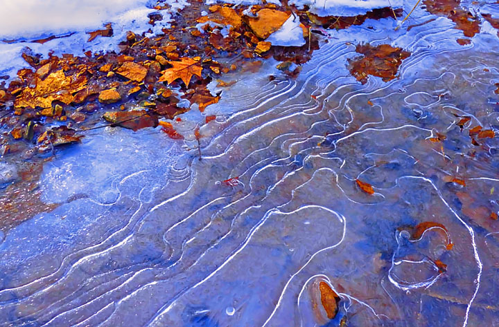
I recently redid this old photo of mine. I liked the contrasts of the warm fall colors with the cold of the ice. I did lots of playing around with color and saturation plus some noise reduction and slight softening. I like the abstract feel of this finished photo. Does this work for others; is it too saturated?

Panasonic DMC-FZ28. 5mm at F/4 for 1/200 sec. ISO 100.

Comments

11 comments
Comment posted by Jaymes Dempsey on November 21, 2011 at 5:49 PM
I love the colors, those blues are lovely...and the swirl of the water is very nice!
Jaymes
Registered on June 28, 2010, 47 Posts, 590 Comments
Comment posted by Charlie Baugh on November 21, 2011 at 6:13 PM
I wouldn't have been able to pass this up as a subject either. The ice patterns are really good. I'd say you are certainly at the edge of saturation, maybe a little over. :wink:
Registered on April 18, 2011, 329 Posts, 1985 Comments
Comment posted by Peter Cross on November 21, 2011 at 7:57 PM
The blues play nicely with the rich browns of the leaves. Very inviting scene and well composed. It reminds me of a topo map. So guess this would be a hydro map. ULC is only space that doesn't add to the image. Perhaps you could crop some of it away. A quick screen crop here was an improvement. Nicely seen and shot.
Registered on April 3, 2010, 271 Posts, 1342 Comments
Comment posted by Rob Graham on November 21, 2011 at 10:40 PM
The colors work well together. I don't think the saturation is overboard, yet......
Registered on August 22, 2006, 842 Posts, 2824 Comments
Comment posted by Brigitte Lorenz on November 22, 2011 at 2:04 AM
I like the colors and your composition...very nice

Brigitte
Registered on January 10, 2009, 187 Posts, 1507 Comments
Comment posted by Barbara Graham on November 22, 2011 at 7:37 PM
This works perfectly for me. I love it just as posted.
Registered on July 27, 2010, 1310 Posts, 5035 Comments
Comment posted by Mark Seaver on November 22, 2011 at 7:55 PM
Definitely not too saturated. I like the angled lines and the subtle interplay of blue and brown in the ice. The leaves on top are a great addition.
Registered on January 23, 2011, 1103 Posts, 17270 Comments
Comment posted by Ron Pederson on November 25, 2011 at 11:26 AM
Nice subject and the treatment works well. I think I'd prefer a tad less saturation...
Registered on October 19, 2010, 95 Posts, 470 Comments
Comment posted by Patricia Brundage on November 25, 2011 at 4:47 PM
Striking lines and colors. The variety of shapes both in the ice and the leaves really keep my interest. Well done!
Registered on March 23, 2006, 1111 Posts, 6531 Comments
Comment posted by Philip Schwarz on November 28, 2011 at 2:19 PM
Nice colors and patterns. It works for me.
Registered on November 29, 2006, 236 Posts, 1210 Comments
Comment posted by denise ippolito on December 3, 2011 at 9:55 AM
This is very appealing.
Registered on December 17, 2009, 202 Posts, 1529 Comments