Nature Photographers Network
This is the preserved archive of the original Nature Photographers Network. The community continues at naturephotographers.network.
Fern
‹ PreviousFlora GalleryNext ›

Fern

by Gary Yeoh

Gallery: FloraPosted November 13, 201117,782 views13 comments
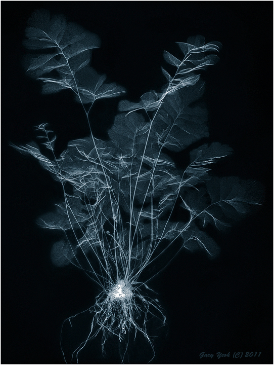
I have been impressed by how the leaves turn out in Xray so I use the whole fern plant. The challenge in this image is the very high noise to signal ratio between the bg and the thin leaves. Spent 2-3 hours just painting over the bg. I like how the image looks like chinese ink on rice paper painting.

GE mammo 22 kV 14 mA. CS5, Viveza, Lab B&W. Thanks for looking and C&C appreciated.

Click larger version to see neg version with duo tone pantone overlay.

Comments

13 comments
Comment posted by Bob&Charly Nelson on November 13, 2011 at 6:36 AM
Another cool submission Gary. This is a unique art form. Heck, I like the negative version also. Great work in my opinion.
Bob :wavey:
Registered on October 27, 2005, 289 Posts, 4202 Comments
Comment posted by Bob Duff on November 13, 2011 at 6:50 AM
Great job Gary. I see a flock of birds taking off. This works really well by having the roots as part of the image. Grounds it so to speak. :wink:
Registered on April 21, 2010, 160 Posts, 1675 Comments
Comment posted by Fabio Giarrizzo on November 13, 2011 at 8:01 AM
Great shot, Gary- This one is special IMO, it seems it has both 2d and 3d feel, and surely the result is a delicate image of great impact- I'd advice you to go in the field with your xrays machine, we are all waiting for that- Just get a good backpack :smile: - Bravo, Fabio
Registered on December 3, 2010, 90 Posts, 1614 Comments
Comment posted by Bill Fach on November 13, 2011 at 8:58 AM
Gary: Including the roots is a brilliant stroke IMO. My preference is the positive but I can picture both hanging on a wall side by side. Really well done.>=))>
Registered on November 1, 2003, 1805 Posts, 26981 Comments
Comment posted by Pat Sampson on November 13, 2011 at 9:37 AM
Gary,

I like the textures in this and the "ink on rice paper" quality of it very much.

The composition is problematic for me though. Most of the subject seems busy to me. I guess the easiest way to explain would be to say that I look for patterns in the shapes and I don't really see anything here that I can relate to. I like the balance of space to subject in the image but I don't find a motif, echoing pattern, symmetrical structure or juxtaposition of shapes that really hold my interest.

The subject itself is interesting and your processing is superb - I'm just not relating to the comp.

Still one of the most interesting images on the web though. (smile)

pat
Registered on May 19, 2007, 953 Posts, 15989 Comments
Comment posted by Monica Siri on November 13, 2011 at 10:19 AM
Gary,
I like the comp and IMO the ethereal textures of the leaves make a very delicate image. Great work. :toast:
Registered on September 20, 2009, 132 Posts, 3764 Comments
Comment posted by Philip Southard on November 13, 2011 at 9:32 PM
Intriguing image Gary. Very, very different, which is a good thing. :cool:
Registered on July 15, 2007, 258 Posts, 3892 Comments
Comment posted by Gary Yeoh on November 13, 2011 at 11:30 PM
Thanks everyone for your comments.

Pat:
This is an asymmetric patternless pattern and cannot be described by any mathematical formula :biggrin:
The image is simply just blobs and lines. For me, the focus point is the base of the plant with roots and leaves stem radiating from it. I appreciate your comment about not connecting with it but at least you find it interesting.
Registered on September 1, 2009, 588 Posts, 8184 Comments
Comment posted by Tonia Graves on November 14, 2011 at 10:40 AM
Gary, this is pretty interesting w/ the roots included. The leaves that aren't flat and showing more density almost remind me of abstract birds flying. I really do like seeing these and am glad that you post them! :smile:
Registered on October 29, 2011, 92 Posts, 1035 Comments
Comment posted by Mauro Pasquero on November 14, 2011 at 12:21 PM
Gary, great work ! Really a great work ! however the image is so neat and tender, that I find the roots a bit distracting: i wonder wther it would be possible to have a different base at the bottom...
Cheers. Mauro
Registered on January 21, 2010, 650 Posts, 2500 Comments
Comment posted by Carol Hyman on November 14, 2011 at 11:53 PM
Gary, both the colored larger version and the smaller B/W are quite attractive, and very different with the inclusion of the root system. My preference is the small image as presented here.

Regards,

Carol
Registered on January 18, 2007, 597 Posts, 8062 Comments
Comment posted by David Taylor on November 17, 2011 at 6:18 PM
Ferntastic!! :smile: :wink:

:toast: :toast: :jump:
Registered on April 24, 2006, 101 Posts, 837 Comments
Comment posted by Albert Darmo on November 22, 2011 at 10:21 PM
Hi Gary :wavey: Miinimalism at its best :jump: I can see Rembrandt sketching this! i will too.
Albert Darmo
Registered on November 25, 2008, 1386 Posts, 11978 Comments