Nature Photographers Network
This is the preserved archive of the original Nature Photographers Network. The community continues at naturephotographers.network.
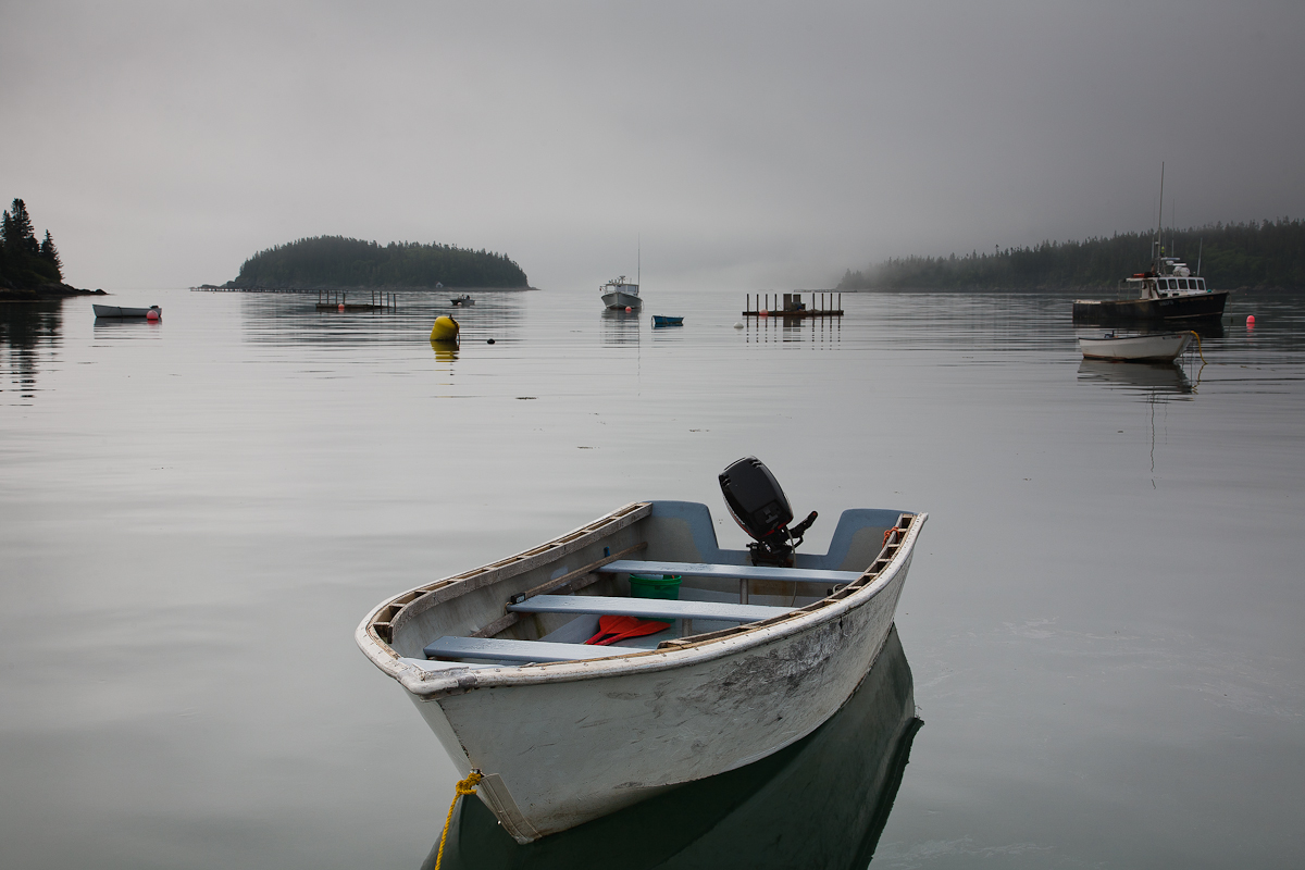
Foggy Maine Morning
‹ PreviousMan & Nature GalleryNext ›

Foggy Maine Morning

by Carol Nichols

Gallery: Man & NaturePosted November 7, 2011257 views10 comments
This photo was taken during my June trip to Maine, a state with so many photo opportunities. Now I know why Eva likes it so much there!

Please also take a look at the B&W conversion of this photo that can be seen here and let me know which one you prefer.

Critiques and comments are very welcome and appreciated. Thanks for looking!

Canon 5D
24-105mm f/4L IS @ 40mm
1/160, f/11, ISO 100
6-27-2011, 7:59am

Comments

10 comments
Comment posted by Eva McDermott on November 7, 2011 at 8:34 PM
Hi Carol - Classic Maine scene especially with the fog in the background. I am leaning towards your B&W version since it seems to have more depth and vibrancy in the water. Two minor nits - I wish the reflection of the foreground boat was complete and the foreground boat was a little more off center. Just curious, where in Maine is this? Mid coast, Bar Harbor? I spend most of my time in Boothbay (close to 27 years now), which is mid coast, but most of the Maine coast has the same character of what I see here.
Registered on January 4, 2009, 1015 Posts, 13229 Comments
Comment posted by Kah Kit Yoong on November 7, 2011 at 9:01 PM
Here's another vote for the BW version. The little splashes of bright colours make my eye wander around a bit too much. A lovely serene feel to this.
Registered on September 27, 2006, 636 Posts, 10682 Comments
Comment posted by Carol Nichols on November 7, 2011 at 9:33 PM
Eva - Thanks for your comment. This is the Cutler harbor.
Registered on November 7, 2007, 161 Posts, 1420 Comments
Comment posted by Eva McDermott on November 7, 2011 at 10:31 PM
So this is really "Down East", Acadia area. Thanks Carol!
Registered on January 4, 2009, 1015 Posts, 13229 Comments
Comment posted by Mark Seaver on November 8, 2011 at 9:06 AM
Carol, even before looking at the b&w version I was confident that this version would be the best because it basically is b&w except for the scattered spots of color. Those bits of color add so much to the overall image. (Surprise, surprise, my prejudice was up held when I looked.) This is a wonderful image as presented! My one thought is that this version might be improved by converting just the line at the bottom of the frame to b&w.
Registered on January 23, 2011, 1103 Posts, 17270 Comments
Comment posted by Danny Laureys on November 8, 2011 at 7:05 PM
Hi, I'm really liking the B&W. :toast:
Registered on January 5, 2008, 590 Posts, 1261 Comments
Comment posted by Nick Bristol on November 8, 2011 at 8:24 PM
B/W version for me also! Very nice. I really enjoy the feel of this.

Nick Bristol
Lone Rock, WI
Registered on February 1, 2004, 752 Posts, 14140 Comments
Comment posted by Harley Goldman on November 9, 2011 at 5:51 PM
I went back and forth on which version I prefer. Both look quite nice, but I think the B&W is doing the most for me. It has more of a vibrancy and dramatic impact. But you can't go wrong with either version.
Registered on November 19, 2003, 586 Posts, 11271 Comments
Comment posted by Vance Gese on November 9, 2011 at 11:30 PM
Fantastic image, Carol. Both the color and b/w are excellent and either would make a great print on the wall. I do like the touch of color in the color version set against all the grays of the sky and water. Superb work though, both versions.
Registered on November 13, 2008, 298 Posts, 6629 Comments
Comment posted by Mark Pelton on November 20, 2011 at 12:16 PM
Very nice, I prefer the color.
Registered on November 25, 2003, 380 Posts, 4647 Comments