Gallery: Regional: UKNPPosted November 7, 2011231 views15 comments
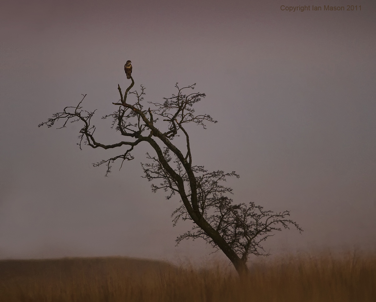
1D Mk iv, 600mm f4, 1/400s, f4, iso 400
One from this afternoon after the sun had set and I was making my way home from my woodland hide.
Comments
15 comments
Comment posted by John Robinson on November 7, 2011 at 7:19 PM
Thats a bit arty Ian
Dont know what the crop is (if any) but I feel the base of the tree over to the right would help a lot. I know the problem is the bitrd would be looking out of shot. No big deal.
Cheers
JohnR
Registered on March 2, 2008, 535 Posts, 2453 Comments
Comment posted by Mike Smith on November 8, 2011 at 1:51 AM
I actually like this as it is, the shape of the tree acts as a strong leading line to the small but important secondary subject.
My only suggestion would be to play with the white balance/colour balance to add some warmth and lift the image slightly, I'm finding the overall natural purple hue a little cold and uninviting at present
Registered on September 16, 2005, 12 Posts, 46 Comments
Comment posted by Ian Mason on November 8, 2011 at 2:28 AM
Thanks both. Yes, new territory for me! I was ready for bed when I processed this and it seems there is no end to the possible options with colour balance etc - here's another.
Registered on December 14, 2005, 399 Posts, 2305 Comments
Comment posted by David Sewell on November 8, 2011 at 4:21 AM
The second version is a big improvement, the warmer colour balance has worked wonders.
David
Registered on September 10, 2008, 63 Posts, 801 Comments
Comment posted by Nick on November 8, 2011 at 4:32 AM
Quite a graphic image Ian. I don't know how you shot it, but depending how you did you've all sorts of cropping options - square, space to left, space to right, or even space above!
It also looks strong in B&W. Making it a grainy B&W makes it feel quite arty too.
Registered on November 1, 2003, 96 Posts, 309 Comments
Comment posted by Des Ong on November 8, 2011 at 5:26 AM
Love the image Ian. 2nd one looks unnaturally warm to me. The only thing I'm not sure of is the crop. Perhaps you can post the original?
Registered on July 12, 2007, 23 Posts, 234 Comments
Comment posted by Ian Mason on November 8, 2011 at 6:06 AM
Des
In terms of crop options, here's a full frame version without much thought on processing. I suspect I'll play with this rather too much. Thankfully though it seems to be a favoured perch and I hope to have a few more opportunities over the winter. You'll probably notice I've removed some faint power lines - not sure if I can keep them out of view next time.
Registered on December 14, 2005, 399 Posts, 2305 Comments
Comment posted by Phil Shaw on November 8, 2011 at 10:43 AM
Prefer the 'as shot' colour balance with a little push to increase the exposure somewhat.
Registered on July 25, 2005, 26 Posts, 110 Comments
Comment posted by Des Ong on November 8, 2011 at 2:41 PM
Just my suggestion Ian...
Registered on July 12, 2007, 23 Posts, 234 Comments
Comment posted by Ian Mason on November 8, 2011 at 3:34 PM
Love it!!
Many thanks Des.
Registered on December 14, 2005, 399 Posts, 2305 Comments
Comment posted by Sandra Hendrikse on November 9, 2011 at 2:21 AM
Beautiful shot, Ian. I prefer the colours in the first image but the crop doesn't quite work for me. However, the version posted by Des is really very nice.
Registered on January 23, 2008, 48 Posts, 769 Comments
Comment posted by Pete Etheridge on November 9, 2011 at 5:29 PM
Hi Ian,
I do like Des' version. The lead-in line from the tree acts perfectly to draw your eye to the main subject.
Registered on August 9, 2005, 3 Posts, 40 Comments
Comment posted by Simon Phillpotts on November 10, 2011 at 4:23 AM
Lots of different opinions with this one but I prefer the original composition with the warmer balance (perhaps backed off slightly). I like the buzzard being to the left and looking back into all that space.
Registered on January 21, 2009, 16 Posts, 62 Comments
Comment posted by Craig Jones on November 10, 2011 at 6:08 AM
I love this, very different making best use of the natural tree and colours. The first one for me
Registered on January 31, 2009, 67 Posts, 316 Comments
Comment posted by Guy Rogers on November 10, 2011 at 1:18 PM
Hello Ian.
Really like this and I think I would leave more canvas on the right as the Buzzard is looking that way so it would work for me.
Well seen and taken.
Registered on January 16, 2007, 450 Posts, 995 Comments

Comments
15 commentsDont know what the crop is (if any) but I feel the base of the tree over to the right would help a lot. I know the problem is the bitrd would be looking out of shot. No big deal.
Cheers
JohnR
My only suggestion would be to play with the white balance/colour balance to add some warmth and lift the image slightly, I'm finding the overall natural purple hue a little cold and uninviting at present
David
It also looks strong in B&W. Making it a grainy B&W makes it feel quite arty too.
In terms of crop options, here's a full frame version without much thought on processing. I suspect I'll play with this rather too much. Thankfully though it seems to be a favoured perch and I hope to have a few more opportunities over the winter. You'll probably notice I've removed some faint power lines - not sure if I can keep them out of view next time.
Many thanks Des.
I do like Des' version. The lead-in line from the tree acts perfectly to draw your eye to the main subject.
Really like this and I think I would leave more canvas on the right as the Buzzard is looking that way so it would work for me.
Well seen and taken.