Nature Photographers Network
This is the preserved archive of the original Nature Photographers Network. The community continues at naturephotographers.network.
Rocks and Water
‹ PreviousLandscape GalleryNext ›

Rocks and Water

by Stephen Weaver

Gallery: LandscapePosted November 6, 2011362 views5 comments
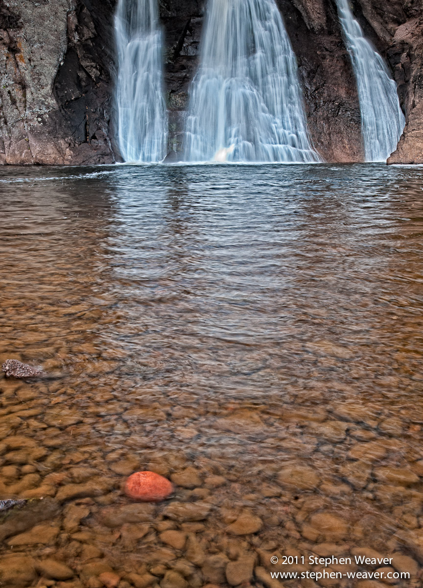
I made this image of High Falls in Tettegouche State Park, Minnesota. I was looking for a more non-typical water fall composition and was attracted to the red oxidized cobble in contrast to the other rocks in the pool. Using a polarizer I was able cut some of the glare from the pool but maintained the sense of water motion with a slow shutter speed. C&C welcome

Nikon D300, 24mm TS-E
RAW processed in LR3 and CS5

Comments

5 comments
Comment posted by R.Bill Moser on November 6, 2011 at 2:17 PM
This is indeed a more non-typical waterfall comp. I love that red rock in the foreground. I'm not quiet sure about the comp. i miss something at the top. and the mid-ground doesn't hold too much attention in my opinion.
Registered on January 29, 2010, 285 Posts, 4281 Comments
Comment posted by Richard Teller on November 6, 2011 at 4:54 PM
The color and the water blur are nice, but I also am not sure about the comp.
Registered on August 23, 2010, 1162 Posts, 6692 Comments
Comment posted by Morris McClung on November 6, 2011 at 4:57 PM
How could you not put that red rock in a composition? :biggrin: Well seen and captured.
Registered on May 7, 2007, 670 Posts, 19650 Comments
Comment posted by Nick Palmieri on November 6, 2011 at 9:22 PM
I like the flow of water in the water falls and I like the red rock. Personally I like to see the tops of water falls and I am bothered by not being able to see that. I am thinking this may be better divided into two compositions One of the water falls and one of the water with the rocks.
Registered on September 1, 2011, 35 Posts, 748 Comments
Comment posted by Stan Rose on November 7, 2011 at 1:18 PM
I like the idea here, Steve--but i see the problems mentioned in the other comments. The cut-off top doesnt bother me too much, but the whole image feels a bit 'long' to me so maybe a slight crop off both bottom and top might help tighten it up. Too late now, but i think the rock (since you mentioned it as a motivation) should be more prominent, maybe centered. Thirds might have worked too but the rock here is too small with nothing on the rhs to balance. I love the reflections and h2o exposure tho... :wavey:
Registered on September 15, 2005, 836 Posts, 17099 Comments