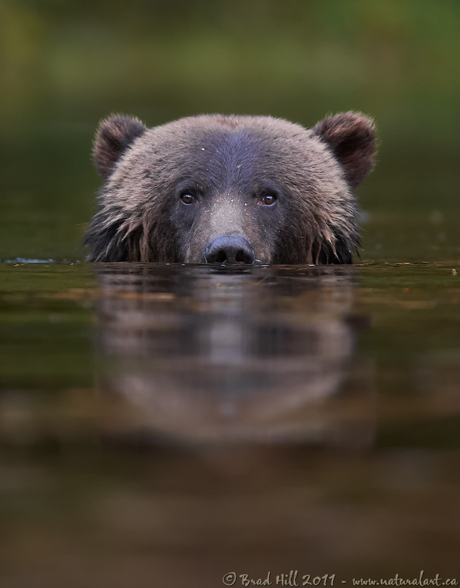
Eye-to-Eye!
This is an image that lived in my head for a LONG time before I finally got a chance in early October to turn it into photographic reality. Sometimes the simplest images - at least graphically - are the toughest to capture!
I'm known for being picky about foregrounds. But in a way this is a bit of bad rap - the thing I'm ACTUALLY picky about is the use of out-of-focus (or OOF) zones. In MOST cases I have a bit of a knee-jerk reaction AGAINST images that have multiple OOF zones in them. Which, given the laws of optics, means an OOF zone in the foreground, a focused zone somewhere in the middle of an image, and an OOF zone in the background. My primary reason for disliking this is simply that it's SO foreign to the way our unaided eyes work. Our brain gives emphasis/attention to what our eyes are focused on, but it doesn't throw everything else out of focus. I can live with (and quite like) OOF backgrounds as a rough "proxy" for the ability of our brain to discard or filter out things in our visual field that we aren't paying attention to. But...when an image contains 3 distinct OOF bands that stretch from edge-to-edge it just looks too unnatural (or "contrived") for my personal taste. This is especially true when the foreground contains irregular objects (like globular rocks or bushes) the really draw one's eye (often in an effort to figure out what the heck the lump is).
So what about this image? Well, while I like it some, to be perfectly honest I'm NOT 100% happy with it. And that's mainly because of the brown tones in the lower foreground (which, if memory serves me correctly, are reflections of logs on the shoreline behind the bear) - I'd prefer if ALL the foreground (except the bear's reflection) was the same colour of green as that in the background so that the illusion of their being only one OOF zone (and one attention-grabbing in-focus zone) was a little more complete. But I suppose I'll live with this image until I happen to stumble upon another grizzly submerged up to its nose and intently staring at me!

Subject: Female Grizzly (
Urus arctos) up to her neck...
Location: Great Bear Rainforest, BC, Canada
Camera: Nikon D3s
Lens: Nikkor 400mm f/2.8 VRII lens - handheld from floating Zodiac. VR on and in "Normal" mode.
Exposure: 1/250s at f2.8. ISO 2500. -0.33 stop compensation from matrix metered exposure.
Crop: Considerable - this is only about 70% of full-frame image
All the gory details about this shot (processing details, conservation, etc.)
http://www.naturalart.ca/galleries/latest/detail_2.html.
Comments and critiques welcomed - probably best to view the larger version prior to doing so!
Cheers...thanks for looking...
Brad

Comments
26 commentsOK - a few quick responses...
1. Fabio - don't think this one will go on the cover of MY book (I have others in mind), if you know of anyone else looking for a cover - let me know!
2. Verdon - OK, I get it - you're the VISUAL type!
3. Vincent: I think you slightly missed my point and self-critique - I think one trick in making dual out-of-focus zones work is to make the two OOF focus zones merge into one (which means one has to find a way to avoid an apparent edge-to-edge focus band somewhere in the middle of the shot AND the foreground and background have to be quite similar and almost homogenous). I think this image mostly does that, tho' it would be better if the foreground colours were MORE similar to the background colours. I don't think many will perceive a full-band of focus across the middle of this image (they'll just see one in-focus element).
Cheers...
Brad
Nice image. In many ways this reminds me of an over/under split shot as if it was taken with a large half-submerged dome port. I love the distinct horizontal line through the middle of the image. One of the best things about this image is how quickly the background goes OOF behind the bear making a sharp transition from "below" to "above". I think the story here is the half submerged bear emerging from the water. While I get what you're saying about a seamless OOF area if anything I'd rather see the foreground be more different from the background in order to accentuate over/under effect.
Clinton
You'll hate what I just posted in Avian.
I like this, though I agree with you about the brown in the bottom half of the image.
Max
Ken Archer
I'm just keen to know, why did you choose to have more foreground than BG. In this kind of situation, normal tendency is to sacrifice about 20% of the FG and add the same to the BG.
I'm just trying to understand your POV. Otherwise I'm perfectly happy with this.
Jagdeep Rajput
Its one of those special images that makes the viewer forget its a photograph. The only thing that come to mind is the feel of being in the water with a bear staring at you.
Ron Huff
Sometimes I agonize way too long over little parts of my own work trying to decide if they are spoiling a particular photo (and yet I still miss things from time to time!), although when it comes to a picture as strong as this that appears, to my eye, as pretty much flawless, I'd be over the moon to have it in my collection, print it, and share it with others :^)
I guess the thing is with this capture and the way you see it is that you apparently visualised the perfect image in mind so long that the slightest deviation from that mental picture you held is bound to result in at least a partial frown on your forehead, something I can certainly relate to. All the same, you should know, if only by the comments here, that most everyone else is gonna' absolutely love this exceptional piece of work. Very well done Brad :^)
Second I fully endorse
"But in a way this is a bit of bad rap - the thing I'm ACTUALLY picky about is the use of out-of-focus (or OOF) zones. In MOST cases I have a bit of a knee-jerk reaction AGAINST images that have multiple OOF zones in them. Which, given the laws of optics, means an OOF zone in the foreground, a focused zone somewhere in the middle of an image, and an OOF zone in the background. My primary reason for disliking this is simply that it's SO foreign to the way our unaided eyes work. Our brain gives emphasis/attention to what our eyes are focused on, but it doesn't throw everything else out of focus."
What has come to be a nemesis for nature photographers is the predominant dependence on big tele lens to capture wildlife further aided by PP tools to throws other areas in OOF, this across the world has led to a proliferation of images with just a tiny pixels of focus and rest blanked out. This had me to look at this whole situation in a very different way and further reinforced by good images captured from wide angles which brings out the whole wildlife in the 'right' perspective.
Lastly with the increased use of our equipment we tend to nit pick our images more but for the vast majority (aam aadmi - Hindi for common man) it is precisely these strong images with except the subject everything else OOF works so well.
To sum up this image is quite strong it holds the viewer to gaze at this powerful predator and would happily grace the cover.
I have looked at this for some time and read with interest your self critique.
I have to agree with Vijay, that we have all become a little too nit picking in the "digital age".
This eye level image is remarkable, personally I would prefer less at the bottom and more at the top, as I think it would emphasise the eye level
Um, wait, that's 3 words...
Thanks for the feedback on this image. To be honest, this one went over far better than I expected (but that's certainly something I don't mind at all and definitely teaches me something!).
A few specific responses:
1. Jagdeep - you asked: "...why did you choose to have more foreground than BG. In this kind of situation, normal tendency is to sacrifice about 20% of the FG and add the same to the BG."
Good question Jagdeep - to be completely honest I wasn't aware of the normal tendency you refer to. I'm very analytical (and very picky) about the technical aspects of an image, but much more intuitive/"gut feel" on the creative aspects of an image. Of course I'm completely aware of most of the "rules" of composition (tho' the one you refer to is news to me) and break them as I see fit to produce images that have visual impact (at least for me). I'm always very aware of the amount of foreground/background in an image (and, of course, how I use OOF zones) and how they impact on the apparent depth conveyed in the image (always a challenge to "mimic" 3-dimensions using a 2D medium). In this case I wanted a lot of foreground to "push" the bear farther back in the image, to increase the apparent difference in sharpness between subject and surroundings (because the near foreground is so out of focus and the contrast between that and the bear is maximized), and to really emphasize the very low POV (and Clinton's comments seem to illustrate I was successful at that).
Not sure I have answered your question entirely. Perhaps would suffice to say "this composition felt right to me"??
2. To Vijay and Ken re: "...that we have all become a little too nit picking in the "digital age"."
Perhaps. But I'm going to continue to nit-pick my own images to death - I personally think it's a healthy way to avoid complacency and avoid settling for "just OK" images. But each to their own on this. I DO think we all have to keep in mind that the kind of comments that sometimes surface in this gallery (and I certainly make them myself) refer to things that only another photographer would notice (and the "general public" would never notice), but this IS an image critiquing gallery and I think such feedback is invaluable and makes this gallery (and all of NPN galleries) the valuable tools they are. But always important for the image posters to remember to keep the comments and nit-picking in context...
Cheers all...
Brad
Thanks for reminding me about your response, I happened to check it couple of times and then forgot about it. I understand your POV. Actually, what I meant was, in this kind of framing, one normally goes for setting that suits for covers.
Jagdeep Rajput