Nature Photographers Network
This is the preserved archive of the original Nature Photographers Network. The community continues at naturephotographers.network.
Death Valley - REPOST
‹ PreviousLandscape GalleryNext ›

Death Valley - REPOST

by Charlie Baugh

Gallery: LandscapePosted October 30, 201195 views8 comments
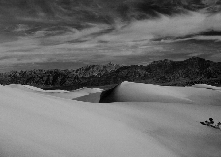
This was taken so many years ago I can't remember. From a Kodachrome slide digitized a few years ago and now converted to B&W with NIK Color Efex 4.

I posted only a small version as this is grainy and overall corupted from processing.

I'd like to here all the problems this has and if there is anything about it that pleases that would be nice. :razz:

Comments

8 comments
Comment posted by Tonia Graves on October 30, 2011 at 7:10 PM
Charlie, I like the layering effect of foreground/mountains/sky that you captured. I believe this image might benefit from a boost in contrast as it has an overall "dull" appearance.
Registered on October 29, 2011, 92 Posts, 1035 Comments
Comment posted by Peter Cross on October 30, 2011 at 7:18 PM
Nice layers Charlie, and good contrast between them. I might clone out the little plants sticking up on the right hand margin. When I saw the thumbnail, I first thought this was a snow picture from the northeast. Thanks for bringing back one of your oldie but goodie shots.
Registered on April 3, 2010, 271 Posts, 1342 Comments
Comment posted by Charlie Baugh on October 30, 2011 at 9:19 PM
I could boost contrast but think the dullness is just all the processing over the years. I did think about taking out the shrub but... :biggrin:
Registered on April 18, 2011, 329 Posts, 1985 Comments
Comment posted by John Mumaw on October 30, 2011 at 11:46 PM
A nice layered composition with lots of good shapes and forms throughout. However, the tones appear muddy as there are no true black/white points, which a successful b&w image needs.
Registered on September 9, 2005, 62 Posts, 2289 Comments
Comment posted by Charlie Baugh on October 31, 2011 at 12:28 AM
I boosted contrast. Let me know if this is works better.
Registered on April 18, 2011, 329 Posts, 1985 Comments
Comment posted by Tonia Graves on October 31, 2011 at 1:45 PM
Charlie, your re-worked image works much better IMO!
Registered on October 29, 2011, 92 Posts, 1035 Comments
Comment posted by Charlie Baugh on October 31, 2011 at 2:21 PM
Thanks all for suggestions. I have so little experience with B&W and this helped me know what to shoot for.

Charlie
Registered on April 18, 2011, 329 Posts, 1985 Comments
Comment posted by Buck Ward on October 31, 2011 at 9:32 PM
My feeling reflects that of the others. My opinion is that black and white photographs should have black and they should have white. In your conversion from color to black and white, try using a digital yellow or red filer. It will darken the blue in the sky and use levels to set the white and black points. Your repost is much improved, but I think you can take it further, especially in the sky.
Registered on December 8, 2003, 96 Posts, 1917 Comments