Nature Photographers Network
This is the preserved archive of the original Nature Photographers Network. The community continues at naturephotographers.network.
High Desert Gardens
‹ PreviousLandscape GalleryNext ›

High Desert Gardens

by Chris Chamberlain

Gallery: LandscapePosted October 18, 2011272 views19 comments
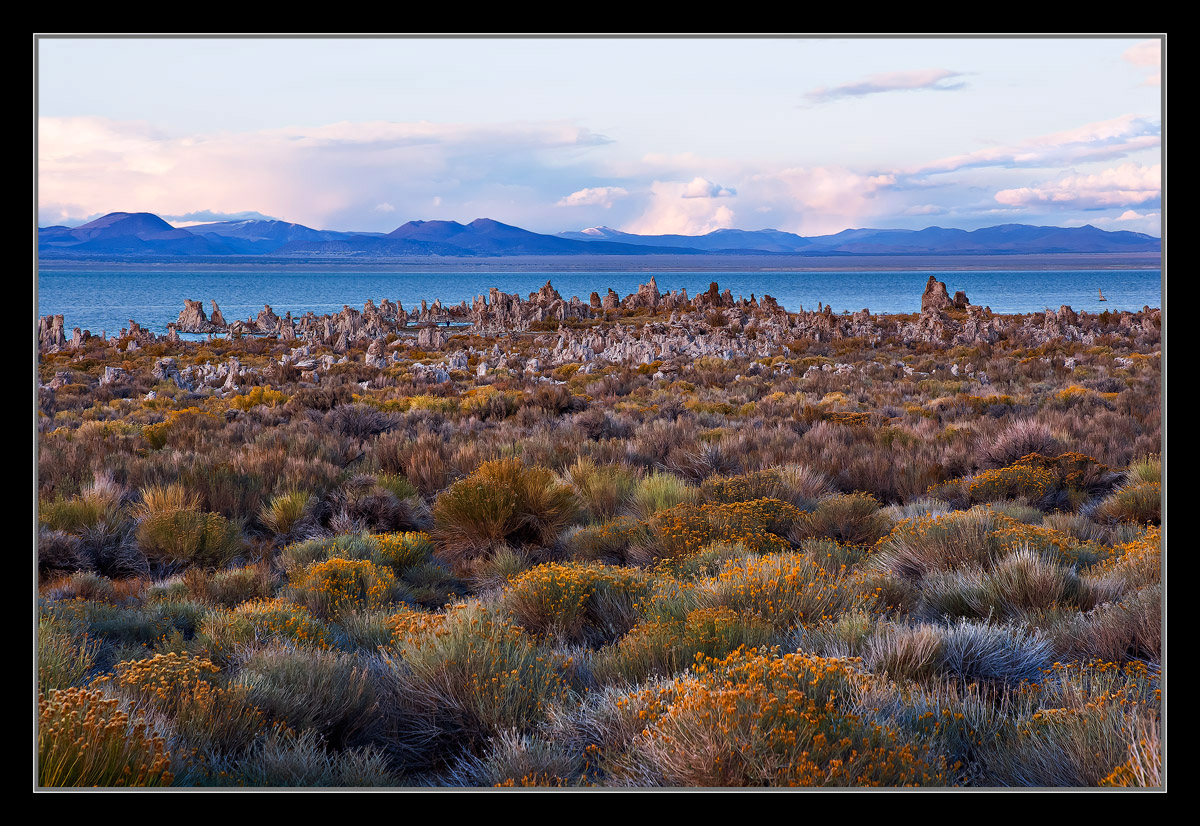
I posted an image a few years ago called "Mono Gardens" I actually like that title for this one, but didn't want to be redundant. As the other guys were rushing off to get down to the waters edge, I couldn't help but notice the wonderful light, and diversity of colors in the foreground here. I paused for a moment and decided the shoreline could wait! I'm sure there are some, but I can't really recall an expansive composition similar to this. Not sure why that is? I'd love to hear your thoughts. large version too!

D200,
18-70mm,
1/6sec, F/13,

Thanks,
Chris

Comments

19 comments
Comment posted by Jason Kim on October 18, 2011 at 11:51 PM
By Mono Lake standards, this is utterly lush. It's nice to see an image that captures the surrounding area in these conditions. That foreground is great.
Registered on July 1, 2006, 60 Posts, 1233 Comments
Comment posted by Hamed Musharbak on October 19, 2011 at 12:55 AM
very nice light, i like the contrast

Hamed
Registered on June 1, 2009, 372 Posts, 2282 Comments
Comment posted by Zack Clothier on October 19, 2011 at 1:12 AM
Nice to see something different from an often photographed area such as this. Is that a photographer down by the water?
Registered on January 28, 2010, 343 Posts, 2257 Comments
Comment posted by Dietrich Gloger on October 19, 2011 at 1:27 AM
The "big" foreground works indeed very well. The depth created by your composition helps to "get" the place. The patterns and colors are really beautiful and make a good subject on their own. I bet this could go well in terms of print sales!
Registered on January 26, 2007, 360 Posts, 9876 Comments
Comment posted by Peter Richter on October 19, 2011 at 1:59 AM
Chris, by this delicate lighting you show the foreground elements at their best in my opinion. The rocks at the shoreline make for an unique pattern to my eye that keeps my attention. A different point of view that works exceptionally well for me.

Peter
Registered on November 10, 2010, 218 Posts, 2723 Comments
Comment posted by Rob Blakers on October 19, 2011 at 3:49 AM
Excellent thinking out of the box. It would work even better for me with a healthy slice out of the sky and then additional foreground, which is where the interest is. So then an expansive foreground leading to the formations and lake and mountains and a sliver of sky to hold it all in place.
Registered on February 26, 2011, 8 Posts, 67 Comments
Comment posted by Mark Pelton on October 19, 2011 at 8:08 AM
gorgeous, Chris. I also love wide views with lots of foreground. :toast:
Registered on November 25, 2003, 380 Posts, 4647 Comments
Comment posted by Paul Duval on October 19, 2011 at 8:45 AM
Chris,

Wonderful detail especially in the larger version...The person in the image is not an immediate discovery and does give a sense of scale. However the scene doesn't need the human presence to work well. While some " Chamberlains" have a symphonic quality to them this is more of a tone poem or a sonata if you will. A tapestry weaved of sage , rabbitbrush, tufas distant snow dusted peaks and retreating storm sky. But through the whole flows one melody and that is Mono Lake. Well done Chris, sometimes it pays not to succumb to iconography. Just curious is this a recent or older image? I bagged a few similar to this last year after the get together at the "Whoa Nellie" . I might share as well.

Paul
Registered on June 30, 2009, 508 Posts, 1907 Comments
Comment posted by Chris Chamberlain on October 19, 2011 at 9:14 AM
Thanks guys!

Paul,

It is an older file from 2009, thanks.

About the presence of a person in the scene. If you are talking about the dark speck, yes I guess that's a person. Being only a speck and insignificant, I bet it's probably Lon!!!!!!! Just kidding Lon :wavey: Anyway, I guess I was just lazy about removing it. With the resolution I get with my camera, it's probably always going to look like just a speck, but I'll go ahead and address it in the print file, thanks!

Chris
Registered on March 13, 2007, 500 Posts, 8365 Comments
Comment posted by Michael J Greene, on October 19, 2011 at 9:52 AM
Painterly Chris. I love the color palette and the background mountains and water are very pleasing + relaxing. I'd consider reducing the brightness or burning down the top of the sky a little. I really like how you de-emphasized the tufa structures here.

Michal
Registered on June 18, 2009, 86 Posts, 2317 Comments
Comment posted by Harry Lichtman on October 19, 2011 at 9:57 AM
You nailed the exposure on this-beautiful light over the lake and scrub. I'd be tempted to crop off the top of the sky devoid of most of the clouds. A sweet shot. :toast:
Registered on September 17, 2010, 304 Posts, 3507 Comments
Comment posted by Rick Goldwasser on October 19, 2011 at 10:26 AM
This actually works quite well for me, I think the vegetation here is beautiful! I think if it were mine I would crop to just above the far shoreline - the sky isn't adding much and this would emphasize the vegetation and tufas a bit more - really nice (and quite creative) either way.
Registered on May 10, 2009, 127 Posts, 970 Comments
Comment posted by Nancy Lea Sandy on October 19, 2011 at 11:20 AM
Beautiful. the light topping the plants is lovely
Registered on January 24, 2011, 576 Posts, 6942 Comments
Comment posted by Wayne Jones on October 19, 2011 at 12:58 PM
GORGEOUS, Chris! This gives me a new appreciation for this place. Never been there, but I always got the impression it was a pretty dead looking place until I saw this.
Registered on April 18, 2007, 953 Posts, 6435 Comments
Comment posted by Morris McClung on October 19, 2011 at 1:45 PM
A unique take on this place, and thank you for that. I have seen enough shots of those tufa formations to last me the rest of my life! I like the textures and colors of the foreground a lot. I could see cropping some sky to accentuate them a little more.
Registered on May 7, 2007, 670 Posts, 19650 Comments
Comment posted by Nick Bristol on October 19, 2011 at 4:04 PM
This is a wonderful shot Chris.I love this foreground with the beautiful light and color. Your comp worked out really nice as well. Excellent image! Large version is really worth the look. :toast:

Nick Bristol
Lone Rock, WI
Registered on February 1, 2004, 752 Posts, 14140 Comments
Comment posted by Phil Pogledich on October 19, 2011 at 6:35 PM
I really like this, Chris. But unlike your other recent posts it's not quite perfect . . . I agree with the others suggesting a partial crop of the sky. I'd take off about 1/3 to 1/2 the sky and then call it done. Beautiful shot.
Registered on August 24, 2009, 123 Posts, 3099 Comments
Comment posted by Vance Gese on October 21, 2011 at 1:32 PM
Love the soft lighting and textures of the foreground, Chris. Great use of layers. A really unique take on this area that works very well in my book. Love it.
Registered on November 13, 2008, 298 Posts, 6629 Comments
Comment posted by Mark Metternich on October 22, 2011 at 12:18 AM
Nice clean scene Chris! :toast:

Maybe a bit more luminance reduction in a graduated way in the sky from top down? It looks near white on my monitor.
Registered on June 19, 2009, 276 Posts, 6240 Comments