Nature Photographers Network
This is the preserved archive of the original Nature Photographers Network. The community continues at naturephotographers.network.
Forces Through Stone
‹ PreviousLandscape GalleryNext ›

Forces Through Stone

by Navin Sarma

Gallery: LandscapePosted October 7, 2011244 views12 comments
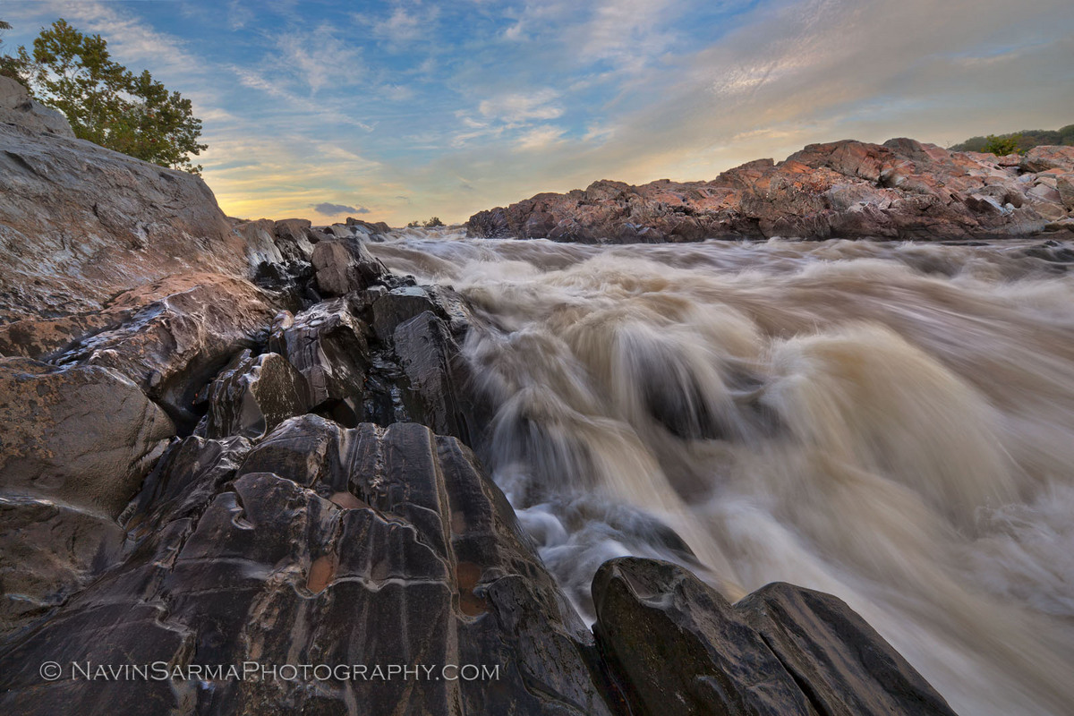
Another shot from Great Falls... I think I have some decent comps in mind for the foliage; this particular shot is more dependent on the sky. I'm somewhat happy with how this one turned out, but will try it again sometime soon.

Canon 5dm2, Nikkor 14-24mm/2.8G, single exposure, f/20, 1/8 sec, ISO 50 at 14mm
Multiple curves adjustments by color range and luminosity, cloning of water droplets on the lens (annoying!, but incessant that close to the river), vibrancy shift for the oranges in the sky, color noise redux, CW tilt and CA fix.

Curious for your thoughts! Please view LARGE!

Comments

12 comments
Comment posted by Bill Chambers on October 7, 2011 at 10:35 PM
A very pretty scene. Nice water action, and beautiful sky. I might try raising the mid level brightness a bit.
Registered on April 10, 2005, 753 Posts, 21216 Comments
Comment posted by Navin Sarma on October 7, 2011 at 10:59 PM
Bill, thanks for that comment. Funny you said that, because after I posted I thought the image was missing something. I turned up the mid contrasts, please see the updated version!
Registered on July 17, 2011, 233 Posts, 1373 Comments
Comment posted by Kane Engelbert on October 7, 2011 at 11:31 PM
Stunning comp. Great light, great detail in foreground rocks, killer sky. The brown water hurts.
Registered on June 14, 2009, 63 Posts, 291 Comments
Comment posted by Dietrich Gloger on October 8, 2011 at 8:59 AM
I like the low camera position, this creates a very dynamic composition. And I like how rocks and water mimic each other regarding shape. I agree with Bill on the overall brightness - I should be a bit brighter imo. I think your repost made it actually darker... :confused:
Registered on January 26, 2007, 360 Posts, 9876 Comments
Comment posted by Justin Marx on October 8, 2011 at 10:45 AM
Beautiful comp, I love the way the striations in the foreground rock pull the eye towards the vanishing point. I agree with Bill, and the adjustments in your repost definitely give the image more presence.
Registered on June 30, 2011, 2 Posts, 14 Comments
Comment posted by Mark Seaver on October 8, 2011 at 12:30 PM
The flow in both the water and the rocks along side is great. Excellent alternative view of Gt. Falls. The repost is noticeably better.
Registered on January 23, 2011, 1103 Posts, 17270 Comments
Comment posted by Tony Kuyper on October 8, 2011 at 12:43 PM
Very nice light and textures. The wide-angle perspective makes me feel I'm right in the scene.
Registered on November 1, 2003, 364 Posts, 22328 Comments
Comment posted by Daniel Rappaport on October 8, 2011 at 2:18 PM
Great capture of the power of the water. Perfect exposure.
Registered on September 9, 2009, 294 Posts, 2006 Comments
Comment posted by scott lanz on October 8, 2011 at 3:37 PM
Dynamic, different view of this place. Well done (especially the repost).
Registered on November 14, 2003, 840 Posts, 12902 Comments
Comment posted by Navin Sarma on October 8, 2011 at 4:14 PM
hi everyone, thanks so much for the comments.

although i did consider the overall brightness of the image, i was more concerned that there was not enough contrasts in the mid tones to let the sky and water pop. this is something i regularly struggle with when it comes to showing the intricacies of flowing water. increasing the contrast drowns out the smaller streaks of water, so it's a delicate balance to try to get it right. i am ok with the overall brightness, because i think that the rock on the left is so prominent that it takes your attention regardless, and that its darker tone adds a bit to the mood of the image. i am curious for more comments on this point.

as far as the water color, great falls and the potomac are always brackish and brown (especially in times of flood - see an earlier post if you're interested). i try to stay relatively true to the scene in that manner, though i can understand the motivation to desaturate those colors. i think this is why many people decide to B&W images of this color of water. i haven't felt that urge to this point.

thanks again for your thoughts, much appreciated. :toast:
Registered on July 17, 2011, 233 Posts, 1373 Comments
Comment posted by Tom Hilton on October 8, 2011 at 8:00 PM
Navin,
I really like all your Great Falls shots
Your locations are very interesting....
I have to get off the beaten path more and find some of those...
I was there for 3 hours this morning, very foggy...
I'll post one...
they do not match up well with yours...
Oh, I'm used to the brown water too...

:wink:
Registered on September 19, 2011, 68 Posts, 668 Comments
Comment posted by Nick Bristol on October 9, 2011 at 7:11 PM
This is a great view Navin. I really like the way you shot this and I can just hear the roaring water. I also like the color.

Nick Bristol
Lone Rock, WI
Registered on February 1, 2004, 752 Posts, 14140 Comments