Nature Photographers Network
This is the preserved archive of the original Nature Photographers Network. The community continues at naturephotographers.network.
GreatOysterBaySunset+RP
‹ PreviousLandscape GalleryNext ›

GreatOysterBaySunset+RP

by Neale Dyster

Gallery: LandscapePosted September 29, 2011661 views9 comments
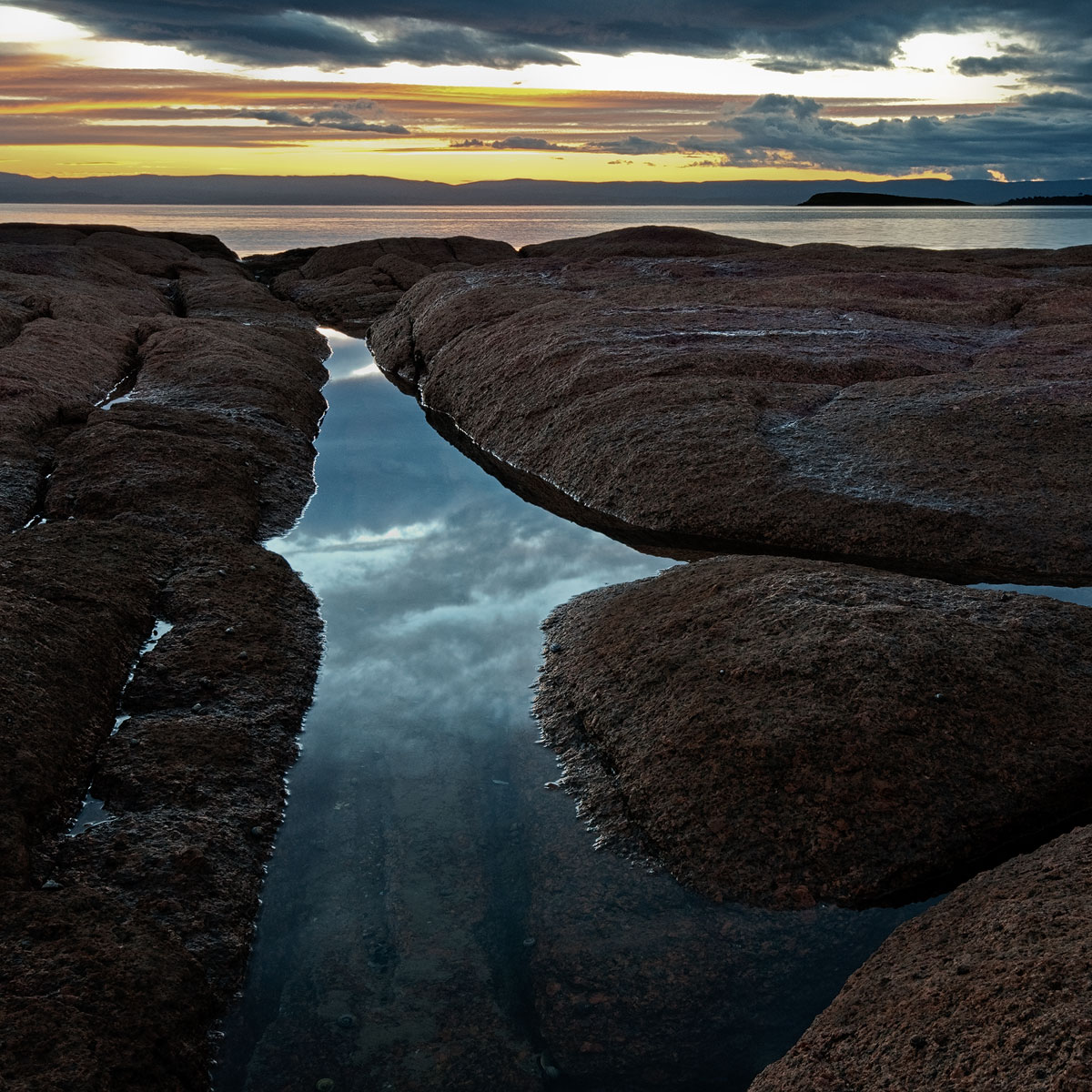
Here's a different angle on a scene I posted previously.
I didn't like it as much as the earlier post until I cropped it square which removed some dead space from the rhs. Now I think its a better image than the earlier one and the processing more successful too, but am keen to hear opinions either way.
D300, Sigma 10-20 mm @ 20mm, Two exposure manual blend- 1 second f/g and 1/4 sec sky @f/16. TK's triple play actions.

Comments

9 comments
Comment posted by Nancy Lea Sandy on September 29, 2011 at 11:14 AM
I love those rocks! This is a great location and I hope you keep coming back for more. IMO, you could have cropped a little more from the bottom as the shadows there don't really add much. I like that you made the rocks more of a presence in this version but I think I prefer the first post due to a better balance between positive and negative spaces. The sky was great in both versions.
Registered on January 24, 2011, 576 Posts, 6942 Comments
Comment posted by Stan Rose on September 29, 2011 at 12:27 PM
Sweet! I just checked out the previous one, and i like this one much more, but its an unfair comparison because i think your processing is much better in this one. It does seem like the lhs is a bit strong here (compared to the rhs), but the sky makes up for that. I love the color contrasts! :toast:
Registered on September 15, 2005, 836 Posts, 17099 Comments
Comment posted by Peter Richter on September 29, 2011 at 2:34 PM
Neale, this is a very strong composition to me, and striking colors. The subsurface structures in the foreground really keep my attention and just make the difference for me.

I just think of brightening the rocks a bit especially at the left, this might accentuate their interesting texture.

Peter
Registered on November 10, 2010, 218 Posts, 2723 Comments
Comment posted by Tony Kuyper on September 29, 2011 at 2:55 PM
Very nice composition that steers me into the frame. I could see maybe cropping the white of the sky and bringing out some additional detail in the rocks.
Registered on November 1, 2003, 364 Posts, 22328 Comments
Comment posted by Bill Chambers on September 29, 2011 at 3:06 PM
Well seen and captured. Lovely detail, and very nice composition. No nits from me.
Registered on April 10, 2005, 753 Posts, 21216 Comments
Comment posted by Neale Dyster on September 29, 2011 at 9:02 PM
OK, one last try for now. Re-cropped to 5x4 eliminating white part of sky and some of the darker f/g rock,. Improvement or not really?
Thanks for feedback, much appreciated.
Registered on February 19, 2008, 94 Posts, 738 Comments
Comment posted by Lon Overacker on September 30, 2011 at 1:56 AM
Neale,

Much more impressive than the thumbnail suggests! And the repost took care of my thoughts about lightening the rocks. For me I like it a little better with more of the sky, but perhaps a little burn down of the brightest areas with some of TK's stuff - like a burn/dodge layer maybe.

I really like the composition and the square format of the original posts works nicely.

Lon
Registered on November 24, 2006, 521 Posts, 19147 Comments
Comment posted by Stan Rose on October 1, 2011 at 1:13 PM
i thought the sky looked just fine :wink:
Registered on September 15, 2005, 836 Posts, 17099 Comments
Comment posted by David Edwards on October 2, 2011 at 3:45 AM
Repost looks great, Neale, although I wouldn't have cropped the fg, just the white sky. I like the sky reflecting in the fg pool, and again I like the shape design of your comp.
Registered on December 6, 2008, 142 Posts, 2623 Comments