Nature Photographers Network
This is the preserved archive of the original Nature Photographers Network. The community continues at naturephotographers.network.
Spirit Island
‹ PreviousLandscape GalleryNext ›

Spirit Island

by Jay Levin

Gallery: LandscapePosted September 27, 2011861 views12 comments
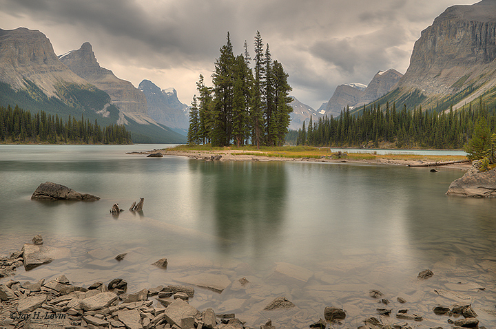
This photograph of Spirit Island in Maligne Lake in the Canadian Rockies was taken on September 15, 2011 at 4:22 PM. It is a six image HDR to deal with the high contrast in the scene. I had been to the Canadian Rockies five years ago but never had the opportunity to take the boat trip to Spirit Island. Photographers are given only about an hour or so there to try their luck!

Nikon D300, Nikkor AF-S DX 16-85mm f/3.5-5.6G ED VR
f/16 at 18mm ISO 200 cloudy WB.

Manual exposure mode, 6 stop neutral density filter to smooth the water

Thanks for looking. Comments and critiques welcome.

Comments

12 comments
Comment posted by Bruce King on September 27, 2011 at 6:25 PM
This is really nice.....one of the most natural looking HDR blends I've seen. The comp is a little static but I think it works well for this scene. Beautiful work. :toast:
Which HDR program did you use? I just picked up the NIK version but haven't used it too much yet.
Registered on January 14, 2010, 276 Posts, 2212 Comments
Comment posted by Jay Levin on September 27, 2011 at 6:42 PM
Thanks for your kind comment, Bruce. I use Photomatix Pro. Ferrell McCullough gives really good tips on how to use all of the sliders in the Details Enhancer version, which I use. See his book and his website. Photomatix also seems to be the most well developed HDR program.
Registered on April 24, 2009, 21 Posts, 184 Comments
Comment posted by Shane McDermott on September 27, 2011 at 8:09 PM
Hi Jay

Nice scene here. I would look at trying to get a bit more color into this, as well as BG contrast and detail in the mountains and sky (particularly more blues and greens) I think it has good potential to be a more impactful image. It also looks like it needs to be tilted CCW about 1-2°.
Registered on November 12, 2007, 49 Posts, 1074 Comments
Comment posted by Ryan Marshik on September 27, 2011 at 11:21 PM
Excellent HDR work to be sure.
I do agree the image could stand for a little contrast/color. Feels like a bit of dodging/burning, selective color etc to draw the eye to the wonderful center stand of trees is in order.

But again , wonderful, subtle, HDR work.
Registered on February 1, 2011, 10 Posts, 103 Comments
Comment posted by Michael J Greene, on September 28, 2011 at 1:28 AM
The foreground is maybe a little flat, but I would have never guessed this to be HDR. This is about as good as it gets considering the time of day. Impressive work.

Michael
Registered on June 18, 2009, 86 Posts, 2317 Comments
Comment posted by Ant on September 28, 2011 at 1:49 AM
Excellent HDR work and extremely pleasant image. While certainly the picture could accept a bit more color,
personally I do like the grey, overcast and moist feeling which make this scene very natural.
Registered on April 13, 2009, 27 Posts, 474 Comments
Comment posted by Joseph Campisi on September 28, 2011 at 3:03 PM
This image has a lot of potential Jay. Straighten the horizon and add a little more saturation and you have a winner!
Registered on November 24, 2008, 304 Posts, 3211 Comments
Comment posted by Mark Metternich on September 28, 2011 at 7:38 PM
I love the scene, the moment captured and the composition... :toast:

but as far as the HDR conversion...

Sorry, but I think it looks very greyish, and wonder why the use of HDR here? This is not a wide Dynamic Range image (with the clouds diffusing the light). I think the use of HDR has flattened the image considerably and it could be much better approached in ACR as one shot likely even single processed. I hope this does not tweak a nerve but I think the image has a lot more potential than the method used and would encourage you maybe to try a ACR version too.

Again, I don't at all mean to be discouraging (we are all in the process of learning) I just think the method chosen is not necessarily the best for the results in this case. Now having said that, I do think this image taken into Photoshop with careful color correction could get you to, or near its ideal.
Registered on June 19, 2009, 276 Posts, 6240 Comments
Comment posted by Jay Levin on September 28, 2011 at 11:04 PM
Hi Mark, many thanks for the time invested in your comment. I first examined a single RAW image with the red channel of the RGB histogram having a very small gap on the right hand side, indicating that the highlights were almost perfectly exposed. However, the blue channel was blocked on the left hand side, and there was no detail in the trees on the island and the trees on the right hand side. I don't believe processing a single RAW image would have had any chance of working. On the other hand, the strong contrast caused by the lack of detail in the shadows suggested an HDR to me. As suggested by some comments here, I have added some saturation since the post, and a large version appears on my website here:
http://www.pbase.com/drjaysel/image/138427846

By the way, as for the suggestion by some to straighten the image, the trees on the island are vertical.
Registered on April 24, 2009, 21 Posts, 184 Comments
Comment posted by Stan Rose on September 29, 2011 at 1:34 PM
I completely agree with Mark here. Its a relatively low contrast subject. A little added contrast here (especially in the fg) will make this pop. I really like the arrangement of this comp though--great way to present the scene! :wavey:

OK--i just read your comment and have to add something: lack of detail in shadows is not necessarily a bad thing. If your histogram goes well off the left edge--its not necessarily a bad thing! Embrace the shadows, Jay--shadows are your friend! :biggrin:
Registered on September 15, 2005, 836 Posts, 17099 Comments
Comment posted by Lon Overacker on September 29, 2011 at 4:53 PM
Jay,

Beautiful scene, wonderfully captured. Excellent composition. I haven't read the comments yet, but my suggestion would be boosting the contrast in general. HDR processing and how folks are using it is certainly getting better, but sometimes still, maintaining some shadow area, as minute as it might be, is still needed; at least for this scene it is. A little tweak with that and you'll have a fine image suitable for hanging on a wall somewhere.

Lon
Registered on November 24, 2006, 521 Posts, 19147 Comments
Comment posted by Zack Clothier on September 30, 2011 at 2:00 AM
Nice composition, although I would agree with others that this needs some more contrast, there's just to much detail in the shadows here.
Registered on January 28, 2010, 343 Posts, 2257 Comments