Nature Photographers Network
This is the preserved archive of the original Nature Photographers Network. The community continues at naturephotographers.network.
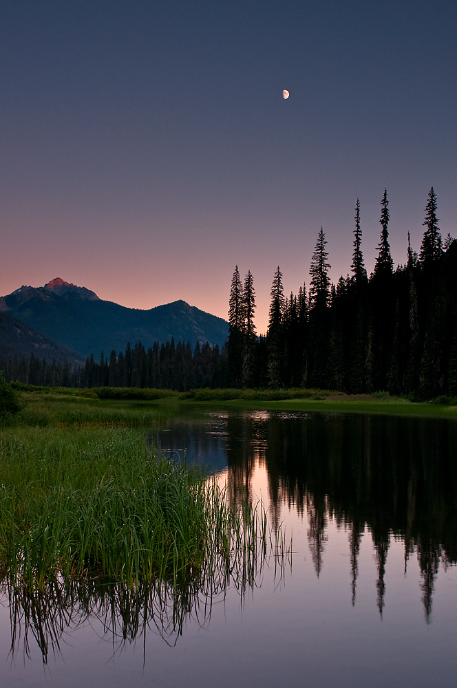
Taquala Meadows
‹ PreviousLandscape GalleryNext ›

Taquala Meadows

by Bruce King

Gallery: LandscapePosted September 18, 2011328 views15 comments
This is the Upper Cle Elum River about two miles from its headwaters. Color management has turned into a guessing game since I calibrated the monitor. Colors seem to look better on IE than Firefox. Since it's a color managed browser and IE is not I remain confused. Any thoughts?


27mm w/3-stop reverse grad
f/16 @ 1/6 sec
ISO 200

Comments

15 comments
Comment posted by Joseph Campisi on September 18, 2011 at 9:20 PM
Nice peaceful scene Bruce. Like the detailed moon!
Registered on November 24, 2008, 304 Posts, 3211 Comments
Comment posted by Nick Bristol on September 18, 2011 at 10:33 PM
Beautiful. This looks wonderful to me Bruce. I love the comp, the beautiful colors and most of all the fantastic mood! The moon works great in this shot. What I really like is how real it all looks, just like I'm standing right there...wish I was. Great shot!

Nick Bristol
Lone Rock, WI
Registered on February 1, 2004, 752 Posts, 14140 Comments
Comment posted by Daniel Rappaport on September 18, 2011 at 10:35 PM
Well done. Excellent composition, wonderful light.
Registered on September 9, 2009, 294 Posts, 2006 Comments
Comment posted by Paul DeCesare on September 18, 2011 at 11:01 PM
I'm a total sucker for images like this. When I saw the thumbnail I leaped on it... you nailed this shot The illuminated peak on the left is that special surprise along with the nicely detailed moon.

BTW, I use IE9 on Win7 and an older Dell 2405 calibrated with a Spyder3Pro, and the color looks fantastic to my eye. :toast:
Registered on August 31, 2007, 29 Posts, 202 Comments
Comment posted by Morris McClung on September 18, 2011 at 11:20 PM
Nice comp, colors look good on IE9, and I like that first light on the peak.
Registered on May 7, 2007, 670 Posts, 19650 Comments
Comment posted by Anil Rao on September 19, 2011 at 4:28 AM
Beautiful composition. I also love the darkness which looks so very natural. Great work, Bruce.
Registered on November 15, 2003, 234 Posts, 4923 Comments
Comment posted by Bill Chambers on September 19, 2011 at 11:46 AM
This is so beautiful and peaceful. Very nice placement of the moon. I might be tempted to darken the reflection a bit. Excellent work.
Registered on April 10, 2005, 753 Posts, 21216 Comments
Comment posted by Ken Smith on September 19, 2011 at 1:35 PM
Bruce, this is beautiful. Love the sky which you handled well with the grad...looks natural. Tranquil and peaceful...the silouette and the lush green meadows frame the water nicely. One of your best landscapes, in my opinion. Well done! (ps...if anything...I might darken the water reflection...to show it darker not brighter than the sky...)
Registered on September 5, 2008, 449 Posts, 2444 Comments
Comment posted by Preston Birdwell on September 19, 2011 at 3:02 PM
Bruce,

The serenity portrayed here is very pleasing. I like the compostion and the moon is a nice element to have. I do have a minor nit, though: the reflection is brighter than the actual background and sky. Reflections are always darker because the water absorbs some light. There is also a merger of the reflection of left-hand trees and the sedges. A few steps to the right would have eliminated it.

You made a very nice effort, here!

--P
Registered on November 1, 2003, 471 Posts, 5188 Comments
Comment posted by Bruce King on September 19, 2011 at 3:21 PM
Preston-I was wondering when someone would mention the lighter reflection. I suppose that's offten the case when using a grad in this situation, I was just too lazy to deal with it before posting. If I print it I'll darken it. Also, another step to the right and I'd have been swimming. :eek: Thanks.
Registered on January 14, 2010, 276 Posts, 2212 Comments
Comment posted by Robert Dayton on September 20, 2011 at 11:12 AM
Great colors and tones, Bruce, and wonderfully composed.
The scenic expresses moods of tranquility and serenity.
Registered on November 11, 2008, 281 Posts, 3958 Comments
Comment posted by Kane Engelbert on September 20, 2011 at 9:15 PM
I love this image. Clean color, clean graduated pink to magenta transition. Just pull the shadows out from the trees and you have a winner!
Registered on June 14, 2009, 63 Posts, 291 Comments
Comment posted by Gary Minish on September 21, 2011 at 12:20 AM
Very nice! I like the darkness of it and the composition is as good as can be. The large version really makes a difference. It puts you right in the scene, shows a lot more detail in the shadows and provides a much better sense of the mood. Nicely shot, Bruce.
Registered on February 4, 2006, 625 Posts, 3583 Comments
Comment posted by Zack Clothier on September 21, 2011 at 1:10 PM
Nice job of keeping some detail in the moon with just one exposure, I would darken the reflection a bit. The small amount of light on the mountain is a nice touch. The image feels a little titled (clockwise), not sure.
Registered on January 28, 2010, 343 Posts, 2257 Comments
Comment posted by Pam Colander on September 21, 2011 at 4:08 PM
This is a gorgeous lowlight image Bruce, very serene and the colors look good to me.
Registered on December 7, 2006, 210 Posts, 1062 Comments