Nature Photographers Network
This is the preserved archive of the original Nature Photographers Network. The community continues at naturephotographers.network.
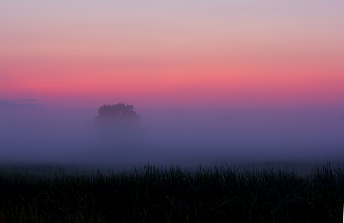
Savannah Morning
‹ PreviousLandscape GalleryNext ›

Savannah Morning

by Barbara Graham

Gallery: LandscapePosted September 13, 2011342 views13 comments
Canon EOS REBEL T2i
EF-S55-250mm f/4-5.6 IS
9/13/2011 – 6:53:01 AM
0.5 sec
Aperture priority
f/8
ISO 400
Focal length 55 mm
Camera on car window
Savannah National Wildlife Refuge, Georgia
Raw, CS5

To me this was a beautiful scene early this morning. I know it's dark, and I tried brightening it, but the scene actually just wasn't brighter. In the end I left it as it was to see what you thought.

Comments and suggestions are desired and appreciated.

Thank you!


Comments

13 comments
Comment posted by Bill Chambers on September 13, 2011 at 8:06 PM
Whoa - drop dead beautiful Barbara. IMO, your best landscape image by far. Love the layers of color, and the transition from dark to light, and tree placement is perfect. Great work!
:toast: :toast: :toast:
Registered on April 10, 2005, 753 Posts, 21216 Comments
Comment posted by Patricia Brundage on September 13, 2011 at 8:22 PM
Now that's the scene for a perfect day. Can't get much better than this. :toast:
Registered on March 23, 2006, 1111 Posts, 6531 Comments
Comment posted by Chris Chamberlain on September 13, 2011 at 9:08 PM
Yeah, probably your best so far! great color and layers going on here. I would like to see a little hint of the tree trunk, I understand it's hidden in the fog. Nice!

Chris
Registered on March 13, 2007, 500 Posts, 8365 Comments
Comment posted by Charlie Baugh on September 13, 2011 at 9:21 PM
Nice simple composition and you nailed it Barbara. It is your eye that made this wonderful shot. You have arrived.

charlie
Registered on April 18, 2011, 329 Posts, 1985 Comments
Comment posted by Yiming Hu on September 13, 2011 at 9:45 PM
Barbara, I like the mood of the photo and the layered colors. Simple and beautiful.
Registered on April 28, 2011, 38 Posts, 733 Comments
Comment posted by Russell Colletta on September 13, 2011 at 10:19 PM
Very nice Barbara. As others have said, the layers are beautifully depicted here. The mood is great too.
Registered on October 31, 2009, 114 Posts, 1008 Comments
Comment posted by Gary Yeoh on September 13, 2011 at 10:55 PM
Awesome! :toast:
Registered on September 1, 2009, 588 Posts, 8184 Comments
Comment posted by Stan Rose on September 13, 2011 at 10:56 PM
Yep, its definitely a winner, congrats, Barbara!
One minor suggestion: the thirds are a huge strength here, so IMO it would be even stronger using that, and crop the top for even thirds for the three distinct layers. :toast:
Registered on September 15, 2005, 836 Posts, 17099 Comments
Comment posted by Neale Dyster on September 13, 2011 at 11:51 PM
Absolutely beautiful as posted, the large version is stunning! You could get more detail into the f/g if possible, and Stans crop suggestion may be worth a look, but honestly, I don't thnk you need change anything :toast:
Registered on February 19, 2008, 94 Posts, 738 Comments
Comment posted by Ian Cameron on September 14, 2011 at 4:41 AM
This is great Barbara oozing with atmosphere.
Registered on August 6, 2004, 1125 Posts, 3318 Comments
Comment posted by Morris McClung on September 14, 2011 at 2:05 PM
Yep, this is your best landscape image I have seen. Excellent use of layers and color, as well as the light. I do agree with Stan's suggestion of a crop from the top. It makes it even stronger, and it has plenty of impact already. Kudos! :toast:
Registered on May 7, 2007, 670 Posts, 19650 Comments
Comment posted by Nick Bristol on September 16, 2011 at 11:01 AM
This is beautiful, Barbara. The colors are wonderful. Although very nice as is Stans crop suggestion works really well with this.Very nice work!

Nick Bristol
Lone Rock, WI
Registered on February 1, 2004, 752 Posts, 14140 Comments
Comment posted by Lon Overacker on September 18, 2011 at 1:27 PM
Fabulous Barbara! Simple is almost always good and this one is just a great example of simplicity. Your comp is excellent and a perfect example and great application of the rule of thirds. Excellent! Color is a bit saturated for me, but actually fits nicely with the scene and mood you've captured.

Lon
Registered on November 24, 2006, 521 Posts, 19147 Comments