Nature Photographers Network
This is the preserved archive of the original Nature Photographers Network. The community continues at naturephotographers.network.
Mid Autumn Moon+Repost
‹ PreviousFlora GalleryNext ›

Mid Autumn Moon+Repost

by Gary Yeoh

Gallery: FloraPosted September 11, 201124,722 views23 comments
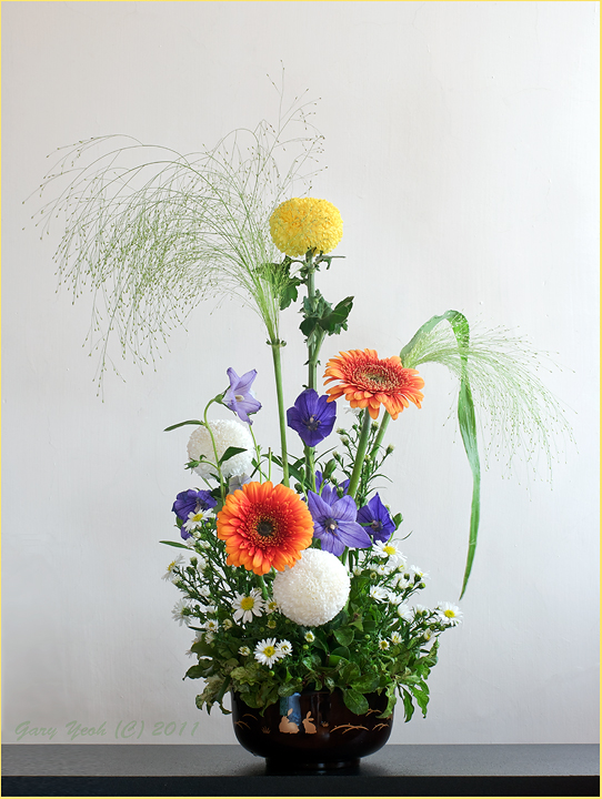
Ikebana #14. Mid Autumn Moon Festival theme. The Mid Autumn Moon festival is an important Chinese Festival dating over 3000 years celebrated at the time of the harvest. There are many myths and legends surrounding the festival which can be read on the link above.

This main theme is the moon which is represented by the yellow 'ping pong' ball chrysanthemum in the center. This version is taken at the studio with black backing. The arrangement is relatively small and I took the whole arrangement home to practice Mapplethorpe style (click larger version). Still a long way to get to his style.

D90 F14 3sec CPL for the above version.
Stack of 8 images F9, 1/3sec for the light version.
Thanks for viewing and C&C appreciated.

Comments

23 comments
Comment posted by Bill Fach on September 11, 2011 at 9:09 PM
Gary: I was just getting ready to open Robert Dayton's image and comment on how it is really eye candy for a color junkie and then you post this! I like the color against the dark BG on this version but I don't like how the bottom of the vase is too dark to discern well. If that area could be opened up a touch I think it would work better for me. Beautiful arrangement and capture. >=))>
Registered on November 1, 2003, 1805 Posts, 26981 Comments
Comment posted by Robert Dayton on September 11, 2011 at 9:42 PM
A great fine art still life, Gary! Of the two, I prefer the darker BG image.
Nevertheless, they both work.
Registered on November 11, 2008, 281 Posts, 3958 Comments
Comment posted by Allen Brooks on September 11, 2011 at 10:56 PM
Very pleasing composition. Wonderful colors. You've inspired me to see if I can get something half as good. The colors really pop against the darker background.
Registered on July 27, 2011, 262 Posts, 2597 Comments
Comment posted by Yiming Hu on September 11, 2011 at 11:06 PM
Gary, I like your beautiful arrangement and the photo works well. I would like to see a slightly more bright vase.
Registered on April 28, 2011, 38 Posts, 733 Comments
Comment posted by Charlie Baugh on September 11, 2011 at 11:52 PM
No kidding around on this, Gary. This is beautiful. I also like the black BG and think just like Bill and Yimming that the vase is a little dark.
Registered on April 18, 2011, 329 Posts, 1985 Comments
Comment posted by Krunal Janani on September 12, 2011 at 5:30 AM
Marvelous arrangement Gary & equally beautiful Light :toast:
Registered on September 16, 2010, 60 Posts, 1370 Comments
Comment posted by scott lanz on September 12, 2011 at 8:32 AM
Beautiful arrangement and image. Great job. I prefer the darker version, although I think being able to see more of the vase in this version would be even better.
Registered on November 14, 2003, 840 Posts, 12902 Comments
Comment posted by Pat Sampson on September 12, 2011 at 8:42 AM
Each one is stronger Gary. I could also see calling this "Moon Behind Cloud Wisp".

Arrangement: asymmetrical elements in rectangular space, energy from diagonals and top heavy verticals, some space but not airy, strong supporting base but appealingly balanced to my eye, pleasing color complements in the choice of flowers and an interesting choice of floral elements in the arrangement. I think the arrangement in the smaller image is much stronger than the arrangement in the larger. Although I do prefer the placement of the grass blade in the larger. I also prefer the thicker arrangement of the base flowers in the smaller image. I like the shape of the vase but would ideally have selected a color that separates it more effectively from the bg. (not a problem in the larger image)

Photography: I prefer the darker bg. Detail is good. Placement in the frame works for me. The container is problematic because of bg separation as already mentioned. The lighting works for me but doesn't seem to add value and that may be your intention. The white ping pong ball mum highlight might be darkened just a touch.

Actually the smaller image seems more like Mapplethorpe to me than the larger. I think the gradient is better and I also like the yellow complement to the blue bg. The table works for me in both images but is more Mapplethorpish in the second, lagrer where it's clearly defined.

I like the first image a lot Gary and would have it on my wall in a second. Very impressive.

pat
Registered on May 19, 2007, 953 Posts, 15989 Comments
Comment posted by Mark Seaver on September 12, 2011 at 10:05 AM
Simply stunning! A natural fireworks display. I much prefer the dark background version where it might be worth cloning out all indications of the vase.
Registered on January 23, 2011, 1103 Posts, 17270 Comments
Comment posted by David Schwaegler on September 12, 2011 at 10:05 AM
You've given us another gorgeous arrangement beautifully photographed. Thanks!
Registered on December 4, 2003, 232 Posts, 1652 Comments
Comment posted by Carolyn Derstine on September 12, 2011 at 10:40 AM
What a beautiful arrangement, Gary! I especially like the addition of those droppy grasses; they look like fireworks. What a magnificent mix of colors which contrasts so nicely with the black BG (I prefer that image).
Registered on February 16, 2011, 610 Posts, 3684 Comments
Comment posted by Morris McClung on September 12, 2011 at 11:54 AM
Amazing color, great arrangement, professional lighting and background. Superb work! :toast:
Registered on May 7, 2007, 670 Posts, 19650 Comments
Comment posted by Bob&Charly Nelson on September 12, 2011 at 1:31 PM
What a stunning, full of life still life Gary. The dark vase aside, this is just superb.
Bob
Registered on October 27, 2005, 289 Posts, 4202 Comments
Comment posted by Mauro Pasquero on September 12, 2011 at 2:15 PM
Great composition and beautiful colors, perfect light control, sharp details... I wonder wether the contrast is a bit too much high...
Mauro
Registered on January 21, 2010, 650 Posts, 2500 Comments
Comment posted by Monica Siri on September 12, 2011 at 3:02 PM
Gary,
beautiful image with excellent detail, great colors and light. Very well done. :toast:
Registered on September 20, 2009, 132 Posts, 3764 Comments
Comment posted by Craig Strand on September 12, 2011 at 10:42 PM
Thanks for both the excellent image but also the Mid Autumn Moon Festival information. The arrangement is perfect, both busy and chock full of variety and color. I prefer the black BG and also appreciate your usual job in nailing comp.and detail so well.

Excellent job!
Registered on March 30, 2008, 416 Posts, 2885 Comments
Comment posted by Gary Yeoh on September 13, 2011 at 1:51 AM
Thanks everyone for your helpful comments. I spent quite a bit of time on the base of this image but did not quite get it right. The main problem is the dark bowl on a dark table and strong shadow. I will rework the bottom part of this image again in future.

Pat: Both versions are the same - only slight rotational POV difference and minor change in flower position during transport...but it does look different when viewed from different angle.
Oh, I do like your suggestion of "Moon Behind Cloud Wisp".
Registered on September 1, 2009, 588 Posts, 8184 Comments
Comment posted by Gary Yeoh on September 13, 2011 at 4:45 AM
Re-worked version. Base exposure increased EC+2. Still darkish but the bowl is better defined. Interested to hear feedback on the base.
Registered on September 1, 2009, 588 Posts, 8184 Comments
Comment posted by Pat Sampson on September 13, 2011 at 8:10 AM
Gary,

I actually still prefer the original. I'd rather sense the dark table as a presence than actually see detail in it. I do like the brightened figures on the container in the repost.

Interesting on the pov. To my eye the positional differences in the elements is significant in the image. And I don't think what I'm looking at is pov induced. The flowers have moved in different directions as opposed to a uniform rotation. Although the blade of grass difference does appear to be a point of view change. At least that's what I think I see. (smile)

pat
Registered on May 19, 2007, 953 Posts, 15989 Comments
Comment posted by Larry Lynch on September 13, 2011 at 8:26 AM
Homerun here. The depth and color you captured is top notch. Terrific work.
Registered on September 16, 2006, 773 Posts, 9940 Comments
Comment posted by Albert Darmo on September 13, 2011 at 9:17 PM
Hi gary :wavey: I prefer the reworked version, but think all the other versions are marvelous. The colors and detail are stunning. :eek: remarkable work :toast:
Albert Darmo
Canada
Registered on November 25, 2008, 1386 Posts, 11978 Comments
Comment posted by Howard Cheek on September 13, 2011 at 10:23 PM
Beautiful arrangement Gary, the colors pop :cool:
Registered on July 24, 2008, 1201 Posts, 10758 Comments
Comment posted by Giuseppe Guadagno on September 15, 2011 at 6:07 PM
Beautiful Gary. For me, it's the best of this series. Splendid.
Take care.
Registered on February 3, 2007, 827 Posts, 5052 Comments