Nature Photographers Network
This is the preserved archive of the original Nature Photographers Network. The community continues at naturephotographers.network.
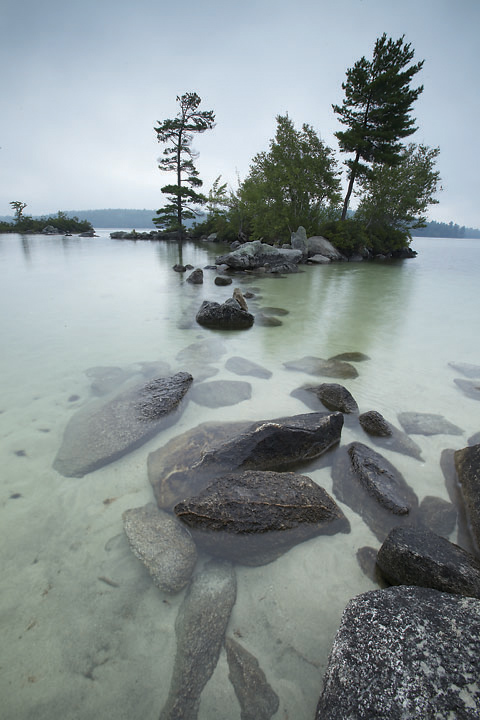
Stepping Stones
‹ PreviousLandscape GalleryNext ›

Stepping Stones

by Richie Graham

Gallery: LandscapePosted September 9, 2011245 views7 comments
I am not sure if this photo works as it lacks some of the drama and lighting typical of early mornings on Squam Lake. I was drawn to these stepping stone rocks and the little island. It was a foggy morning and the lake was very quiet and calm. Thank you for any input! Canon 5DM2, 16m, F22, 1.3s

Comments

7 comments
Comment posted by Aaron Feinberg on September 9, 2011 at 8:46 PM
Comp is decent...bit empty down the left side but go back and get some good light...not doing anything for me. Keep at it! :)

aF
Registered on October 26, 2009, 399 Posts, 2789 Comments
Comment posted by John Tobias on September 10, 2011 at 9:12 AM
I like this image, but it might be too monochromatic, lacking a wow factor. Not sure if I am saying this right. IMHO the photo needs some punch. Possibly being closer to the rocks, or a tighter crop. I would suggest trying different compositions and see what works. The photo needs to be rotated CC to level the horizon. Thanks for sharing, I do like the photo.
Registered on September 12, 2009, 2120 Posts, 6455 Comments
Comment posted by Jeffry Oonk on September 10, 2011 at 2:27 PM
Like the idea of the image and you did well capturing it.
Personally I like the monogrammatic coloration.
Beside the slide rotation that needs to be done there is a weird force in the frame that leans to the right: The rocks in the water and the tree on the tree on the right form a strong diagonal that seem to out balance the frame.

Thx for posting
jef
Registered on February 5, 2011, 21 Posts, 122 Comments
Comment posted by Tony Kuyper on September 10, 2011 at 3:23 PM
Yes, the stones do indeed walk me into the scene quite nicely. It seems that compostionally the trees might work better perfectly centered.
Registered on November 1, 2003, 364 Posts, 22328 Comments
Comment posted by Luis Argerich on September 10, 2011 at 4:33 PM
Hi Richie,
For some reason I think this would be great in B&W it reminds me the classic Japanese landscape paintings. I think it has great potential but I'm not sold on this color version.
Registered on December 22, 2009, 91 Posts, 1349 Comments
Comment posted by Lucy Aron on September 11, 2011 at 4:36 PM
Even though the light is a bit flat, the low angle is surprising and effective. Also like the subtle colors.


lucy
Registered on February 25, 2011, 189 Posts, 1160 Comments
Comment posted by David Edwards on September 12, 2011 at 5:27 AM
Quite a nice comp, Richie. I like the subtle green/blue tones, but the lighting is quite glary, I guess from the foggy conditions.
Registered on December 6, 2008, 142 Posts, 2623 Comments