Nature Photographers Network
This is the preserved archive of the original Nature Photographers Network. The community continues at naturephotographers.network.
Red Leaf Intimate
‹ PreviousLandscape GalleryNext ›

Red Leaf Intimate

by Bill Chambers

Gallery: LandscapePosted September 6, 2011212 views17 comments
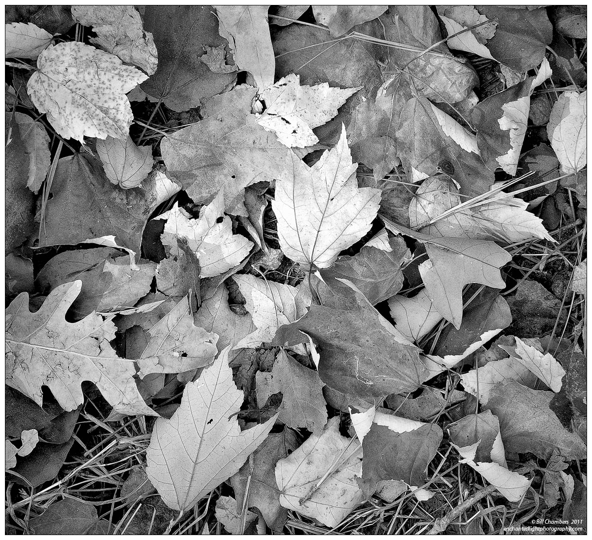
Yeah, yet another B&W vs color image for you. Thanks for tolerating my questions for this. I'm deciding whether to print a group of four of these leaf images in B&W or color, and am asking others for their opinions. So far, it definitely seems to break down into polar opposite camps of photographers vs. non-photogs. Non-photgs prefer the color version 100% so far, while photogs prefer the B&W about 95%. Please let me know which you prefer, but don't let these figures sway you.

Anyway, this one isn't quite square formatted as posted here, but will be for the final print. Silver Efex pro used for conversion, emulating Kodak ISO 32 Pan X film.

D2x w/ 28-79 @ 38mm
.3 sec @ f/11 - MLU & mc-30 remote release
100 ISO
No filters
Tripod
Capture One 6, CS4, Silver Efex Pro, TK's actions

Your thoughts are greatly appreciated. Thanks for looking and sharing.

Comments

17 comments
Comment posted by Bill Chambers on September 6, 2011 at 10:29 PM
Color version here.....
Registered on April 10, 2005, 753 Posts, 21216 Comments
Comment posted by Chris Chamberlain on September 6, 2011 at 10:38 PM
BLACK AND WHITE! Again, the colors are nice, but the texture and detail just seem to come out better with the conversion. And, this one has the light, and dynamics I was asking for with the previous post. Maybe it isn't there to this level in that one?
This one is about perfect in all respects, imo
Registered on March 13, 2007, 500 Posts, 8365 Comments
Comment posted by Anthony Vincent on September 6, 2011 at 10:50 PM
Lovely detail Bill. I so excited for fall and this makes me even more anxious. I like your framing and the color version is a nice treat. May I suggest a little vignette in the bw version or even Tk's edge burning.
Great catch and thanks for sharing
Registered on February 5, 2009, 199 Posts, 2775 Comments
Comment posted by Bill Chambers on September 6, 2011 at 10:53 PM
Thanks guys! Anthony, both versions received the same amount of vignetting (-1.04 in Capture One 6), it's just more noticable in the color version I think.
Registered on April 10, 2005, 753 Posts, 21216 Comments
Comment posted by Joseph Campisi on September 7, 2011 at 12:37 AM
Hmmm...hard choice for me Bill. I agree with Chris about the texture and detail in the B&W, but the color version really pops...gotta think about this one a bit!
Registered on November 24, 2008, 304 Posts, 3211 Comments
Comment posted by Anthony Vincent on September 7, 2011 at 12:38 AM
Ya, I totally see it in the color. Maybe just a touch me in the bw :biggrin:
Whatever your fancy Bill. Its gorgeous as is. :toast:
Registered on February 5, 2009, 199 Posts, 2775 Comments
Comment posted by Lon Overacker on September 7, 2011 at 2:47 AM
Bill,

I failed to comment on your previous post of this subject, but I'm right there with Chris - b&w for me in both cases. What's interesting for me is that the b&w version comes across as very natural where as the color version looks a bit more "arranged." Maybe it's the turned over leaves (which is of course natural...) but it's only in the color version that I think that. I really like the tonal range that the colors provide in the conversion.

A restful arrangement of leaves beautifully captured.

Lon
Registered on November 24, 2006, 521 Posts, 19147 Comments
Comment posted by Jose Viegas on September 7, 2011 at 4:21 AM
Color with a little bit more contrast for me :biggrin:
Registered on August 26, 2011, 3 Posts, 66 Comments
Comment posted by Hamed Musharbak on September 7, 2011 at 7:58 AM
the color version is much better Bill (IMO) :smile:

VERY RICH NATURAL COLORS :toast:
Registered on June 1, 2009, 372 Posts, 2282 Comments
Comment posted by Yiming Hu on September 7, 2011 at 8:52 AM
Again I side with non-photogs :biggrin: The bw version looks a little bit dry to me.

I think this version is better than your previous post -- I think leaves have better shapes and are better "arranged" here.
Registered on April 28, 2011, 38 Posts, 733 Comments
Comment posted by Eva McDermott on September 7, 2011 at 10:57 AM
B&W for me too Bill. As Chris said, the texture and ddetail seem more prominent in the B&W version.
Registered on January 4, 2009, 1015 Posts, 13229 Comments
Comment posted by Nick Bristol on September 7, 2011 at 4:57 PM
This is really nice Bill. These both look good, but I like the b/w version the best. I agree with Chris's comment about this one too. The texture, detail and the feel all seem better in the b/w version imo. Your conversion work looks awesome. This is not to say the color isn't nice, because it is!

Nick Bristol
Lone Rock, WI
Registered on February 1, 2004, 752 Posts, 14140 Comments
Comment posted by Wade Hardy on September 7, 2011 at 8:59 PM
Black and White! No doubt about it.
Registered on May 2, 2006, 121 Posts, 1824 Comments
Comment posted by Tony Kuyper on September 7, 2011 at 11:46 PM
B&W wins again. It seems carry on your tradition of making ordinary extraordinary.
Registered on November 1, 2003, 364 Posts, 22328 Comments
Comment posted by Morris McClung on September 8, 2011 at 9:13 AM
Really nice variety of tones and shapes. Excellent luminosity as well. Very nice, Bill.
Registered on May 7, 2007, 670 Posts, 19650 Comments
Comment posted by Harley Goldman on September 8, 2011 at 6:23 PM
Definitely B&W for me. Maybe a very little boost to the blacks to pop the contrast a touch?? Very nice image, Bill! Taking the ordinary and making it sing.
Registered on November 19, 2003, 586 Posts, 11271 Comments
Comment posted by Cory Freeman on September 10, 2011 at 12:02 PM
wonderful tones and textural detail Bill. The color image is pretty nice too. For the two images posted as is I think I prefer the color version. The b&w feels too light to me, i.e. too many similar tones. Take that with a grain of salt as I seem to prefer moody contrasty b&ws! ;)

For either versions I think I'd be tempted to emphasis that central lighter toned leaf by darkening the outer image more.
Registered on December 16, 2003, 107 Posts, 1341 Comments