Nature Photographers Network
This is the preserved archive of the original Nature Photographers Network. The community continues at naturephotographers.network.
Orchid
‹ PreviousFlora GalleryNext ›

Orchid

by Gary Yeoh

Gallery: FloraPosted September 4, 201119,084 views9 comments
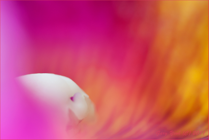
I struggle a lot with making abstracts, but I enjoy making them even though I get cramps and backache in the process. I wish the center of the orchid here is a bit sharper but I this is the best I can do as this was taken at the orchid display in HK Park where access and space for positioning are limited.

D90 50mm+32ET F2.2 1/125 HH. Thanks for looking and C&C appreciated.

Comments

9 comments
Comment posted by Ramamohan Pai on September 4, 2011 at 9:24 PM
Some brilliant colors (I'll post one this week which has similar colors in the background) and radiating lines in the background. The main white portion looks like a humanoid skull :eek: - I wish it were a wee bit more defined. Its OK to go right up to F/3.5 to F/4 with that combo without sacrificing the softness or the washes. Since the ETs are light, you can still handhold it at 1/50 or 1/60 Seconds :cool:
Registered on November 1, 2003, 550 Posts, 9037 Comments
Comment posted by Gary Yeoh on September 4, 2011 at 9:32 PM
Ram:
The white reminds me of helmet worn by the soldiers in Star Wars. :biggrin:

Thanks for your comments and the pointers - will remember to try smaller apertures in future.
Registered on September 1, 2009, 588 Posts, 8184 Comments
Comment posted by Pat Sampson on September 4, 2011 at 9:42 PM
Gary,

Beautiful color palette. I'm not really connecting with the comp but that's frequently a problem for me with abstracts.

pat
Registered on May 19, 2007, 953 Posts, 15989 Comments
Comment posted by Albert Darmo on September 4, 2011 at 10:40 PM
Hi Gary :wavey: Have to agree with Ram. looks like a skull being consumed by the fires of hades :eek: :eek: The colors are stunning, but intimidating. with the skull glowering :biggrin:
Albert Darmo
Canada
Registered on November 25, 2008, 1386 Posts, 11978 Comments
Comment posted by Monica Siri on September 5, 2011 at 10:33 AM
Gary,
I really like the vivid colors but, as Ram said, I'd have preferred the main white portion a bit more defined. :wavey:
Registered on September 20, 2009, 132 Posts, 3764 Comments
Comment posted by Mark Seaver on September 5, 2011 at 11:00 AM
The colors are really interesting and there's some nice flow on the right. I wish either that the center was sharp or that it was softer.
Registered on January 23, 2011, 1103 Posts, 17270 Comments
Comment posted by Charlie Baugh on September 5, 2011 at 3:34 PM
Gary, I haven't the slightest clue of how to go about "creating" an abstract like you and Ram and others post. I've tried it and usually the result is too distinct in detail. I've looked over lots of images of mine for small segments that might make nice abstracts. In this image of yours for instance, did you set out thinking "abstract" or came to that after shooting this flower with other things in mind?
Registered on April 18, 2011, 329 Posts, 1985 Comments
Comment posted by Daniel & Loana on September 5, 2011 at 4:00 PM
I agree with you that maybe a bit sharper center would work better, but I like the colours very much.
And I understand your problems of space!

Congrats

D&L
Registered on October 7, 2008, 166 Posts, 3044 Comments
Comment posted by Morris McClung on September 5, 2011 at 4:03 PM
Outstanding color washes, and I agree with those who wish for a little more in focus in the white center.
Registered on May 7, 2007, 670 Posts, 19650 Comments