Nature Photographers Network
This is the preserved archive of the original Nature Photographers Network. The community continues at naturephotographers.network.
Heron Version 2
‹ PreviousAvian GalleryNext ›

Heron Version 2

by Peter Conway

Gallery: AvianPosted August 28, 201184 views8 comments
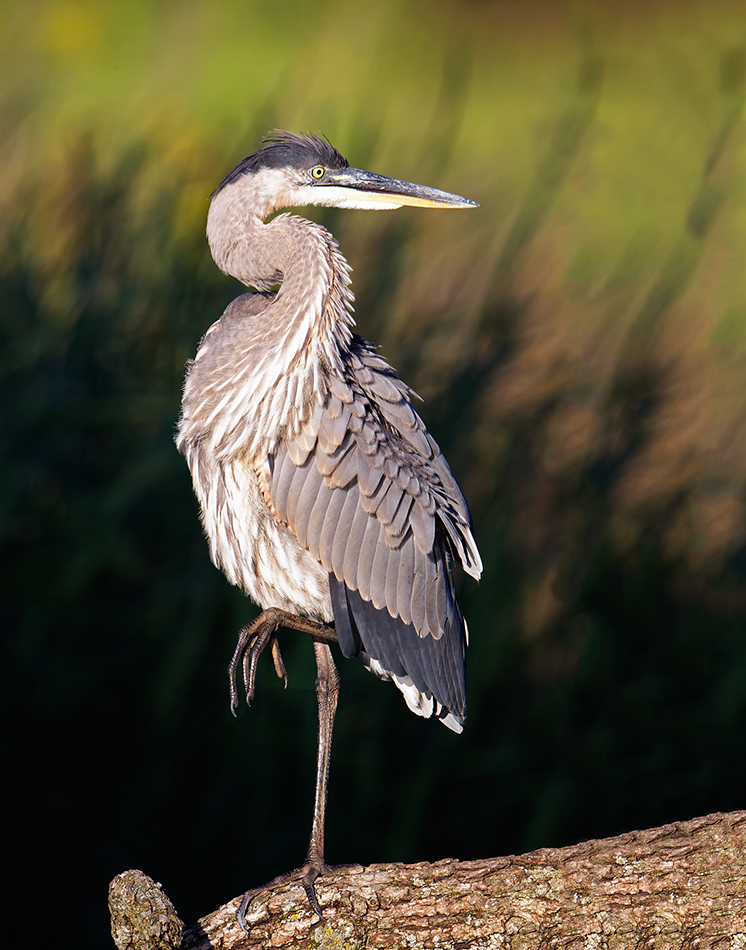
I posted this image last week with a centered composition. I quite liked it and composed it that way because I thought it added emphasis to the balance of the bird itself. Several people that I greatly respect felt the comp would be better with more room on the right. Because of that input I re-did the photo and I must say I think they were right. I did have to add some canvas to make this work, and I also used a Nik contrast filter this time.

This image went from one that I liked to one of my favorite Heron images (that I have taken). It demonstrates the value of NPN and the people that post here. I so appreciate the input! Thank you all.

Peter
larger image provided for detail



Comments

8 comments
Comment posted by Gary Gulash on August 28, 2011 at 11:08 PM
Very dramatic background for the unique pose, love the finished product. :toast:
Registered on January 28, 2005, 879 Posts, 12098 Comments
Comment posted by Dennis Plank on August 28, 2011 at 11:29 PM
Wonderful, Peter. I thought it was good before, and agreed with your crop, but i must admit I like this better. Excellent job on adding the canvas.
:toast:
Registered on January 28, 2008, 1767 Posts, 23192 Comments
Comment posted by Kurt Bowman on August 29, 2011 at 3:38 AM
Great shot is all I can say Peter! Love the exposure and the comp is excellent! The leg lift always adds a lot for me on these heron images.
Registered on June 19, 2008, 1005 Posts, 8028 Comments
Comment posted by Ron Bielefeld on August 29, 2011 at 6:42 AM
I like this comp better Peter. I do see where you added the canvas to the right as there are repeated patterns that I detected right away. If this were mine, I would do some additional work on the added canvas to remove the repeated patterns. Just a suggestion.
Registered on December 6, 2008, 360 Posts, 7132 Comments
Comment posted by Howard Cheek on August 29, 2011 at 8:08 AM
Love that pose and this comp works much better Peter.
Excellent job on adding the canvas, I looked closely at the LP and even took out my microscope :biggrin:
Well done! :toast:
Registered on July 24, 2008, 1201 Posts, 10758 Comments
Comment posted by Richard Ditch on August 29, 2011 at 12:47 PM
A nice pose and good composition as presented. Exposure a bit high on the chest and chin. I agree with Ron on the cloning/repeated pattern in the lower left [edit: lower RIGHT].
Registered on November 1, 2003, 1031 Posts, 12705 Comments
Comment posted by Peter Conway on August 29, 2011 at 1:48 PM
Thanks for the comments everyone. Ron and Richard, good suggestions, I will incorporate in my final file image.

Peter
Registered on June 25, 2007, 347 Posts, 3913 Comments
Comment posted by David Haynes on August 29, 2011 at 3:01 PM
Peter,
Sorry, I did not see the previous version so I can't give you a comparison. I too can tell where you added canvas but considering how detailed the background is you did a pretty good job. Could use a little more work though. As for the comp I think it's terrific. He's got more room to look into with an off center comp like this. The foot in the air is a very nice touch and everything is nice an sharp with good feather and leg detail. Love the log that he's standing on. There appear to be some areas where the whites are a little bit hot but I've been mentioning that for almost every comment this morning so maybe it's my monitor. Other than that what's not to like about this pose, background, and composition? I love it. Well done Peter. :toast:
Registered on February 20, 2010, 110 Posts, 1511 Comments