Gallery: LandscapePosted August 28, 2011178 views13 comments
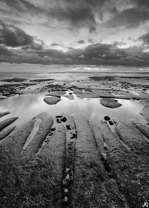
Encinitas, CA
Shot this last year and posted a different version back then... this one is vertical and b/w, while the other was horizontal and color.
Canon 5Dmk2, Zeiss 21mm.
Comments
13 comments
Comment posted by Philip Hodgkins on August 28, 2011 at 7:12 AM
Totally fine B/W, Jimmy! Good tonality and dynamic range, and I like the symmetry and balance. I believe I would clone out or tone down the minute white stuff under the cloud layer, at the horizon.
Registered on July 24, 2006, 2741 Posts, 12349 Comments
Comment posted by Joseph Kayne on August 28, 2011 at 12:17 PM
Registered on November 1, 2003, 573 Posts, 2619 Comments
Comment posted by Joseph Campisi on August 28, 2011 at 12:50 PM
Beautiful black and white conversion Jimmy, love the tones in this! Very dramatic shot!
Registered on November 24, 2008, 304 Posts, 3211 Comments
Comment posted by R.Bill Moser on August 28, 2011 at 1:53 PM
This looks very dramatic. The black & white conversion looks great
Registered on January 29, 2010, 285 Posts, 4281 Comments
Comment posted by John Mumaw on August 28, 2011 at 4:46 PM
An excellent choice for b&w, with a great range of tones. The composition and subject are quite appealing to me. Great leading lines and tonal gradients. I don't remember the last one, but I suspect that this one tops it.
Registered on September 9, 2005, 62 Posts, 2289 Comments
Comment posted by Hamed Musharbak on August 28, 2011 at 7:06 PM
very nice B&W
i like it
Registered on June 1, 2009, 372 Posts, 2282 Comments
Comment posted by Tony Kuyper on August 28, 2011 at 9:09 PM
Nice comp and light, Jimmy. Overall, it feels a bit gray to me, like there are a lot of mid-tones. It feels accurate for the light, but wonder if more contrast, especially in the clouds, would also add more drama.
Registered on November 1, 2003, 364 Posts, 22328 Comments
Comment posted by Jimmy Gekas on August 29, 2011 at 1:44 AM
A little more contrast and moodier clouds.
Registered on July 26, 2007, 244 Posts, 2807 Comments
Comment posted by David Edwards on August 29, 2011 at 2:05 AM
Very nice, Jimmy. Lovely patterns and shapes for b/w. Conversion and toning looks great.
.. repost looks better.
Registered on December 6, 2008, 142 Posts, 2623 Comments
Comment posted by Morris McClung on August 29, 2011 at 12:01 PM
I really like the silvery tones in this one, Jimmy. I also liked how your repost make the blacks even richer. Excellent comp and conversion!
Registered on May 7, 2007, 670 Posts, 19650 Comments
Comment posted by Phil Pogledich on August 29, 2011 at 3:29 PM
I prefer the repost . . . not a lot, but just enough to make a point of saying so. Overall this works very well for me. I like the composition and the conversion. One small critique that I'll offer is that I find the line of the horizon to be a bit indistinct in places. A little of dodging and burning (likely with some careful masking) could change that if you were so inclined.
Registered on August 24, 2009, 123 Posts, 3099 Comments
Comment posted by Nicolaus Wegner on August 29, 2011 at 6:11 PM
Great comp with the leading lines Jimmy.
Registered on February 21, 2010, 133 Posts, 1509 Comments
Comment posted by John Mumaw on August 29, 2011 at 8:31 PM
Great advice from Tony, and you used a subtle hand to achieve it. I prefer the repost myself now.
Registered on September 9, 2005, 62 Posts, 2289 Comments

Comments
13 commentsi like it
.. repost looks better.