Nature Photographers Network
This is the preserved archive of the original Nature Photographers Network. The community continues at naturephotographers.network.
Weed  Head a-glow
‹ PreviousFlora GalleryNext ›

Weed Head a-glow

by Christine Jackson

Gallery: FloraPosted August 20, 2011102 views14 comments
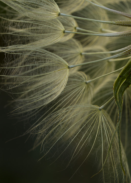
I believe this to be a "goats beard" weed. I thought the way the seed heads were back-lit made this specimen unique. However, I'm a bit unsure of the composition and would like some feedback. All comments/critiques appreciated. Thanks for viewing!

Canon 7D
100mm macro
f/8
1/30s
ISO 200

Chrisie Jackson
Denver, Colorado

Comments

14 comments
Comment posted by Charlie Baugh on August 20, 2011 at 10:56 AM
Composition is very pleasing and the presence of the leaf in a nice feature. I'm pretty sure you are correct in "goatsbeard". I really like that wildflower and don't see anywhere near enough of the blooms, which bloom for such a short time. Your focus is precise and you've captured the whispy stuff between the fingers of there seeds very well.
Registered on April 18, 2011, 329 Posts, 1985 Comments
Comment posted by Jeffry Oonk on August 20, 2011 at 11:25 AM
Nice composition and lighting.
The whole scene looks very fragile.
Well done.

Jef
Registered on February 5, 2011, 21 Posts, 122 Comments
Comment posted by Pat Sampson on August 20, 2011 at 1:26 PM
I like the image Christine and I certainly don't think there's anything wrong with the composition. For my tastes it might be stronger if the space around the seed heads echoed one seed head, so basically you'd have a curve created around the seed heads by space on their top and right as well as the left. (I'm imagining the image rotated 90 degrees to the right.) This assumes of course, that you could back up and get all of these in frame and have space on the top and right. (smile)

For my tastes this is good looking as posted.

pat
Registered on May 19, 2007, 953 Posts, 15989 Comments
Comment posted by Bill Fach on August 20, 2011 at 3:46 PM
Christine: This looks great to me. The inclusion of the leaf is a major plus for me. The only thing that would make this better for me is if the LLC was filled with the seed heads but it still looks great to me as is. >=))>
Registered on November 1, 2003, 1805 Posts, 26981 Comments
Comment posted by Philip Hodgkins on August 20, 2011 at 4:16 PM
I have no problem with the composition. It is nicely dimensional and is quite pleasing to the eye. A fragile and lovely image. No nits!
Registered on July 24, 2006, 2741 Posts, 12349 Comments
Comment posted by Carolyn Derstine on August 20, 2011 at 7:41 PM
I like the wispy feel to this photo, Christine. The backlighting does really help show their unique design. I like your DOF choice and I think the comp is great as is. Nice job!
Registered on February 16, 2011, 610 Posts, 3684 Comments
Comment posted by Ken Smith on August 20, 2011 at 7:58 PM
Great pov and wonderful details throughout this. Super shot!
Registered on September 5, 2008, 449 Posts, 2444 Comments
Comment posted by scott lanz on August 20, 2011 at 11:13 PM
I like the image, and I particularly like the stems at the top. I wonder about a vertical comp focusing on the stems in the top 1/3 of the image. Also consider a little more DOF. Just my thoughts.
Registered on November 14, 2003, 840 Posts, 12902 Comments
Comment posted by Richard Teller on August 20, 2011 at 11:30 PM
I like the image a lot. Very well seen and photographed. Very artistic.
Registered on August 23, 2010, 1162 Posts, 6692 Comments
Comment posted by Christine Jackson on August 21, 2011 at 9:09 AM
Thank you for all of your comments and the great feedback on the composition.


Chrisie Jackson
Denver, Colorado :smile:
Registered on September 19, 2010, 20 Posts, 244 Comments
Comment posted by Vincent Nobel on August 22, 2011 at 3:51 PM
Great find! Love the comp, lighting and overall attention to detail in this image! Nice!!!
Registered on June 16, 2010, 57 Posts, 175 Comments
Comment posted by Robert Dayton on August 23, 2011 at 5:09 PM
A great find, Christine!. I like the lines and repeating patterns. I'm on
the border as to whether or not the green leaf on the right adds any-
thing to the image. I would like to see the image brightened a little
more. I like your choice of depth of field. All in all a first rate posting.
Registered on November 11, 2008, 281 Posts, 3958 Comments
Comment posted by Morris McClung on August 23, 2011 at 7:11 PM
Simply marvelous.
Registered on May 7, 2007, 670 Posts, 19650 Comments
Comment posted by Howard Cheek on August 25, 2011 at 7:22 PM
I think the vertical comp/framing works well with the open space bottom. Not sure about the leaf RT side though..
I might've got out the scissors :wink: Totally subjective of course..
Would like to see it slightly brighter also. It has good symmetry and focus front as well:wavey:
Registered on July 24, 2008, 1201 Posts, 10758 Comments