Nature Photographers Network
This is the preserved archive of the original Nature Photographers Network. The community continues at naturephotographers.network.
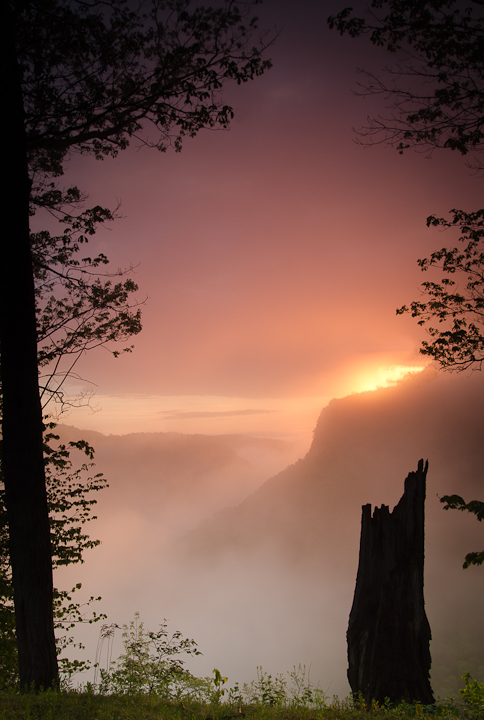
fog over Genesee river
‹ PreviousLandscape GalleryNext ›

fog over Genesee river

by Gerald Liddelow

Gallery: LandscapePosted August 16, 2011283 views14 comments
Hi all,I am a new member and this my first post.On a photo tour to Letchworth state park NY,I shot this among many other sunrise shots overlooking the Genesee river.My question is.Are the branches on the right distracting or are they good framing?
All comments are welcome.

Nikon D7000
18-55mm @ 18mm
10sec@f22

Comments

14 comments
Comment posted by Luke Ormand on August 16, 2011 at 10:18 PM
Brillant use of elements to create a natural frame and the glow coming from behind the mountain is fantastic. Branches aren't a distraction to me as they are complimented by the other side. As a New Yorker I'm amazed this was shot in my state - Long Island is certainly different than upstate!
Registered on February 4, 2009, 1093 Posts, 7035 Comments
Comment posted by Jim Sabiston on August 16, 2011 at 11:03 PM
Love the light in this. The branches are a plus in my view, gives a bit of 'sense of place'.
Registered on April 7, 2007, 134 Posts, 443 Comments
Comment posted by Michael J Greene, on August 17, 2011 at 12:33 AM
Welcome to NPN Gerald. Crazy light and great processing. The lower branches sticking next to the stump are definitely distracting (and an easy clone), the upper ones are slightly distracting for me, but obviously others like it as is. To me, it is either in or out and it looks like you were on the fence about the framing. Killer light and great shot from a unique place. Looking forward to seeing more.

Michael
Registered on June 18, 2009, 86 Posts, 2317 Comments
Comment posted by Vance Gese on August 17, 2011 at 1:01 AM
Beautiful light and color, Gerald. The framing of the leaves and trees seems to work quite well although I would consider removing the branches immediately to the right of stump as they seem to detract from the strength of the stump in your composition. The rest of the branches on the right hand side work fine in my opinion. Welcome to NPN and hope to see more images.
Registered on November 13, 2008, 298 Posts, 6629 Comments
Comment posted by Lon Overacker on August 17, 2011 at 1:56 AM
Gerald,

Welcome to NPN and the Landscape/ESS Gallery! Great to have you hear. And a wonderful first post. I really like the misty atmosphere and the light/color is beautiful. The branches all around work very well to frame this quite nicely. I can see Vance's suggestion about the branches to the right of the stump, but they don't bother me too much. Actually what distracts me more is the space on the left between the edge and the tree trunk. My little rule of thumb is either include something along the edge with purpose, or exclude it. I think that space fits that. However, cropping the left edge would left a slanted left edge because of the tree and I'm not sure that would be any better. But it's a minor issue for me regardless.

Otherwise, this is quite peaceful and enjoyable. This is a great image for a book or magazine cover!

Welcome aboard. We look forward to your images and contributions to NPN.

Lon
Registered on November 24, 2006, 521 Posts, 19147 Comments
Comment posted by Stan Rose on August 17, 2011 at 9:37 AM
Hi Gerald, welcome to NPN!
A very nice first post! The background is amazing! Great light and atmosphere. I think the framing could work in theory, the problem here is that there are too many distractions--the break on the left side, and the leaves on the lower right. If you want a 'frame', it should look like a frame usually (in other words you wouldnt buy a painting with a crooked or broken frame!). Personally, I could even do without the foreground tree stump--it's a competing element for me. IMO, when you have an extremely strong subject as you do here in the background, there's no reason to get fancy or try to 'enhance' it with other details--simpler is almost always better. The background here is incredible, and it can easily 'speak for itself'.
Look forward to more from you! :wavey:
Registered on September 15, 2005, 836 Posts, 17099 Comments
Comment posted by Bill Chambers on August 17, 2011 at 9:51 AM
Welcome to NPN Gerald, and a beautiful first post. As mentioned by a couple of others, I would clone the two small branches to the right of the stump. Other than that, I might cloning cropping a bot off the left side to remove the strip of light along the left edge of the frame. I find that slightly distracting, but not a deal killer. Looking forward to many future posts.
Registered on April 10, 2005, 753 Posts, 21216 Comments
Comment posted by Nick Bristol on August 17, 2011 at 7:06 PM
Hi Gerald, and welcome to NPN! A very pretty scene with these beautiful conditions. Makes for a wonderful mood. I too think the branches right of the stump are distracting and also the bright area on the left side of the tree at the left edge. Both of these already mentioned. Still a really pretty scene with a wonderful feel.

Nick Bristol
Lone Rock, WI
Registered on February 1, 2004, 752 Posts, 14140 Comments
Comment posted by Mark Seaver on August 17, 2011 at 9:08 PM
Beautiful light and color in the sky. Your framing works well here it helps maintain focus in the frame.
Registered on January 23, 2011, 1103 Posts, 17270 Comments
Comment posted by Tony Kuyper on August 17, 2011 at 10:01 PM
Welcome, Gerald. Very nice light here. The tree branches and foreground ground cover make a nice frame for the rest of the frame. Agree with Lon that the gap in the LLC is a bit distracting. If you have PS, you might be able to Edit>Transform this away.
Registered on November 1, 2003, 364 Posts, 22328 Comments
Comment posted by Gerald Liddelow on August 17, 2011 at 10:47 PM
Thanks everyone for your welcome and your comments/suggestions.I made some minor changes as per some suggestions and I think there is some improvement. Thank you all.
Registered on August 10, 2011, 30 Posts, 40 Comments
Comment posted by Aaron Feinberg on August 18, 2011 at 8:39 AM
Probably a bit tight on the right and bottom but lovely color and atmosphere. Nice catch

aF
Registered on October 26, 2009, 399 Posts, 2789 Comments
Comment posted by Nick Bristol on August 18, 2011 at 3:04 PM
Gerald, I think your repost really work out nice. What a wonderful feel this has. Liked it before as I had mentioned, but this is really wonderful now. Those couple of small things can, and did make a big difference. :toast:

Nick Bristol
Lone Rock, WI
Registered on February 1, 2004, 752 Posts, 14140 Comments
Comment posted by Shantikara Valuska on August 19, 2011 at 12:29 PM
Welcome to NPN! This is a very nice first post! The mystic mood and light in the background is amazing. With the framing, I also like something simple and I think with the repost it is working better.
:toast:
Registered on July 25, 2011, 38 Posts, 451 Comments