Nature Photographers Network
This is the preserved archive of the original Nature Photographers Network. The community continues at naturephotographers.network.
Scoured
‹ PreviousLandscape GalleryNext ›

Scoured

by Parnell Legg

Gallery: LandscapePosted August 16, 2011189 views7 comments
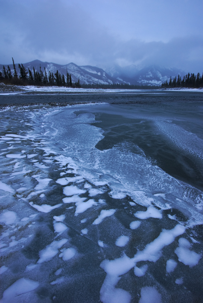
I have just joined NPN and I'm glad to associate with such a dazzling array of artists. I thought I should kick this off by placing a photo up for critique as I realised it is the next step to improvement. I chose this photo as it was on of my favourites but overtime I have realised that it may be more from the experience than the elements of the photo. So in the spirit of understanding my style and striving to create stronger images please comment (likes or dislikes). I look forward to reading your thoughts.
Cheers

Comments

7 comments
Comment posted by Jared Atencio on August 16, 2011 at 1:19 AM
Welcome to NPN Parnell! This definitely conveys a cold mood, both in subject and in color and tone. I do like the monochromatic nature here, and could even work as a straight B&W. The comp works for me, with the curving ice pattern leading through the image and to the peaks in back. For critique, it looks to me like the mountains are a bit soft in focus, so I'm curious what f-stop you shot this at? I would also like a little more definition in the clouds which you could probably partially achieve in PS with some simple selective curves/levels adjustments. Again, welcome to the community, hope this helps :toast:
Registered on June 23, 2009, 21 Posts, 422 Comments
Comment posted by Stan Rose on August 16, 2011 at 1:30 AM
Welcome to NPN, Parnell! I think Jared did a great job of summing up all the main points worth critiquing here, so I'll just add that I like the mood here, especially like the cool patterns up front, and it has me longing for the first mountain snows--which should hit in a few weeks here in CO! Look forward to seeing more from you! :wavey:
Registered on September 15, 2005, 836 Posts, 17099 Comments
Comment posted by Joel Hazelton on August 16, 2011 at 2:04 AM
What an awesome and dynamic foreground! I think Jared's critique is spot on.
Registered on August 6, 2008, 194 Posts, 1315 Comments
Comment posted by Kent Mearig on August 16, 2011 at 4:07 PM
I appreciate the very realistic look in the image, but at the same time I wish I could experience more of the foreground's textures through some selective contrast adjustments and brightening. It might take a larger presentation (print) to satisfy my curiosity. I don't know.
Registered on September 4, 2006, 237 Posts, 4748 Comments
Comment posted by Phil Pogledich on August 16, 2011 at 4:41 PM
Jared pretty much nailed the critique. Very nice first post overall. In addition to Jared's points, I might also suggest considering selectively brightening and perhaps desaturating the brighter tones in the foregound ice to help give it a bit more "pop".
Registered on August 24, 2009, 123 Posts, 3099 Comments
Comment posted by Parnell Legg on August 17, 2011 at 12:46 AM
Excellent! Thanks for your responses. Jared - the shot was taken at f16. There was a lot of cloud that obscured the mountains that day which whipped by as the wind was vicious so I think some crispness was lot there. However I also struggle with focusing and wearing glasses so it may be front focused as well. I tried to make them a little more contrasty to solidify the detail. It was an amazingly cold day when this was taken and everytime I removed my gloves my fingers instantly swelled and stung in the cold. Actually thinking about that Stan I'm not really longing for winter to much myself! Kent I tried to increase the size and still follow the guidelines though I don't know if that helps. And lastly Phil I tried to brighten and remove the blue tint from the highlights in the foreground as well as dodge a little to bring out the texture. I'm still wary of over processing so let me know if it has had enough of an effect.
Registered on August 15, 2011, 2 Posts, 1 Comments
Comment posted by Stan Rose on August 17, 2011 at 9:48 AM
I prefer your repost--better fg detail. You may want to add "repost" to your title--that lets people know you reworked. I also like the warmer color--but i'd guess i'm in the minority on that cause people usually prefer blue to gray.
Registered on September 15, 2005, 836 Posts, 17099 Comments