Gallery: FloraPosted August 4, 201182 views13 comments
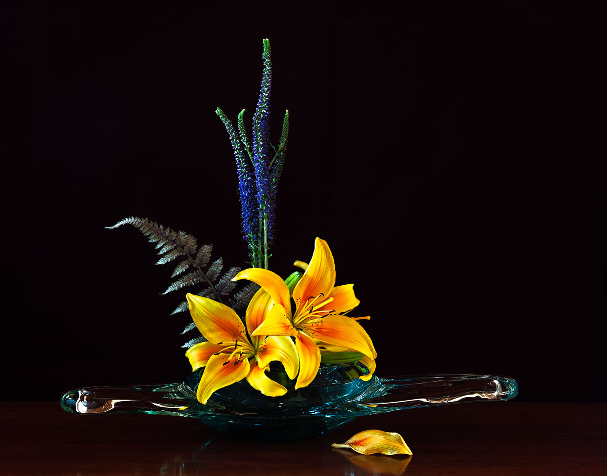
From the garden.
Canon 5D MkII 90mm T/S 16mm
All comments are most appreciated.
Comments
13 comments
Comment posted by Pat Sampson on August 4, 2011 at 8:33 AM
Gorgeous work Bob. I love the single petal and it's reflection on the table. I also like the lilies, bowl and fern. For that matter I like the blue flowers with the lilies. I'm having trouble with the spatial arrangement. I like the height from the blue flowers but it also requires you to bring in a lot more space into the image because of the width of the container. That consequently de-emphasizes the lilies and while I like triangle created, I think the height weakens the arrangement somewhat. You've got nearly an equilateral triangle here, the fern's tip disrupts that shape a touch but not much. I think the arrangement would be more interesting to me if the triangle were scalene or at least isosceles with a more acute angle on the viewer's right.
What I've described is a preference though and certainly not a weakness in the arrangement. Others may prefer this exactly as you've done it. It's a lot better than any arrangement I've done and I've been trying some lately.
I love the light, the table, the bg and the photography.
pat
Registered on May 19, 2007, 953 Posts, 15989 Comments
Comment posted by scott lanz on August 4, 2011 at 8:59 AM
Beautiful arrangement and image. The lilies are gorgeous, and everything else is very complementary. I do see Pat's point about the volume of negative space particularly in the URC. Before reading his comment, I thought about a crop off the right to reduce that space, but I do like the off center comp and cropping anything off the right may make this look like a misplaced centered arrangement, so I don't know. I do like this very much as presented.
Registered on November 14, 2003, 840 Posts, 12902 Comments
Comment posted by Charlie Baugh on August 4, 2011 at 9:57 AM
Pats word is just right for me too. Gorgeous! I can only imagine how much time this arrangement took to create and it worked out splendidly to my eyes (a non arranger).
Registered on April 18, 2011, 329 Posts, 1985 Comments
Comment posted by Ramamohan Pai on August 4, 2011 at 11:28 AM
Bob, I purely go by the aesthetic impact and this one has it in loads. I am no flower arranger either - no training, zero skills but I like what I see here.
The only thing that strikes me is the illusion (or otherwise) of a tilt for the Vase.
Other than that, superb photo
Registered on November 1, 2003, 550 Posts, 9037 Comments
Comment posted by Mark Seaver on August 4, 2011 at 11:55 AM
Bob, it's a beautiful arrangement and the black background really make the subject pop. The dropped petal is also a nice addition. I do find it just a bit stark and wonder about a softer background color.
Registered on January 23, 2011, 1103 Posts, 17270 Comments
Comment posted by Gary Yeoh on August 4, 2011 at 8:39 PM
Bob:
Stunning top notch photography! Perfect lighting conditions, tack sharpness and vibrant true colors.
From what I have read about flower arrangements, the western arrangements are usually more symmetrical and the japanese style which I have started doing are usually more asymmetrical. I think overall the floral arrangement itself looks good and pleasing to the eye. However I think there is a disconnect between the symmetry in arrangement and the irregular shape of container. The flowers orientation is vertical and the container is horizontal. This arrangement will probably work better with a taller and narrow container. The photography here is so outstanding that it may be worth experimenting with different crop such as portrait framing (cutting off the wings of the container) and see if this works.
I am liking what you are doing here and look forward to seeing more of your arrangements.
Registered on September 1, 2009, 588 Posts, 8184 Comments
Comment posted by Morris McClung on August 4, 2011 at 8:46 PM
Oh, that's so good it's sick! Pure art.
Registered on May 7, 2007, 670 Posts, 19650 Comments
Comment posted by Bob Duff on August 5, 2011 at 6:01 AM
Thanks for everyones comments. I truely appreciate them and try to encorporate the learnings.
Combining Pat's comments about the the spatial arrangement and Gary's comment about "cutting off" the wings, I tried a little content aware scaling in PS to work on the wings of the vase and bring them in a bit on both sides and to scale the ferm fron tip to alter the perspective and reduce the negative space so it isn't as stark. Given there was only so much one could do with the existing image, does this reworked "arrangement" work better or still needs more refinement (probably does but I'm afraid to mash the pixels too much )
Registered on April 21, 2010, 160 Posts, 1675 Comments
Comment posted by Ian Wolfenden on August 5, 2011 at 7:18 AM
Wonderful arrangement, Bob, and a superbly lit image ! So much is good about this - the choice of vase which seems to suit the lilies perfectly, the dropped petal and the overall colouring particularly come to mind. I do like the repost and feel it is stronger still.
Registered on May 18, 2007, 1108 Posts, 7647 Comments
Comment posted by Wayne Willison on August 5, 2011 at 8:23 PM
This is a wonderful piece, Bob. The whole arrangement shows tons of thought and effort. I like the low key lighting effect, yet it dances with color and texture. The flowing lines of the glass adds a sense of real motion. And I'll go against the grain here by saying I like the original best, especially for its use of included space.
Registered on April 10, 2009, 292 Posts, 3967 Comments
Comment posted by Giuseppe Guadagno on August 7, 2011 at 2:32 PM
What a beauty, Bob and what colors! In the colors of the vase there are all the colors of its content. I think you have done a good job for the repost, that I like much better. Splendid!
Take care.
Registered on February 3, 2007, 827 Posts, 5052 Comments
Comment posted by Albert Darmo on August 7, 2011 at 10:03 PM
Hi Bob Love the comp,. color and light. still trying to love the vase
Albert Darmo
Registered on November 25, 2008, 1386 Posts, 11978 Comments
Comment posted by Robert Dayton on August 8, 2011 at 10:08 PM
A very creative and artistic rendition, Bob. The leaf on the
table adds that little bit of extra bazaaz to the image.
Registered on November 11, 2008, 281 Posts, 3958 Comments

Comments
13 commentsWhat I've described is a preference though and certainly not a weakness in the arrangement. Others may prefer this exactly as you've done it. It's a lot better than any arrangement I've done and I've been trying some lately.
I love the light, the table, the bg and the photography.
pat
The only thing that strikes me is the illusion (or otherwise) of a tilt for the Vase.
Other than that, superb photo
Stunning top notch photography! Perfect lighting conditions, tack sharpness and vibrant true colors.
From what I have read about flower arrangements, the western arrangements are usually more symmetrical and the japanese style which I have started doing are usually more asymmetrical. I think overall the floral arrangement itself looks good and pleasing to the eye. However I think there is a disconnect between the symmetry in arrangement and the irregular shape of container. The flowers orientation is vertical and the container is horizontal. This arrangement will probably work better with a taller and narrow container. The photography here is so outstanding that it may be worth experimenting with different crop such as portrait framing (cutting off the wings of the container) and see if this works.
I am liking what you are doing here and look forward to seeing more of your arrangements.
Combining Pat's comments about the the spatial arrangement and Gary's comment about "cutting off" the wings, I tried a little content aware scaling in PS to work on the wings of the vase and bring them in a bit on both sides and to scale the ferm fron tip to alter the perspective and reduce the negative space so it isn't as stark. Given there was only so much one could do with the existing image, does this reworked "arrangement" work better or still needs more refinement (probably does but I'm afraid to mash the pixels too much
Take care.
Albert Darmo
table adds that little bit of extra bazaaz to the image.