Nature Photographers Network
This is the preserved archive of the original Nature Photographers Network. The community continues at naturephotographers.network.
About to Burst
‹ PreviousFlora GalleryNext ›

About to Burst

by Jonathan Heywood

Gallery: FloraPosted July 18, 201139 views8 comments
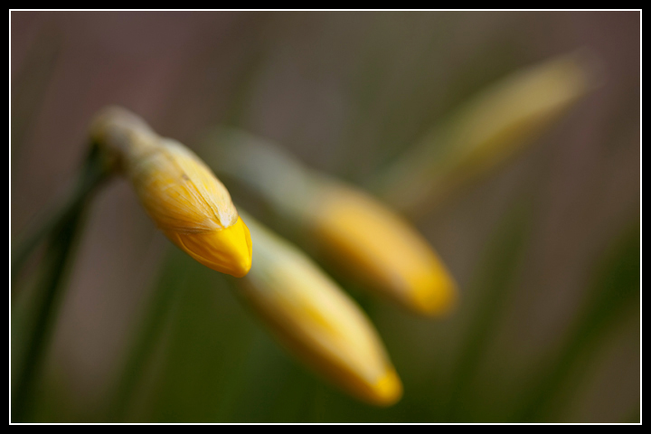
I don't often shoot floral subjects, I'm really more of a landscape guy, but I figured I would see what you thought of this one from the spring of 2010. Daffodils just before opening.

Canon 5D MKII
EF 100mm f/2.8 macro
f/2.8
ISO 100
1/5th second

All comments and critiques are welcome and appreciated.

Comments

8 comments
Comment posted by Pat Sampson on July 18, 2011 at 7:47 PM
Interesting image Jonathan. The detail and color on the in focus bud is very compelling for me.

I don't recall commenting on one of your images before, so welcome to the gallery. I'm looking forward to seeing more of your work. I've enjoyed analyzing or trying to analyze this image. I'm still not sure about it and will revisit it.

pat

Registered on May 19, 2007, 953 Posts, 15989 Comments
Comment posted by Gary Yeoh on July 19, 2011 at 3:10 AM
Jonathan:
The thumbnail does not quite show the nuances in this image. The selective focus on the front bud really anchors the image and blurring bg is very compelling. Engaging image.
Registered on September 1, 2009, 588 Posts, 8184 Comments
Comment posted by Pat Sampson on July 19, 2011 at 8:26 AM
I think the problem I'm having analyzing this is the mood and what I perceive to be contradictory messages in the image. The overall mood of this image is somewhat sinister to me. I've been trying to figure out why and I think it's mostly the shapes, the bg colors and the light value. The buds make me think of a claw or maybe a snake. While the yellow would normally be warm, the wash mostly masks the warmth at least for me. Also the light illuminates but doesn't warm the mood. Maybe "sinister" is too strong but I certainly think "somber" fits the image. The concept and title suggest Spring and new life but the image elements themselves seem to convey the opposite to me.

Others may not be seeing it this way and this may just be my reaction to it.

I like the image and find it very interesting but for me at least, it's certainly not your typical "happy little Spring image" and I'm fine with that. Very interesting work and a strong composition.

pat
Registered on May 19, 2007, 953 Posts, 15989 Comments
Comment posted by Krunal Janani on July 19, 2011 at 8:49 AM
I like this Jonathan, i think the tip of the bud which is in focus looks a bit blown on my monitor maybe u take tone it down by a bit
Registered on September 16, 2010, 60 Posts, 1370 Comments
Comment posted by Nancy Lea Sandy on July 19, 2011 at 9:26 PM
It works for me until I get to the furthest bud. The contradicting angle and extreme blur make it more of a distraction, IMO, than an asset and I would suggest doing away with it. The rest is very interesting and well done.
Registered on January 24, 2011, 576 Posts, 6942 Comments
Comment posted by Bob&Charly Nelson on July 20, 2011 at 10:02 AM
Great DOF/POF used here Jonathan. The fade to OOF is what I like.
Bob
Registered on October 27, 2005, 289 Posts, 4202 Comments
Comment posted by Ingrid Vekemans on July 21, 2011 at 11:31 AM
I love the composition and the DOF you've chosen. The photo wouldn't have the same appeal to me if those OOF daffodils weren't there. :toast:
Registered on August 2, 2010, 138 Posts, 780 Comments
Comment posted by Bill Fach on July 21, 2011 at 4:55 PM
Jonathan: Sorry to be so late to this party and to welcome you to the finest Flora gallery on the planet. I like your DOF/POF choice and the color palette. Faced with this same scene I probably would have positioned the flowers a little higher in the frame and then also cropped from the right to 5:4 ratio. Well seen and captured. Hope you shoot more flowers and hang out here more.>=))>
Registered on November 1, 2003, 1805 Posts, 26981 Comments