Nature Photographers Network
This is the preserved archive of the original Nature Photographers Network. The community continues at naturephotographers.network.
Friendly?+Repost
‹ PreviousPhoto Art GalleryNext ›

Friendly?+Repost

by Steve Balke

Gallery: Photo ArtPosted July 4, 201170 views5 comments
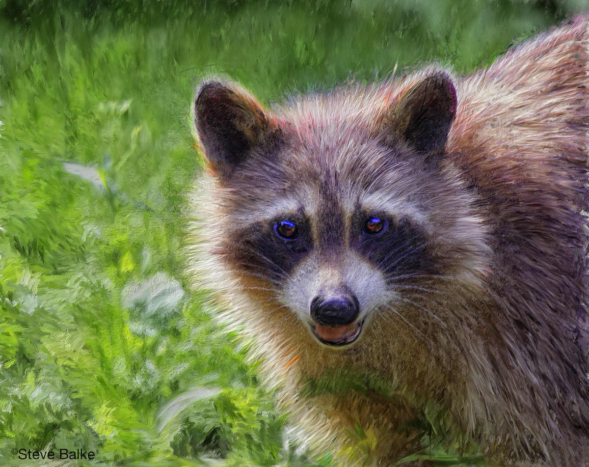
Maybe….maybe not… As I stated in the posting of the original photograph in the Wildlife Gallery, I didn't test her friendliness.

I like the original image. However, at the same time I wanted to see if I could bring more life to the image by using it as the basis for a digital painting. This involved using mostly Corel Painter 12 except for a few finishing touches in PS. I'm still very new to Painter 12. Here, I tried various methods: building the painting by combining a series of layers, each one painted with a different brush size; working on the flattened image with different brushes (notably impasto brushes in an attempt to provide more of a three dimensional look); two different versions of the image as a basis for the painting (the original and one obtained by applying HDR); finally adding a texture. I've included a large version. I find it interesting to magnify the image to see the brush strokes, etc.

In addition to the generally different look of the Photo Art version compared to the original, note the change in the bg, the new "hair dye" job given the raccoon and the glistening eyes.

All comments most welcome.

Original image:
1D Mark IV, 400 mm f/5.6, 1.4x TC, hand held: ISO 800, 1/640 s, f/8, 0 EV, 13.4 MP (84% of 16 MP full frame), NR, exposure adjustment, sharpening.

Comments

5 comments
Comment posted by Ron Pederson on July 4, 2011 at 6:21 PM
I think the "dye job" on the fur coat works fine; the thick coat lends itself to the brush strokes you've used. I think I'd consider a square crop with this one; not much of interest happening on the left hand side and would shift more focus to the face.
Registered on October 19, 2010, 95 Posts, 470 Comments
Comment posted by John Tobias on July 4, 2011 at 8:39 PM
Sorry Steve, don't care much for this version. Do like the original.
Registered on September 12, 2009, 2120 Posts, 6455 Comments
Comment posted by Carol Hyman on July 5, 2011 at 2:09 PM
Hi Steve, I much prefer the image in Wildlife over this one. I think if you open up the shadows around the eyes in that image, you'll have a real winner.

In this image, there's bit of overlap between your background and the animal; however, I'm sure that's because you're new to Painter 12.

Sincerely,

Carol
Registered on January 18, 2007, 597 Posts, 8062 Comments
Comment posted by David W. Kelly on July 6, 2011 at 7:04 PM
I really like the painterly look of the Bg and I agree with Ron's comment on the square crop. A nice image overall.
Registered on October 7, 2005, 883 Posts, 6590 Comments
Comment posted by Steve Balke on July 10, 2011 at 12:59 PM
Well, pretty diverse comments! Thank you. Looks like I've got more work to do in improving my abilities here. Regarding Ron and David's suggestion about using a square crop, my first reaction was that I hated to see that nice vegetation cropped out. However, here it is: I do agree that it definitely improve emphasis on the raccoon and I think it makes the shot more intimate too.
Registered on June 18, 2009, 229 Posts, 2915 Comments