Nature Photographers Network
This is the preserved archive of the original Nature Photographers Network. The community continues at naturephotographers.network.
The colour of rocks
‹ PreviousLandscape GalleryNext ›

The colour of rocks

by Morkel Erasmus

Gallery: LandscapePosted July 1, 2011175 views8 comments
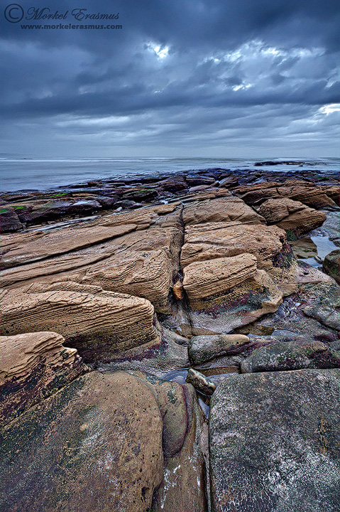
I do not get a chance to photograph seascapes often, mostly because when I do go on a trip, I prefer going to the African bush or the desert in search of wildlife and whatever great light falls on the landscape.

During a recent trip to family on the South African Wild Coast, I spent some time with a friend and fellow photographer on a lovely patch of beach. There was some cloud cover at 5am and we were hopeful for some good light...yet it was not to be, the horizon closed up pretty soon after we arrived. We decided to still try and create some imagery (didn't wake up at 4am for nothing).

I loved the textures and colours in the rocks, and the overcast light enhanced the details and mood for me.

All critique welcome!

Techs:
Canon 7D with 10-22mm USM @ 10mm
f22 @ ISO-100
Blend of 3 exposures

Own nit - the patches of blown highlight where the sun shone through the clouds...my underexposed images wasn't underexposed enough to tame them properly :razz:

Comments

8 comments
Comment posted by Luis Argerich on July 1, 2011 at 6:26 PM
Hi Morkel,

I like a lot the level of detail you captured here, it makes the foreground really awesome.
To my eyes the sky asks for a horizontal framing and the rocks for a vertical framing. So I'm 50-50 about which one would be better.
Registered on December 22, 2009, 91 Posts, 1349 Comments
Comment posted by Stan Rose on July 1, 2011 at 6:35 PM
I feel your pain with the overcast conditions...
Good job making lemonade, though--some cool lines and color contrast here.
I agree with Luis, so IMO a 50/50 crop would work best here--most of the cool part of the rocks is up top, and i think a 50/50 split would really emphasize the warm/cool contrast from sky to rocks here. :wavey:
Registered on September 15, 2005, 836 Posts, 17099 Comments
Comment posted by Eva McDermott on July 1, 2011 at 9:42 PM
Fantastic rock, sky, and sea scape Morkel. Now that both Luis and Stan mentioned it, I think a 50/50 slit would work great here. Beautiful none the less.
Registered on January 4, 2009, 1015 Posts, 13229 Comments
Comment posted by Scott Smorra on July 1, 2011 at 10:04 PM
I think this turned out pretty good Morkel. I like the lines and textures in the foreground and the sky works well here. The blown out areas in the sky really don't bother me much.
Registered on November 2, 2009, 161 Posts, 2143 Comments
Comment posted by dean hebert on July 2, 2011 at 12:46 AM
I like the lines and textures. I can see what they're saying about a 50/50 comp, but I prefer a bit of a crop from the top to emphasize the rocks. :toast:
Registered on August 4, 2010, 70 Posts, 1132 Comments
Comment posted by Tony Kuyper on July 2, 2011 at 4:46 PM
Nicely done all around, Morkel. The rhythms and textures here are very appealing.
Registered on November 1, 2003, 364 Posts, 22328 Comments
Comment posted by Morkel Erasmus on July 3, 2011 at 5:26 AM
Thanks for the kind feedback, folks.

Do you guys mean a 50/50 split with less FG, more sky so the horizon is centered?
Registered on March 22, 2011, 385 Posts, 2068 Comments
Comment posted by John Williams on July 4, 2011 at 10:27 AM
My favorite part is the great lines in the rock, so I wouldn't crop too much off. Maybe to just below the first shelf of rock on the left? Regardless, this came out pretty good considering the conditions.
Registered on September 6, 2007, 221 Posts, 5985 Comments