Nature Photographers Network
This is the preserved archive of the original Nature Photographers Network. The community continues at naturephotographers.network.
Existence (plus revision)
‹ PreviousLandscape GalleryNext ›

Existence (plus revision)

by Kah Kit Yoong

Gallery: LandscapePosted June 28, 2011355 views23 comments
West Coast, NEW ZEALAND

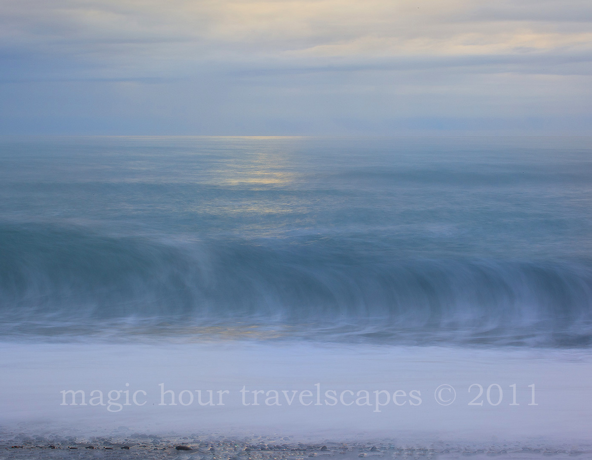
Bit of a change of pace from the drama I the last couple of posts. While everyone was photographing the interesting driftwood on this beach, I tried my hand at an abstract seascape....

Canon 5DMkII, 70-300mm @100, ISO 50, f29, 2.5s.

View the large version if possible.

Comments

23 comments
Comment posted by Anand Narayanan on June 28, 2011 at 12:50 AM
Awesome eerie surreal feel to it :toast: :toast: :toast:

This is largely subjective, but i would crop away the foreground pebbles. They take away a bit of mystery.
Registered on October 25, 2009, 110 Posts, 835 Comments
Comment posted by Lon Overacker on June 28, 2011 at 12:58 AM
Kah Kit,

Soft and gorgeous; a wonderful seascape. Now I call it a seascape cause I'm gonna go where Anand just went. Not only would I consider cropping the line at the bottom, but also cropping the brightest areas at the top of the frame. I say that because that reduces the image to something about light and form. As presented, it's a beautiful seascape with much less mystery and intrigue; ie. less of an abstract. Don't get me wrong, I love the image and think it's beautiful. So take my suggestions as an alternate presentation rather than a nit pick. Hope that makes sense. And I wouldn't make these suggestions unless I thought the image was worth it. and this certainly is.

Lon
Registered on November 24, 2006, 521 Posts, 19147 Comments
Comment posted by Danny Laureys on June 28, 2011 at 2:59 AM
Excellent shot, I love this. I do agree with previous posts, crop bottom with pebbles and brightest area on top. :toast: :toast: :toast:
Registered on January 5, 2008, 590 Posts, 1261 Comments
Comment posted by Ian Cameron on June 28, 2011 at 4:29 AM
Hi Kah Kit that's very much my preference in style for seascapes. I love the effect of the ethereal wave rearing up and the lemon yellow reflected sun/moonlight playing across the surface water with no low key elements present what-so-ever. On a personal note I find this style of picture sells like hot cakes for me as there is nothing daunting to the home owners restful eye. I have also found the opposite to be true in respect of this style of image for photographic competitions it's lack of immediate impact causes it to be bypassed in favour of the wide angle dramatic hyper coloured look, only if the image makes the first cut does it progress rather better and do very well, perhaps because it spends a longer time being scrutinised. These images certainly grow on me.
Registered on August 6, 2004, 1125 Posts, 3318 Comments
Comment posted by Kah Kit Yoong on June 28, 2011 at 4:56 AM
Thanks for the suggestions. Here's the bottom cropped and a grad applied over the top to darken it. Ian, I think you've summed up the seascape market very well :)
Registered on September 27, 2006, 636 Posts, 10682 Comments
Comment posted by Nick Bristol on June 28, 2011 at 6:45 AM
Kah Kit, This is wonderful and I just love the feel of it. I'm glad you tried this because you came away with a beautiful image. The light, sky and water all look fantastic. It is so easy to look at this and it leaves you with a very calming feel. I like it alot. The suggestions you did with the repost look perfect to me. I very much can see this hanging on a wall.

Nick Bristol
Lone Rock, WI
Registered on February 1, 2004, 752 Posts, 14140 Comments
Comment posted by Rob Graham on June 28, 2011 at 7:41 AM
very peaceful, especially the second version, well done
Registered on August 22, 2006, 842 Posts, 2824 Comments
Comment posted by Alister Benn on June 28, 2011 at 8:15 AM
My initial response was exactly the same as Lon, the crop of the repost and the added grad really helped, and I think it's way better now...

Agree, that this style of image is very pleasing, and the simplicity is very appealing. Trad seascapes are very in your face... (guilty as charged!)
Registered on June 9, 2011, 23 Posts, 258 Comments
Comment posted by Pedro Bento on June 28, 2011 at 8:28 AM
It is a moonset?

I love this kind of abstracts, your interpretation of the scene is really good!

PB
Registered on September 2, 2007, 45 Posts, 761 Comments
Comment posted by Eva McDermott on June 28, 2011 at 9:00 AM
I love this Kah Kit! Simply gorgeous and breathtaking.
Registered on January 4, 2009, 1015 Posts, 13229 Comments
Comment posted by Bill Chambers on June 28, 2011 at 9:29 AM
The repost is absolutely gorgeous Kah Kit. Great eye to see this and perfect tiing on the wave.
Registered on April 10, 2005, 753 Posts, 21216 Comments
Comment posted by Jorne de Bruin on June 28, 2011 at 10:33 AM
Lovely abstract seascape, I really like the repost, the softness of it all makes it kind of dreamy! :toast:
Registered on June 26, 2008, 178 Posts, 2136 Comments
Comment posted by Randy Wilson on June 28, 2011 at 11:00 AM
Love the textures and subtle hues and the gentle light and much prefer the re-post as it removes any intrusion of concrete reality into this wispy surreality.
Registered on June 25, 2009, 7 Posts, 85 Comments
Comment posted by Art Escobado on June 28, 2011 at 12:06 PM
This is well captured. But I would do a pano crop horizontal along the sun lit area top to bottom...you probably didn't want to hear that. The eye needs more push to move through this image and a tight pano crop provides that.

Great colors!

Ahh didn't see the repost. Perfect crop there.
Registered on January 7, 2007, 0 Posts, 775 Comments
Comment posted by R.Bill Moser on June 28, 2011 at 2:46 PM
Excellent shot. The large version is even better. I love both version but the repost is a bit stronger.Well done :toast:
Registered on January 29, 2010, 285 Posts, 4281 Comments
Comment posted by Sarah Marino on June 28, 2011 at 3:21 PM
Hi Kah Kit - The hint of light of the water adds so much beauty to this image. I really like the report, as I think it focuses on the best parts of the scene. Really beautiful.
Registered on November 10, 2008, 23 Posts, 393 Comments
Comment posted by Phil Pogledich on June 28, 2011 at 3:35 PM
Very pleasing seascape. The repost looks very good and your shutter speed complements the soothing colors nicely to add a bit of a dreamy quality to the scene.
Registered on August 24, 2009, 123 Posts, 3099 Comments
Comment posted by John Williams on June 28, 2011 at 9:12 PM
This is subtly brilliant. I much prefer the crop. This is one of those photos that seems so flat at first glance, and then with study there is much for the eye to wander through and enjoy. Each of the different sections then reflects that same theme, almost like a fractal effect. Superb.
:toast:
Registered on September 6, 2007, 221 Posts, 5985 Comments
Comment posted by Gary Crabbe on June 28, 2011 at 9:46 PM
Man, I just love the soft ethereal pastel layers you have in this image. Very sweet, indeed.
Registered on November 1, 2003, 182 Posts, 1840 Comments
Comment posted by Dietrich Gloger on June 29, 2011 at 7:50 AM
Wow, fantastic. Really amazing. A large print will be an experience for sure.
Registered on January 26, 2007, 360 Posts, 9876 Comments
Comment posted by Kah Kit Yoong on June 29, 2011 at 10:22 AM
Thanks very much. The crop certainly is an improvement. The golden glow for those wanted to know is sunset not moonlight. It would have been to dark to shoot this scene at night.
Registered on September 27, 2006, 636 Posts, 10682 Comments
Comment posted by Stefan Gimpl on June 30, 2011 at 8:24 AM
I like the cropped version. simple and good :toast:
Registered on May 12, 2007, 26 Posts, 184 Comments
Comment posted by Daniel Ewert on July 1, 2011 at 8:15 AM
Brilliant! Second version for me :)
Registered on June 2, 2009, 103 Posts, 1500 Comments