Nature Photographers Network
This is the preserved archive of the original Nature Photographers Network. The community continues at naturephotographers.network.
Butterfly Arch
‹ PreviousLandscape GalleryNext ›

Butterfly Arch

by Jared Atencio

Gallery: LandscapePosted June 16, 2011277 views18 comments
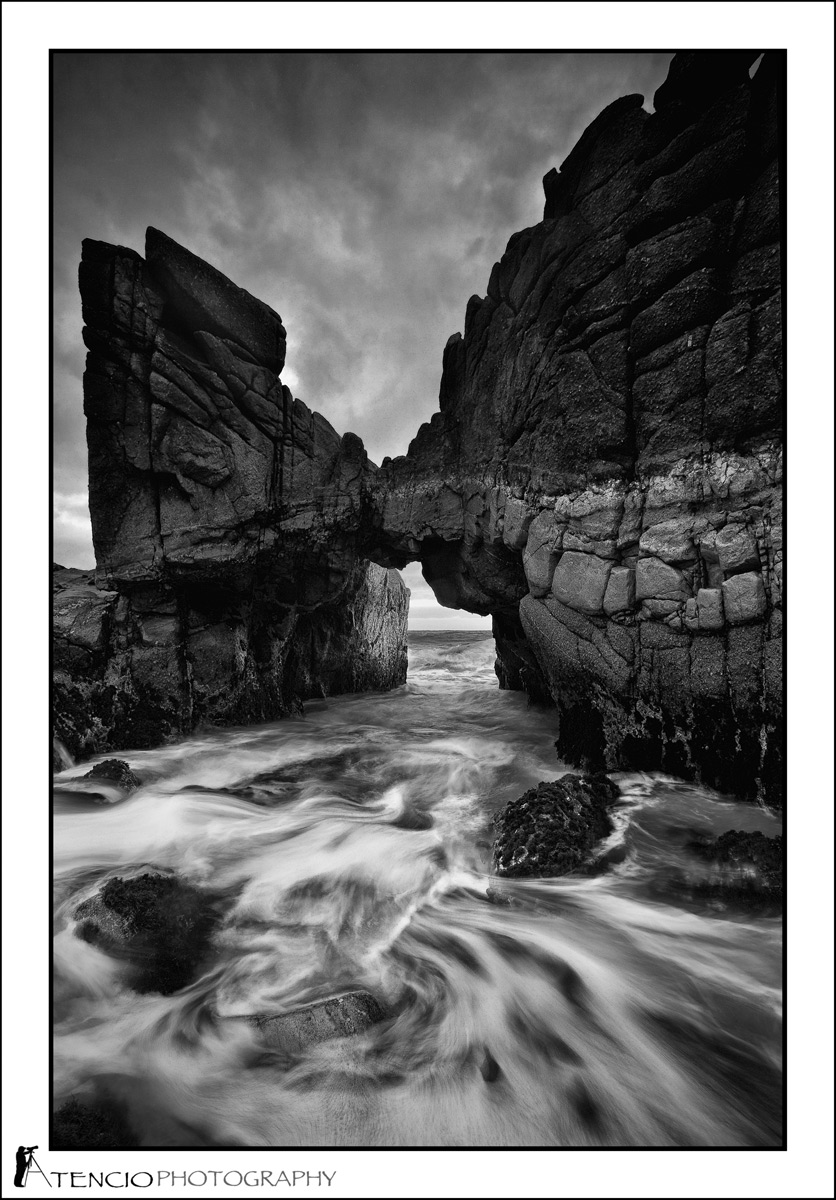
This is an often overlooked arch that exists in the Monterey Bay in Northern CA. I've been chasing a shot here for most of the winter, but ideal conditions at this location only exist for very short windows of time and have been few and far between. Although I was originally drawn to the color version of this image, I'm curious how the B&W comes across? Any comments or critiques are always encouraged and appreciated. Thanks again for taking a look.


4 shot hand blend (1 for water, 3 for sky) handled in ACR, then CS4 and final conversion to B&W using SEPII.

Comments

18 comments
Comment posted by Phillip Noll on June 16, 2011 at 11:14 AM
Wonderful tonal range, great drama in the sky, and an interesting foreground too! I like your conversion to B&W. No nits from me! :toast:
Registered on November 17, 2003, 207 Posts, 1083 Comments
Comment posted by Michael Lowe on June 16, 2011 at 11:55 AM
Awesome shot. I was going to suggest it was a little soft, but the larger image looks fine. :toast: :toast:
Registered on February 11, 2004, 777 Posts, 5252 Comments
Comment posted by Helio Cristovao on June 16, 2011 at 12:44 PM
wow what a beautiful and imposing formation! A great angle, and I think you´ve done well, water motion emphasizes the drama in the sky. Just stunning.
Registered on September 15, 2009, 83 Posts, 434 Comments
Comment posted by Sarah Marino on June 16, 2011 at 1:12 PM
Hi Jared - Overall, I like this image a lot - powerful and intense. I love moody black and white images, so I am naturally drawn to work like this. I like the patterns in the wave and the processing, plus the arch adds a lot of interest. My only critique has to do with the slot running down the left side of the image. I am assuming that you had your reasons for not shifting the composition so that the rocks hit the left edge (like making the arch opening smaller, probably). However, I think I would like the composition more if the rock went to the edge of the frame.
Registered on November 10, 2008, 23 Posts, 393 Comments
Comment posted by Koveh Tavakkol on June 16, 2011 at 1:27 PM
This looks like a beautiful location Jared. I really like your idea for this shot and the B&W processing is a great choice, which adds some nice drama to the scene. I would agree with Sarah on the comp though. I could see a tighter comp working really well here to really draw the attention to the opening at the far end of the arch. The other nit I have is with the blend, in that the top of the rocks looks almost completely in shadow. I could see this being the case if you used a grad, but since you are doing a blend you should be able to even this out. The top right of the image is in complete shadow with little to no details there. I do really like the white streak in the rocks form right leading your eye into the shot. :smile:
Registered on September 1, 2009, 41 Posts, 608 Comments
Comment posted by Nathan Buck on June 16, 2011 at 2:00 PM
The lines and textures in the water make the shot for me Jared. Very nice. I would not mind seeing the color shot for comparison, but I do like this one.

Nathan
Registered on November 1, 2003, 1101 Posts, 13589 Comments
Comment posted by Phil Pogledich on June 16, 2011 at 3:47 PM
I like the composition and the B&W presentation. Very appealing shot. I'd be curious to see the color for comparison, but I suspect I'll agree with you that the B&W is stronger. My only nit is the blend in the top 1/2 of the frame, essentially for the same reasons expressed by Koveh.
Registered on August 24, 2009, 123 Posts, 3099 Comments
Comment posted by Tony Kuyper on June 16, 2011 at 4:06 PM
This is awesome and obviously demonstrates a high degree of skill in the the photographic arts. I'd say there is maybe a bit of a halo around the UR rocks, but it sort of works to make a certain degree of separation between the rocks and the sky. I like this comp just fine.
Registered on November 1, 2003, 364 Posts, 22328 Comments
Comment posted by Gary Crabbe on June 16, 2011 at 10:24 PM
Wow, that's a great shot. Very impressive. Is this the one near the park?
Registered on November 1, 2003, 182 Posts, 1840 Comments
Comment posted by dean hebert on June 17, 2011 at 12:02 AM
Love the water and the lines and texture of the rocks. :toast:
Registered on August 4, 2010, 70 Posts, 1132 Comments
Comment posted by Jared Atencio on June 17, 2011 at 12:06 AM
Thanks for the comments and critiques everyone!

Sarah-I was curious how that "slot" of light would go over. I do have comps where I've eliminated it, but one of the most unique features of this arch is that hard perpendicular edge that just comes out of nowhere, so I wanted to include it for some context. Without I just felt it could be any hole in a rock, anywhere. Thanks for the honest comments.

Koveh-I intentionally went a bit darker than normal just because I liked the feel of it. There was a lot of detail that I took even darker than normal just to add some drama purely for aesthetic effect while sacrificing a little technical accuracy, but I agree that it makes that corner just a tad "weighty."

As for the blend, the rock on this arch naturally turns a very dark color at the top which gives it that "burned" look, and some of the haloing is just the natural lighter clouds behind this dark rock. Some of it may also be the smaller version as the haloing doesn't seem as apparent on the larger version.

Gary-I believe it's the arch near "the park" you're referring to. Although tourist busses drive past this arch all day, I haven't really seen any shots of this arch and it would be a shame for it to become iconic IMO. Shoot me an email directly and I can steer you there if you want. Thanks again!

Registered on June 23, 2009, 21 Posts, 422 Comments
Comment posted by Lon Overacker on June 17, 2011 at 1:32 AM
Jared,

The b&w definitely adds to the scene, even without having seen the color version. I really like the patterns in the water creating some nice dynamics and motion. I actually like the comp and the fact that you have space on the left. In fact, would that be kind of indicating why this is called "Butterfly Arch?" I don't think one could see that if you had composed or cropped differently.

The only nit/suggestion I have is the darkness of the rocks up top. I understand it's a tough balancing act and blend with a brighter sky behind and all. But I'm wishing for a little more detail or lightness balance on the upper rocks. Of course for all I know they are naturally darker up top - there's that possibility. Otherwise, I think you did very well with this. I like it.

I may have to contact you about this. I've been around that Bay many times including the drive around Pacific Grove and never seen or heard of this. Looks like a great spot!

Lon
Registered on November 24, 2006, 521 Posts, 19147 Comments
Comment posted by Aaron Feinberg on June 17, 2011 at 1:55 AM
Very cool spot and pretty dynamic shot. Could see a 10stop working very well here. Would say a good sky will go a long way here too. Good job w/ the processing and water capture.

aF

p.s plus what lon said :p
Registered on October 26, 2009, 399 Posts, 2789 Comments
Comment posted by Jesse Estes on June 17, 2011 at 3:13 AM
Very cool dramatic image here Jared. No nits :toast:
Registered on April 13, 2011, 20 Posts, 174 Comments
Comment posted by Jesse Estes on June 17, 2011 at 3:14 AM
After looking a little closer, I see some haloing on the rocks to the right side. Maybe the blend...
Registered on April 13, 2011, 20 Posts, 174 Comments
Comment posted by Andreas Resch on June 17, 2011 at 3:33 AM
Excellent composition and motion in the water. The top of the rocks still looks a bit dark - I would prefer it lighter.
Registered on November 14, 2007, 322 Posts, 6101 Comments
Comment posted by John Williams on June 17, 2011 at 5:43 PM
Great capture of a great formation. Haloing can be tough. Sometimes it was what nature provided and not from processing, but we photographers tend to assume processing even if it was natural. Non-photogs probably wouldn't care.
Registered on September 6, 2007, 221 Posts, 5985 Comments
Comment posted by Mark Metternich on June 19, 2011 at 6:26 PM
Very cool shot here! :toast:
Registered on June 19, 2009, 276 Posts, 6240 Comments